paperposts (137)

A hand holding a book that has a spine on both edges that makes it unopenable

Dutch book binders are crazy folk

Spotted this series of 'experimental' book bindings on a visit to the Letterform Archive a few years ago. Fabulously playful take on book binding. The double bound, unopenable one is my favourite. Sadly I only have pics of 1-3 of the series but there were…

A pamphlet. It has 2 retro male faces and the title of The Immediasts Seizing the Media

The Immediasts

For me this pamphlet sums up a lot of the themes and ideas driving the DIY culture movement from the early 90s. The main thrust, back then, was getting access to the methods of production and broadcast of media. And for this pamphlet broadcast was…

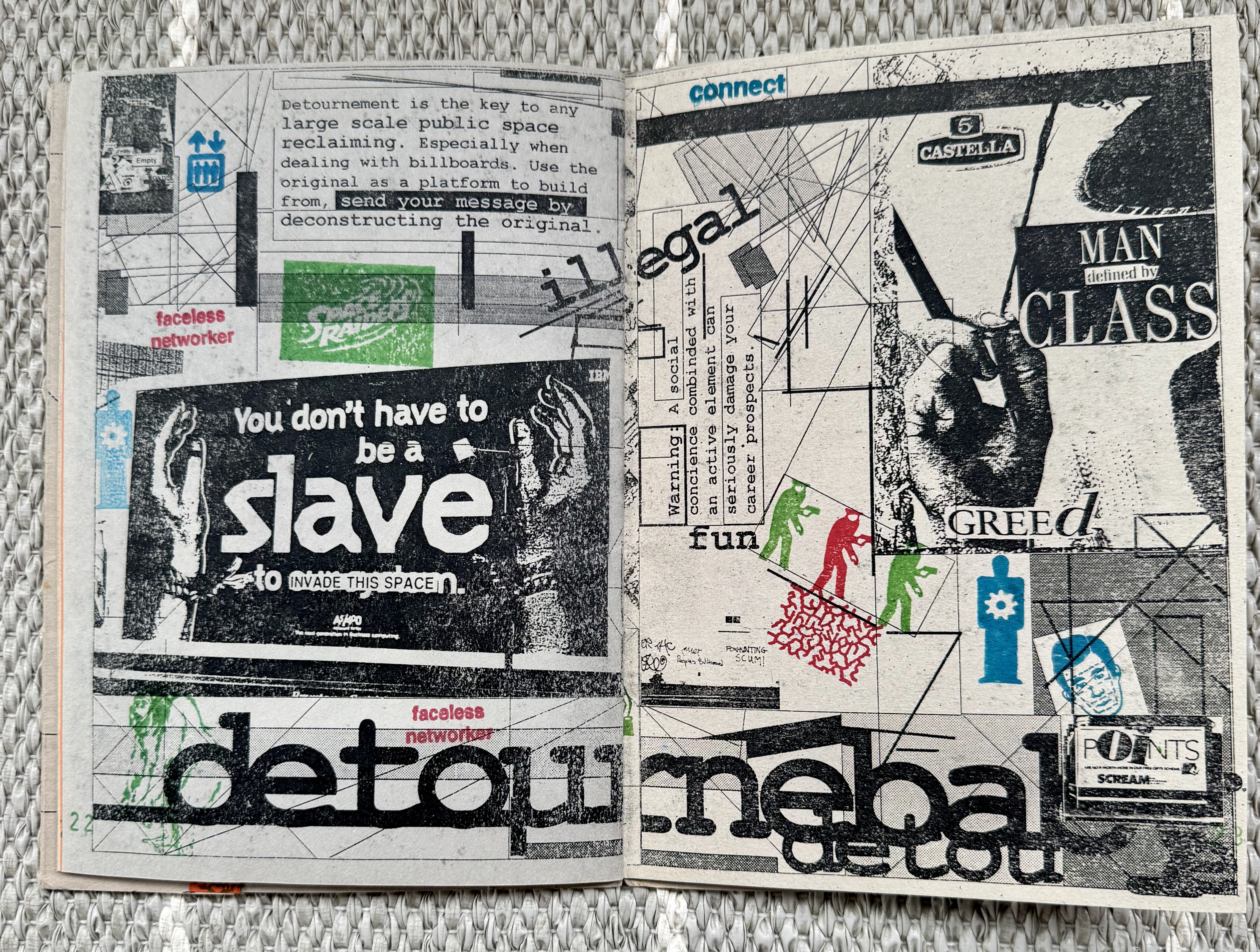
A double page spread of a photocopied, rubberstamped and stickered zine. It is a noisy layout of text, images and icon.

Invasion

Invasion was a 'seizing the media' event held in Portsmouth more than 30 years ago. In the heady days before widespread use of mobile phones, internet access and well before social media. It was inspired by the many DIY culture events of the early 90s,…

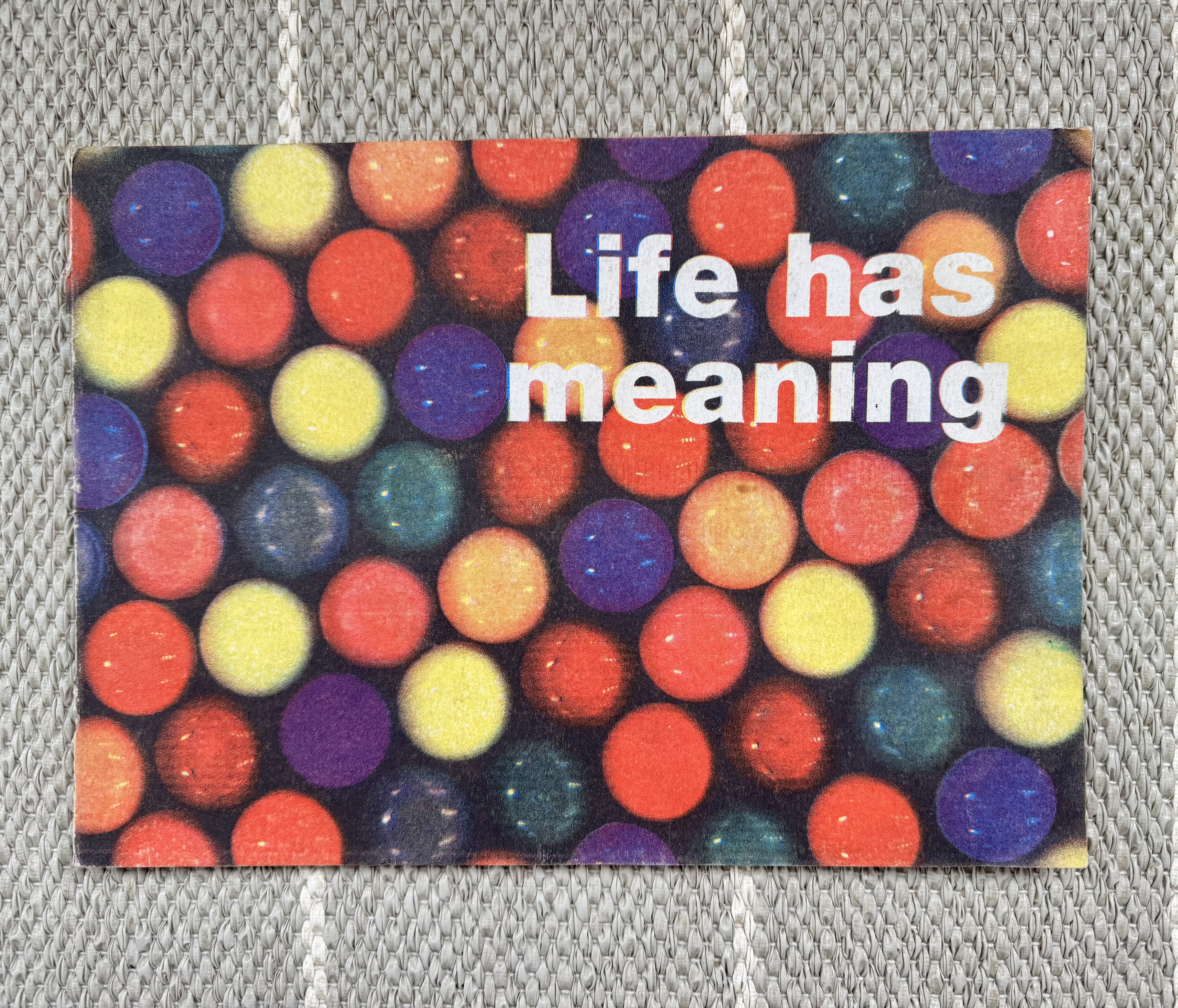
A brightly coloured A4 landscape book with a bold white title saying Life Has Meaning

Mark Pawson

The world lost Mark Pawson a little over a year ago (March 2025). I met Mark back in my student days and was fascinated and inspired by his art. His blend of "trash" culture, ephemera collection (he didn't do this cynically, it was not some…

A pamphlet with a dark photocopy image of a pack of Solvite wallpaper paste and the words ANTICOPYRIGHT WALLPAPER ADHESIVE agitational, subversive and downright scurillous flyposters plaster them all over your town! STICK AND DESTROY

From the frenzied days of flyposters

From Unnatural or at least Graham Harwood and Matthew Fuller. A collection of entries (almost like classifieds) describing contemporary flyposters doing the rounds in the Anticopyright network, circa 1990. This was probably related Matt's book Flyposter Frenzy. There are some real gems in the 187…

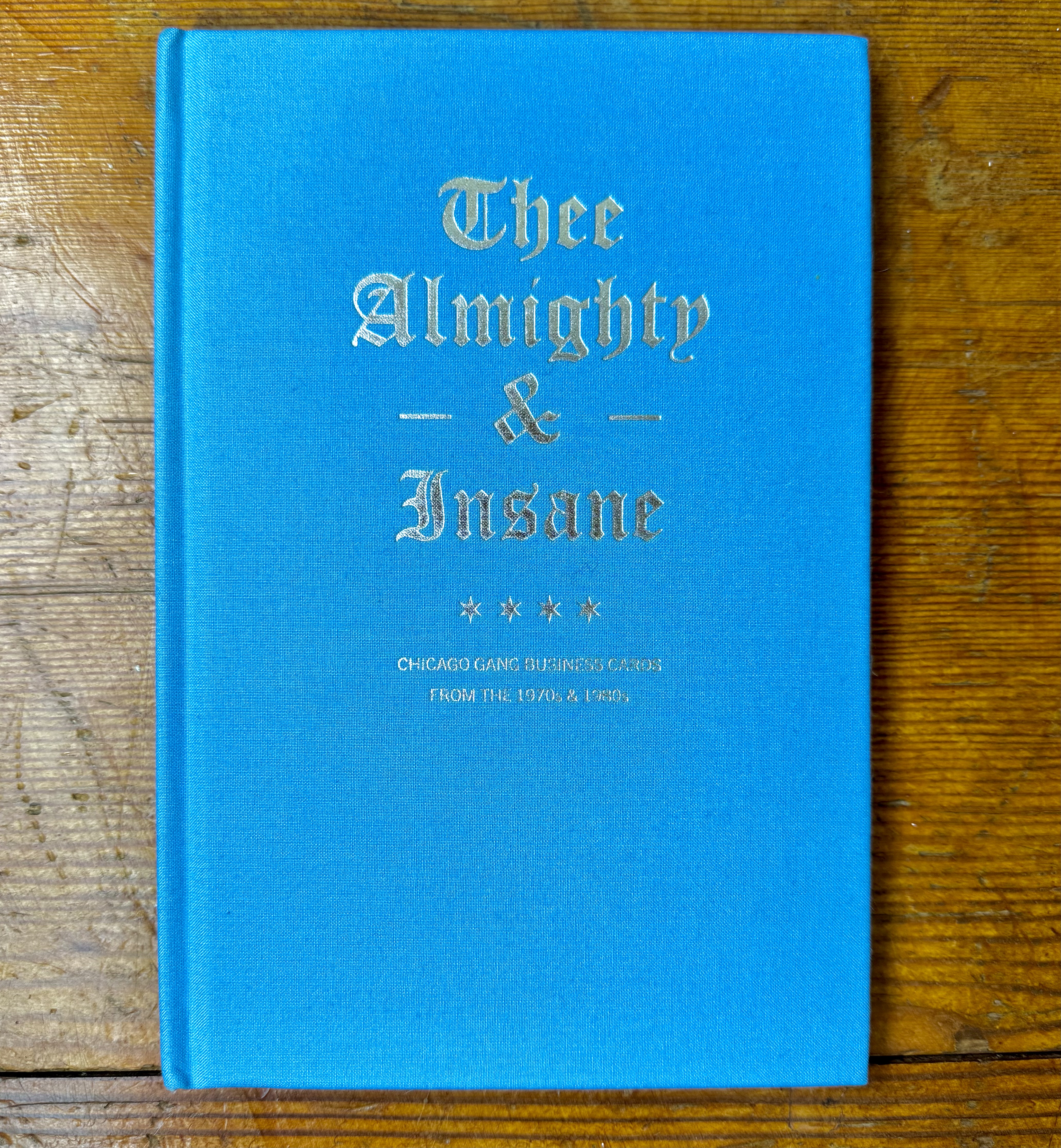
A blue cloth book with gold embossed elaborate title, it says Thee Almighty and Insane

Chicago gang business cards

Thee Almighty & Insane Chicago Gang Business Cards from the 1970s & 1980s is a wonderful journey into the dark realm of 70s & 80s Chicago gang vernacular. Mostly these were created on DIY machines in print shops, and hand amended or even fully hand…

Strips of paper that show examples of various type faces. Above them are 2 card winders, one full with the strips wound around it and secured, the other empty.

La Perruque type specimens

An intriguing type specimen magazine from La Perruque in the form of thin, narrow strips of paper, 1 per font, wrapped around a winding spool and secured in place with a band. These are tiny objects of wonder, like some ancient artefact that must be…

Cover of the Derek Beaulieu catalogue saisonee, surrounded by other printed ephemera

Beautiful Derek Beaulieu catalogue

Here's a wonderful Catalogue Saisonee by Paper View for the brilliant visual poet and artist Derek Beaulieu. It's a small but incredible book, ~180 pages of texture and surprises, from the binding to the mix in production techniques and papers. It's lovingly designed by someone…

A landscape book, it is plain with a simple cover displaying the title 28 Amendments

A proof reader's art

A long time back I picked up 28 Amendments by Astrid Stavro, Pablo Martin and Nick Asbury. A wonderfully simple idea, well executed. Amend the word using proofing marks to make it all better. As they put it: 28 Amendments is a series of positive…

A book, it is wrapped in transparent protective paper. The title is Fiction Hole and there is a collage featuring a bus.

Fiction hole - Japanese UFO manga

Picked this gem up over on the fabulous 50 watts books: "Genpei Akasegawa Super Science Kamishibai / Japanese-language publication from 1978". My Japanese is zero, so I'm missing the story but the imagery is amazing. Struggled to find much more information about this book in…

The cover of issue 1 of Inscription journal. It shows partially open pages from the edge, there is a small hole in the middle.

The intricate themes of Inscription Journal

With the up coming launch of Inscription: The Journal of Material Text – Theory, Practice, History #5 'Containers' on May 14th 2025, I thought is was about time I posted something about this wonderful journal. I have the first 3 issues, I missed issue 4, maybe…

a framed illustration of a black and white dog laying on a red and white striped mat

The adorable prints of Fumi Yanagimoto

I came across Fumi Yanagimoto's work via Instagram many years back (@fumiyanagimoto). Such beautifully sensitive illustrations of the animals we share a life with. A few years later a friend in Japan was putting on an exhibition of their work and we managed to get…

The cover of a book. The title, Brick Index, is printed vertically in bold white text against a dark brick red background.

The Brick Index

Living in California means I live in a wooden house, which feels like I'm the second of The Three Little Pigs. But I grew up just north of London in a brick terrace house so this book on bricks from brickworks across the UK had…

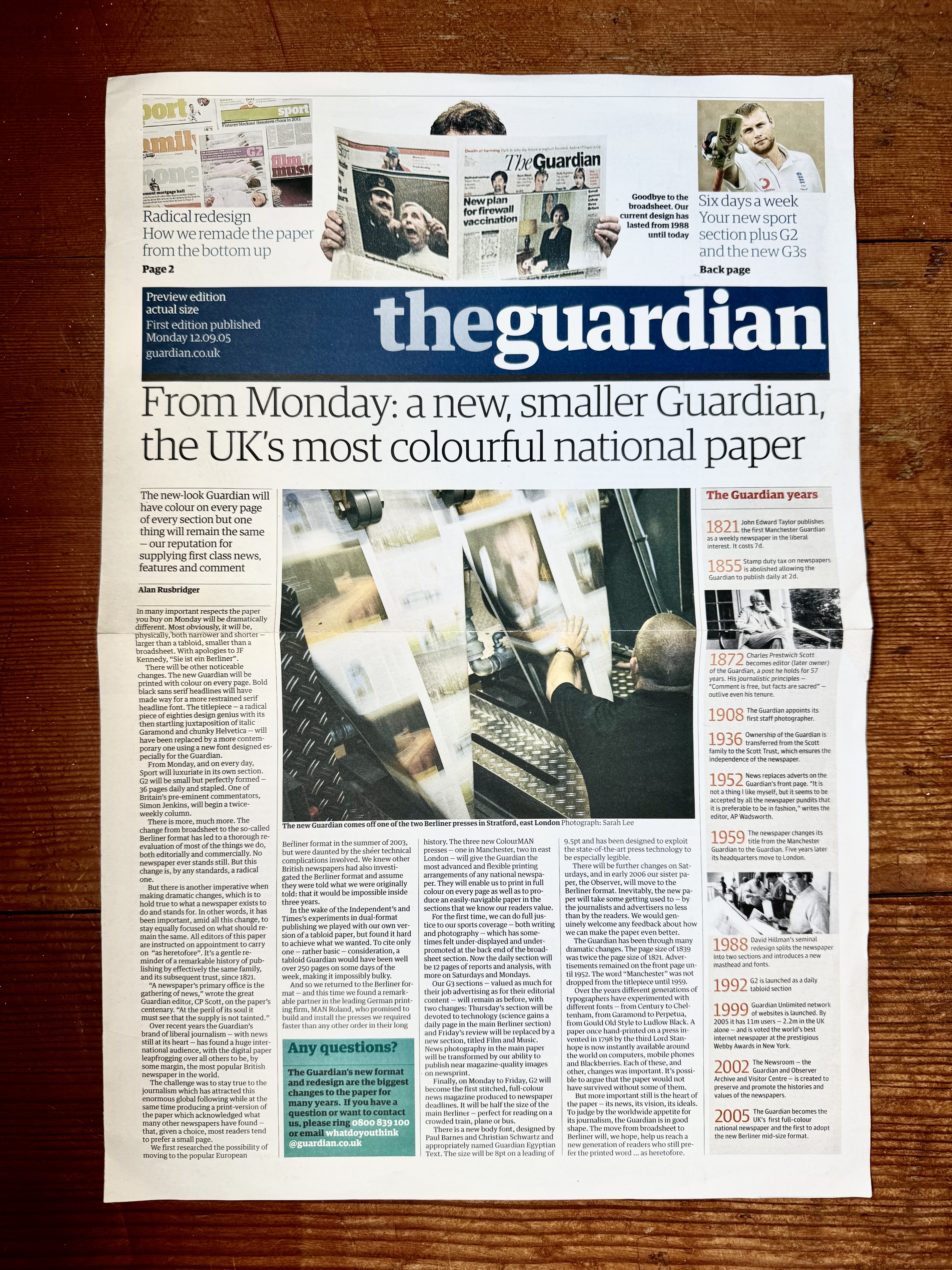
Front page of a Guardian newspaper supplement introducing their new Berliner format and design. It is in the format and design of the paper and the main story header says: From Monday: a new, smaller Guardian, the UK's most colourful national paper

20 years ago The Guardian was redesigned

Almost 20 years ago the Guardian newspaper did a major redesign. It was a big one; full visual system, grid, typeface and format overhaul - which meant full press and production overhaul too. That's a lot on the shoulders of the then creative director: Mark…

2 type specimen pamphlets side by side.

Recentish Emigre Type Specimens

You might have realised that I'm a big Emigré fan, I can't help it, I was a design student in the 90s. Something that made me very happy recently is that I'm still on their physical mailing list, and that they have started creating new…

An brightly colored illustration of an open matchbox, featuring 2 cats and the words Best Friends.

Three small prints by Charlotte Farmer

A while back, Katrina picked up these 3 beautiful small prints by Charlotte Farmer. I absolutely adore them, the vibrancy and style make me smile every time I look at them. She has tons of great prints on her site. The British tea time treats…

a grid of books and paper things on a variety of themes.

And we're back

So there's no denying that I've let this blog go stale. Over the last few years I've been busy dealing with life and neglecting my love of paper things, well neglecting sharing them on here at least. Now it's April 2025 and I've revamped the…

A yellow book with a black circle and some ornamental eyes.

Wonders from Atelier Éditions

So it’s been a long time since I posted, and have a backlog for sure, but I had to get these up. I recently picked up two books from Atelier Éditions and they are such beautifully crafted books. They both look amazing but not only…

A logo for Timglaset which is made from typewriter Ts and the name in the shape of a time glass shape

Discovered a new small press: Timglaset Editions

Recently discovered the wonderful small press Timglaset editions from Malmö in Sweden. Lovely range of concrete poetry and other forms of experimental and visual poetry and books. I couldn’t resist these two pieces: I love this idea; 50 transparencies of paths and routes to overlay…

A grid of 6 issues of U&lc paper journal

Some U&lc.

I always had mixed feelings as student when I leafed through U&lc. The covers and size promised so much but often it didn’t deliver (at least for the style/idea hungry design student I was back then). Probably because it was ultimately a trade rag (back…

The cover of the A-Z of The Designers Republic, which is silver and features a DR style character and ASTDR in signature neon or piped letters

The vast A-Z of The Designers Republic

I’ve had this a while and finally gotten around to posting it. Mostly because there’s so much of it! AZTDR or A-Z of The Designers Republic is a vast body of work from the Sheffield duo. Chocked full of commercial, personal, political, cultural and random…

A grid of 4 issues of baseline magazine

Baseline

I was digging through my library and found four issues of Baseline. I’d forgotten how good it was! The issues are from 1999, 2004 and 2 from 2005 (# 27, 44, 46, 48) and all have ‘poster’ cover wraps which make them feel oh-so-special. Looking…

The screen printed cover of Franticham's Los Angeles Palmtrees. The title is shown as a motel sign.

Glorious screen printed goodness from Red Fox Press

A while back I managed to snag a copy of Franticham’s Los Angeles Palmtrees from Red Fox Press. I’m a huge fan and this beautifully screen printed artist book is a real gem. From the transparent, perspex, back screened front cover to that incredible inky…

The title page fromI Declare a Permanent State of Happiness, featuring Wittgensteins Tractatus Logico-Philosophicus

This book certainly makes me happy

I Declare a Permanent State of Happiness is a stunning piece by Kenneth Goldsmith produced by Urtext, under the imprint Eris (originally listed under Marginalia). As with others in the Marginalia series, it’s a type of meta writing. Goldsmith takes 60(ish) pages of Ludwig Wittgenstein’s…

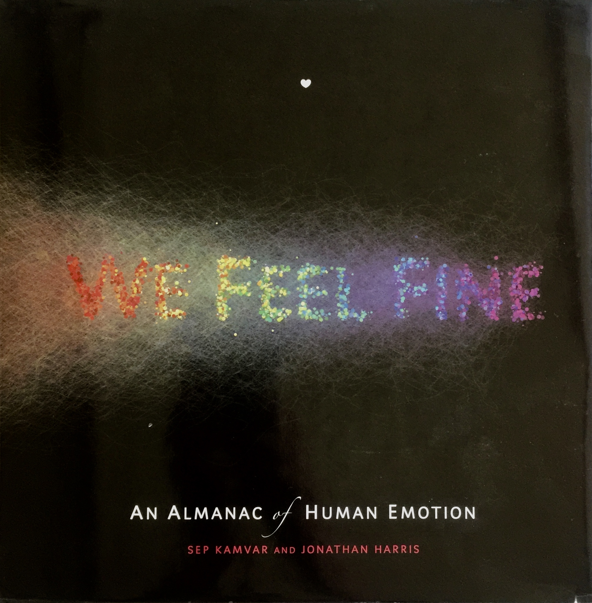
The cover of the book We Feel Fine, with the words formed from the color of a dense data visualization

Are we still feeling fine?

It’s been well over a decade since Jonathan Harris and Sep Kamvar created the We Feel Fine project. This book of the project is from 2009 but the work started way back in 2005 when they first built the system and started to collect the…

The cover of anthology of concretism, with the word light created outed blue black and light blue shapes

Something concrete

On a visit to Portland I popped into a great little fashion/design boutique called Johan (as I can never resist anything Scandi sounding). I got chatting with the owner and found out she’d spent time in Malmö and Lund - small world. Then it got…

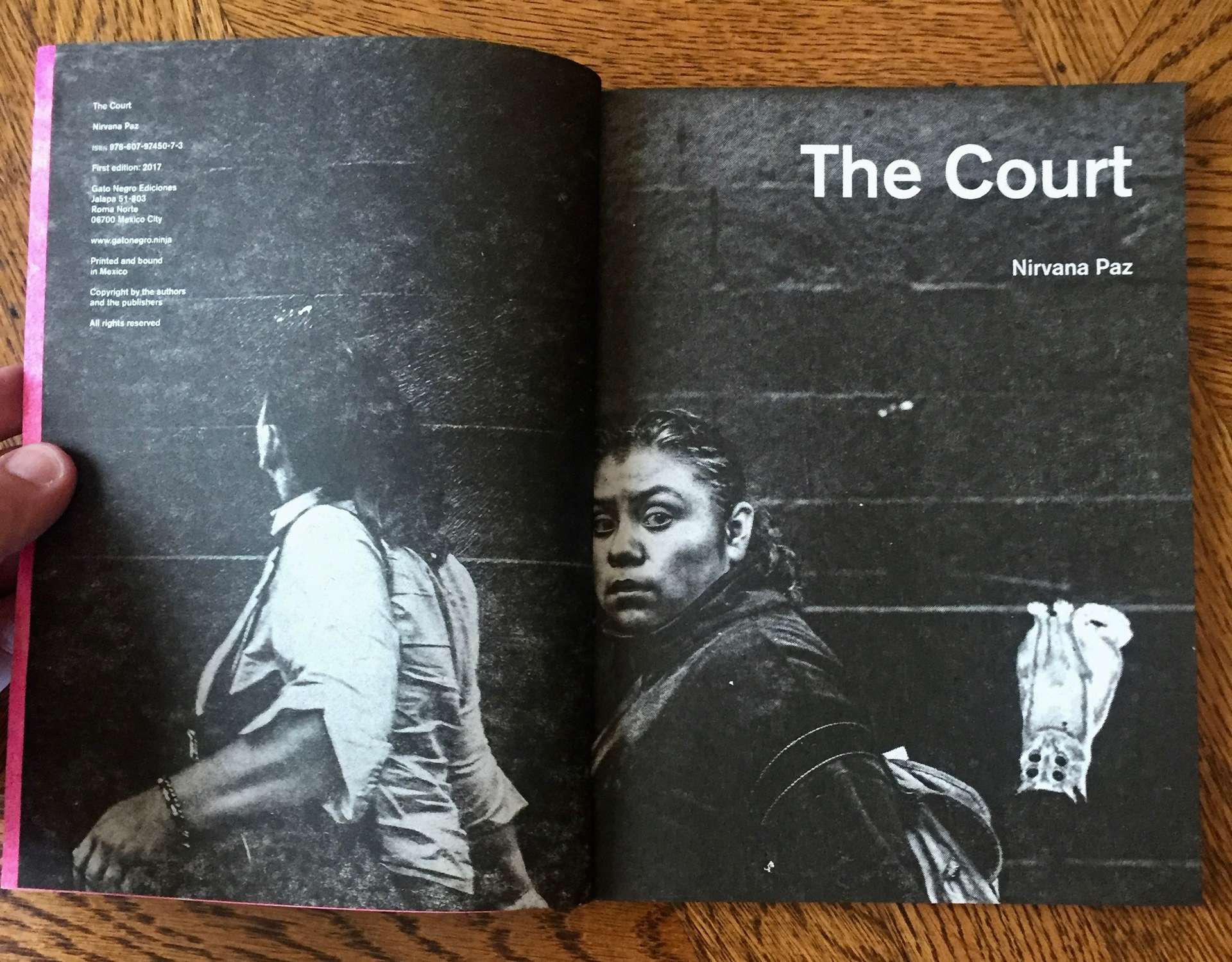
A spread from The Court. It is a dense black page with a monochrome image of 2 women

Some unposted gems from 2018 p3

Here are a few items that I didn’t feel I could put a full post together for back in 2018. Either it’s because they only have a few pics or they were items I’ve spied elsewhere so didn’t have much extra info for them. PART…

The cover of Typo Bilder Buch, with abstract shapes and light washed out numbers 3 and 7

Some unposted gems from 2018 p2

Here are a few items that I didn’t feel I could put a full post together for back in 2018. Either it’s because they only have a few pics or they were items I’ve spied elsewhere so didn’t have much extra info for them. PART…

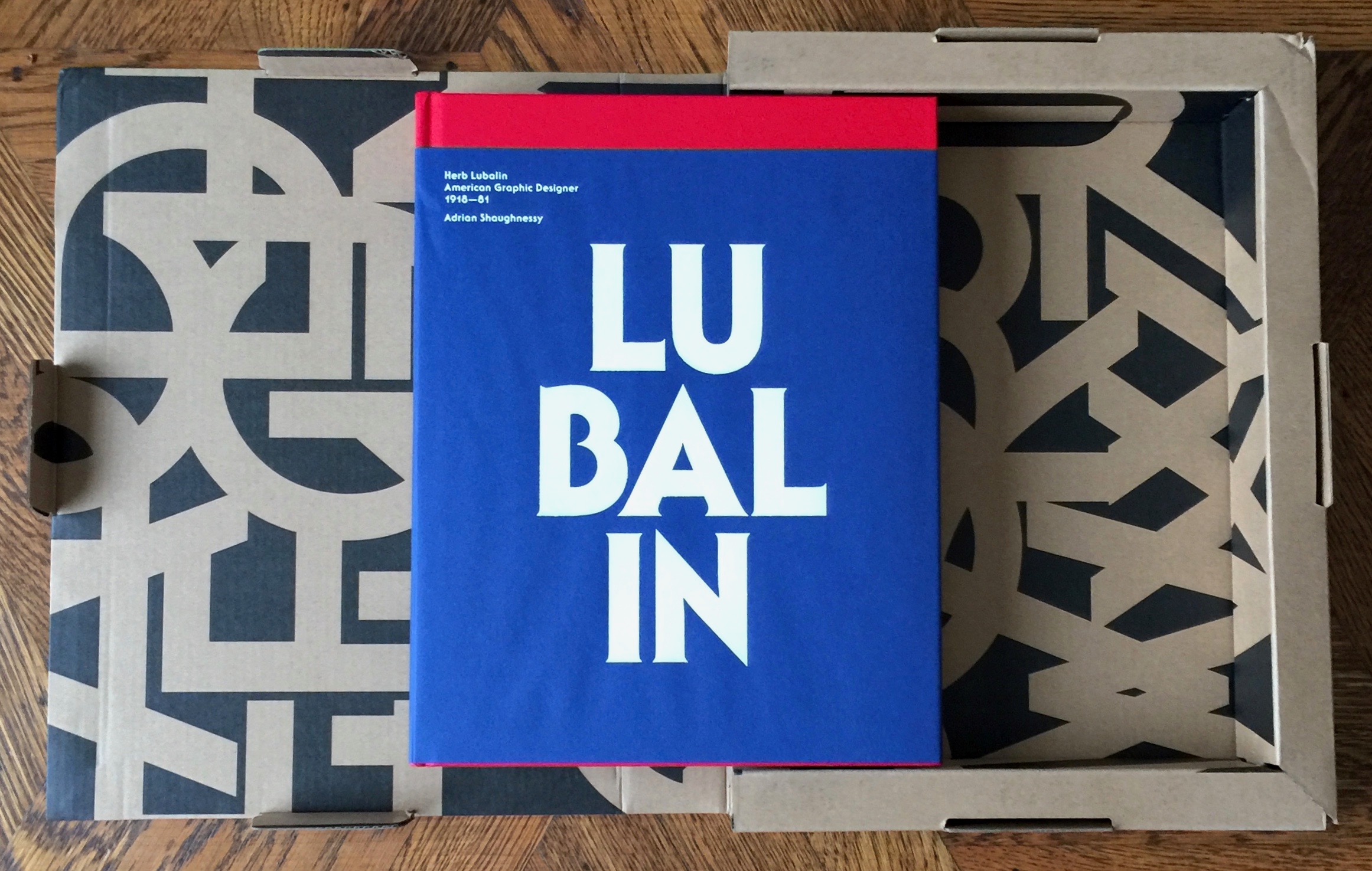
The book Lubalin 100 sitting on its open card board case.

The Lubalin 100 reissue

From Unit Editions the Lubalin 100. Another massive and heavyweight monograph from Unit Editions, boxed and beautiful.

An advertising manual for Coca Cola, it is very large and there is a mans hand on it to illustrate that its approximately 20 inches by 16 inches

Some unposted gems from 2018 p1

Here are a few items that I didn’t feel I could put a full post together for back in 2018. Either it’s because they only have a few pics or they were items I’ve spied elsewhere so didn’t have much extra info for them. PART…

a grid of 20 books

2018's paper additions

I haven’t posted much recently (been busy on this: 23 Years in the Making. But here’s a quick overview of what’s I’ve acquired this year. Some of which I’ve had time to post about, others I will hopefully get to post on in the new…

The cover of the report Preliminary Report No. 5 Urban Design Principles for San Francisco. It is deep pink with a large black 5 on it.

San Francisco's 1970 Study for Urban Design

View fullsize View fullsize View fullsize I love a bit of design history. Whilst in the Mission yesterday I picked up this gem from 1970 at Farnsworth Mercantile on Valencia. It's part of an urban planning study that was carried out by the city in…

The cover of Damn Everything But the Circus, with bold pink text for the title of black background

Damn Everything But the Circus

To my shame, I only discovered Sister Corita Kent in the last few years. I came across her through her work with John Cage and the brilliant 10 Rules they created for the Immaculate Heart College Art Department. Last year SF MoMa featured some of…

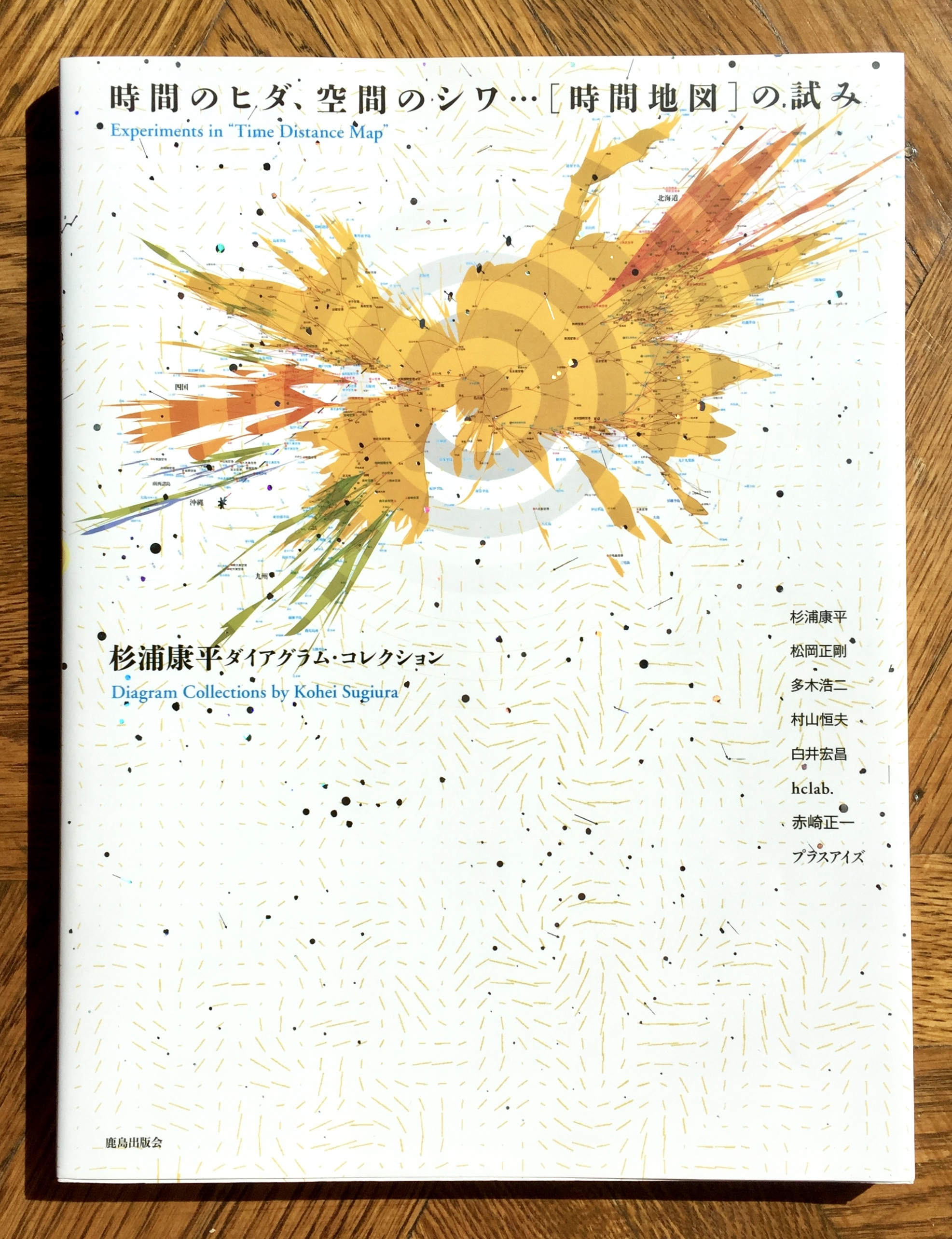
The cover of Experiments in "Time Distance Map": Diagram Collection

The Glorious Data Visualisations of Kohei Sugiura

It's taken me a while to post this and I know a few people have been eager to see the contents, so here it is: 『時間のヒダ、空間のシワ … [時間地図]の試み: 杉浦康平ダイアグラムコレクション』 or Experiments in "Time Distance Map": Diagram Collection by Kohei Sugiura I saw this on the…

3 postcards with large letraset letters added on the landscapes they feature

Aaron Marcus and Letraset

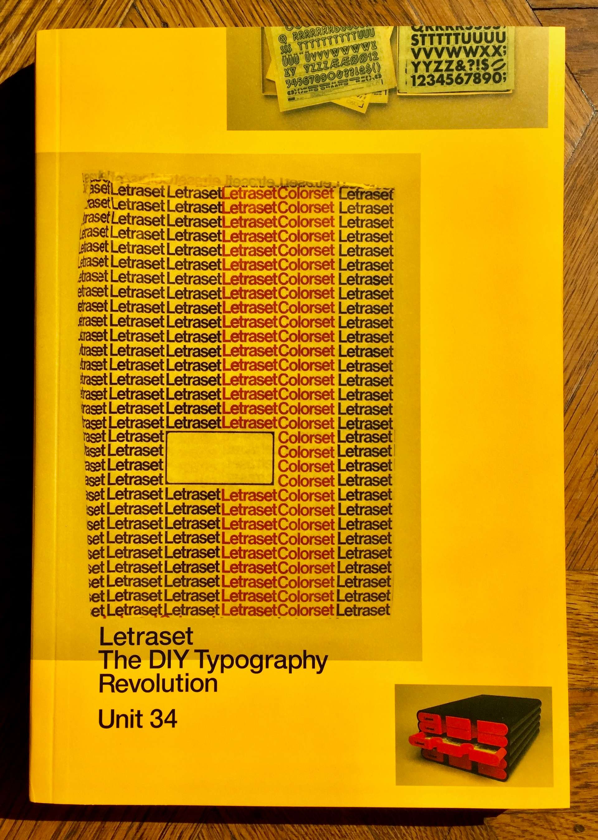
Reading Aaron Marcus' interview in Letraset The DIY Typography Revolution reminded me that a while back I took a few pictures of his work when on a visit to the Letterform Archive. They have a large amount of his work, which includes plenty of his Letraset…

Cover of W.A. Dwiggins: A Life In Design featuring a portrait of him, all devilish grin and white quiff hair

Celebrating W.A Dwiggins, the first "graphic designer"

Before you pounce on me for the title, I know he wasn't the first ever person to practice the various crafts that make up graphic design. But William Addison Dwiggins was exceptionally talented in all things graphic design - illustration, typography, book design, calligraphy, layout, advertising,…

The yellow cover for Letraset The DIY Typography Revolution

The Letraset Legacy

View fullsize View fullsize View fullsize Letraset The DIY Typography Revolution from Unit Editions is a loving exploration of the impact that Letraset had on graphic design through the memories and experiences of designers. The selection of designers is great, includes Andy Stevens (the person…

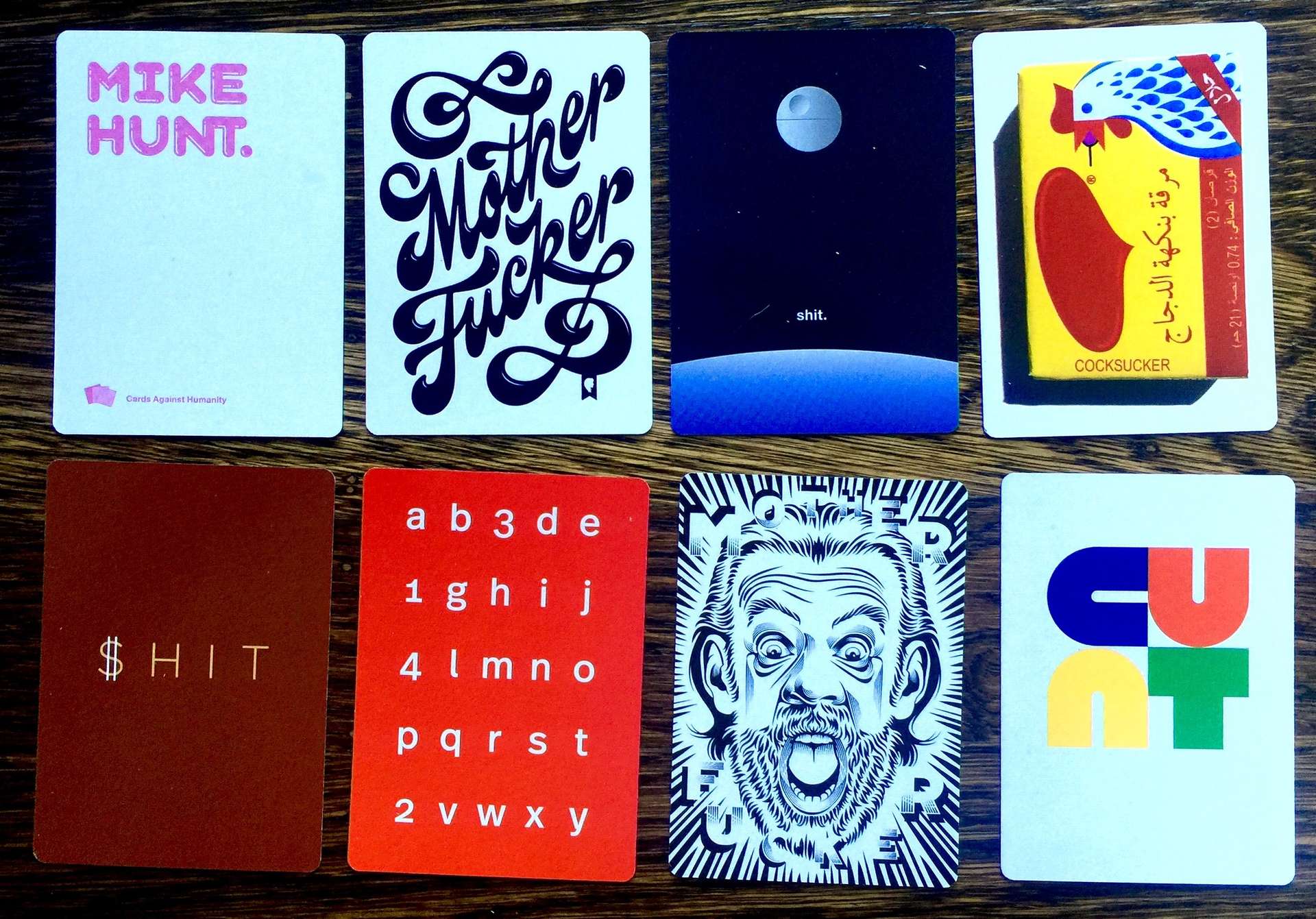
6 cards from a cards against humanity set

Cards Against Humanity - xmas 2017 campaign

As you probably already know, I really like cards and card systems. The game Cards Against Humanity is a brilliant example of an open card system and I've posted before about one of the additional sets. The other thing that they are famous (infamous?) for,…

a tables with printed items on it, closest is a large black book with shiny black symbols printed all over the cover

Letterform Archive - tables of pure delight

I'm often visiting the Letterform Archive just after they've put on a visit for this or that design team or artist or historian. So I get to see the 'table' that's been put together for them. Sometimes these reflect specific themes or ideas the visitor…

The typography journal Spin in the plastic bag it came in

Spin - Adventures in Typography

Last month I was back in London, for the first in years. Amongst other things I simply couldn't resist the opportunity to swing by MagCulture - always a treat and chocked full of incredible publications and gems. Unfortunately I had to limit my purchases as hand…

A facsimile of the Depero bolted book

The Depero Bolted Book - a facsimile

Depero Bolted Book facsimile and the Reader's Guide by Designers and Books It's been way too long since I had something to post about, so when this arrived this week I was doubly happy. Some time ago I backed the kickstarter campaign to create a…

The cover of the Graphis annual Graphis Diagrams with a pseudo visualisation on red lines on the cover

Graphis Diagrams - 1974 data visualisation

I've been after a copy of Graphis Diagrams ed. Walter Herdeg (Graphis, 1974) for years. Always hoped I'd find it in a second hand book store, alas in the end I snagged it on Amazon Marketplace. It's had the edges 'repaired' or at least protected with…

a pamphlet showing a picture and the name of George Maciunas, he is short haired and wearing round glasses

Rediscovering George Maciunas

View fullsize Last week I came across a fantastic article on Hyperalergelic about mapping art movements, which in turn led me to George Maciunas' Fluxus timeline. I'd forgot how much I love his graphic design and typography. Luckily there's a pretty good facsimile version on…

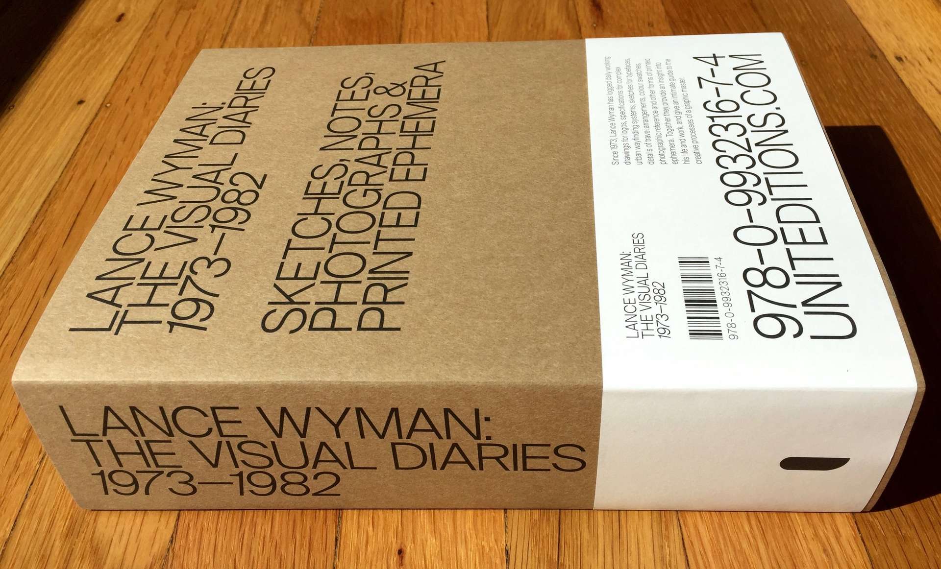
The Lance Wyman visual diaries book, it is a very large heavy looking book

Inside the design process of the great Lance Wyman

What seems like a very long time ago I sponsored the Lance Wyman Visual Diaries project on Kickstarter. Another amazing and ambitious project from Unit Editions. Yesterday the swag arrived, and boy was it worth the wait. The pack included; a boxed version of Lance…

An IBM brand book, it is black with small primary colored IBM logos gravitating towards the center

Letterform Archive - brand and design guidelines

As you'd expect, the Letterform Archive has a lot of identity and brand guidelines. Many of these are not very glamorous, often simply presented in ring binders, but they are graphic design gold. On a recent visit I spent some time cataloguing them. Here are…
The Letterform Archive logo, which is 9 As rotated in a circle but each A gets progressively heavier in weight, starting at 3 o'clock and moving anti-clockwise

Letterform Archive - an eclectic sample

One of the things I love most about visiting the Letterform Archive is the impromptu discovery of awesome bits of design. You can book a research session with them and get a focussed deep dive into a particular subject area, but as a volunteer you…

Cover of MacGuffin magazine, showing a tight rope walker

MacGuffin Magazine and The Life of Things

Finally picked up a copy of the much raved about MacGuffin magazine. I'm a bit late to this party as it's already on No. 3, The Rope issue. I must say it's pretty damn nice, lovely stock and use of illustration. I really like the…

a grid of 30 images of graphic design items from the Letterform Archive

Letterform Archive - SF's graphic design treasure trove

A small selection from Letterform Archive's Instagram feed. For the past few months I've been visiting and volunteering at the Letterform Archive in San Francisco. It's a collection of over 30,000 lettering, typographic, calligraphic and graphic design related items. From stone artefacts and illuminated manuscripts through…

A paper model with a candle burning in front of it

Seasonal paper art from Diptyque

Mostly I tend to avoid promotional christmas giveaways, but this one from Diptyque is beautiful. It's a paper based theatre set, consisting of one pop up 3d theatre scene and a second stand up theatre where you can change the scenes - with 9 story…

a white and red star map, but instead of constellations it's horror movies

Poster goodness from Dorothy

Despite having limited wall space, I can't resist posters and prints. I recently discovered Dorothy (http://www.wearedorothy.com/) and oh boy what a treasure trove. After much deliberation I managed to limit myself to these three posters: But this one is so on my radar for my…

2 issues of Mondial magazine, the left, issue 1, is pink, the right, issue 3, is yellow

Mondial magazine from Rapha

There's something about cycling that seems to brings out the best in graphic designers. I'd seen a few pieces about Mondial magazine from the British cycling brand Rapha on the design blogs, but hadn't seen it in the flesh until I visited their San Francisco…

The book Action Time Vision, with a plastic bag containing badges next to it

Action Time Vision - was waiting for me

Arrived back from a long weekend and this little beauty was waiting for me: Action Time Vision, #002 in Unit Edition's Archive Series. I'd almost forgot that I'd ordered it! I'm loving the books being put out by Unit Editions (Tony Brook, Patricia Finegan and Adrian Shaughnessy), and can't…

The book Shady Characters.

Octothorpes, interrobangs and other wonders in Shady Characters

Octothorpe Interrobang A few weeks back I saw a tweet featuring a pic of the octothorpe or hash symbol, from Shady Characters: The Secret Life of Punctuation, Symbols and Other Typographic Marks by Keith Houston. It looked exquisite and I couldn't resist grabbing a copy of the…

A wooden display case containing multiple copies of 9 different brightly coloured recipe pamphlets

Tiny recipe collections to treasure

Today I discovered Short Stack Editions whilst taking a perusal around Heath Ceramics. These are lovely small, 'pamphlet' sized recipe collections. I picked up two volumes: volume 8, Honey by Rebekah Peppler and volume 13, Lemons by Alison Roman. Each focuses on a single ingredient…

2 cards, one says Data, Decisions and Design, the other has an old fashioned drawing of a jester.

Strategy cards for the day job

Mostly I keep this blog personal work free. However recently I put together a pack of strategy cards on working with analytics and data for my day job at Qlik. It was a fairly rapid project, 6 weeks from concept to delivery. It's been a…

Issue 1 of Zembla magazine show Tilda Swinton on the cover

Zembla Magazine issue 1 - words, pictures and graphic design gorgeousness

Since the early 2000s there's been an explosion in high quality independent magazines. These are often lovingly crafted, hugely indulgent, hyper focussed niche offerings. Not aimed at mass distribution or high ROI and usually not the most successful business models. One of these magazines that appeared…

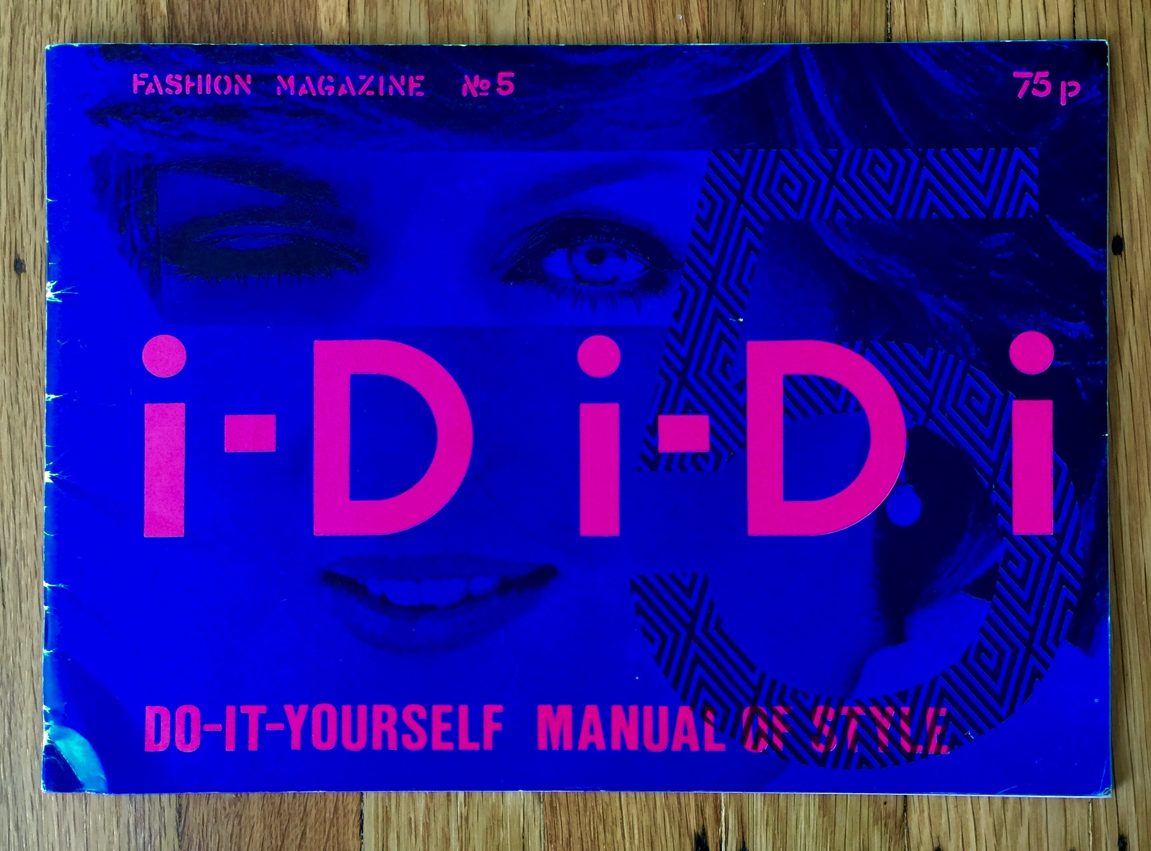
Issue 5 of I-D Magazine. The cover is a dark bright blue with pink letters saying i-D i-D i and in the background is a 5 and a photofit of Lady Di

Vintage I-D Magazines (1981, 1983, 1984, 1985)

Rediscovered some old issues of I-D Magazine. They range from issue 5 (1981) to issue 28 (1985) and cover the mag's early progression from fanzine to fashion mag. First up is issue 5 aka the Lady Di issue. A spectacularly good typographic pun for the…

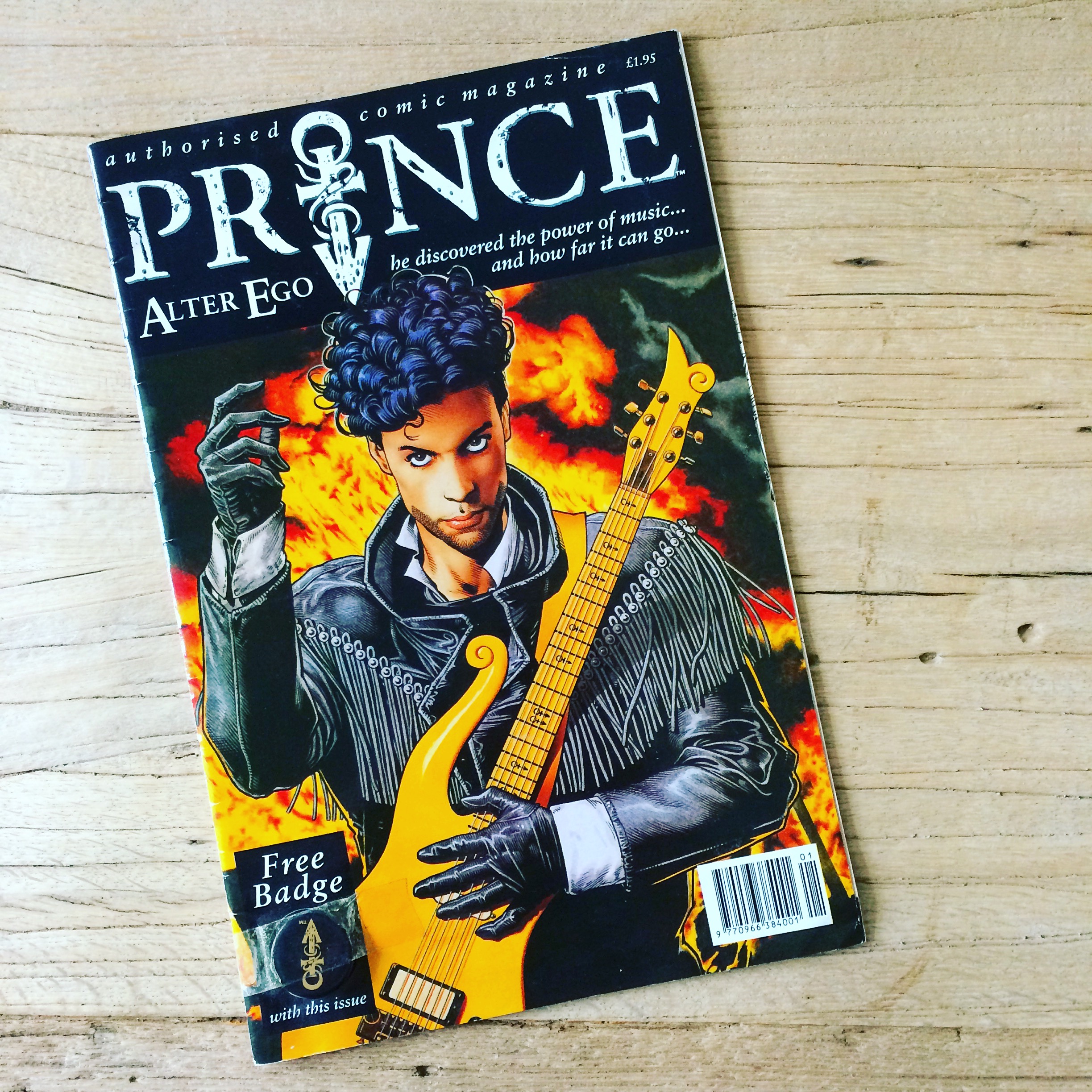
An illustrated Prince comic featuring him on the cover with guitar and flames behind him.

Prince Alter Ego Comic 1991

On a very sad day. Here's a few pics from Katrina's copy of Prince Alter Ego Comic from 1991, that sits on our bookshelf - loving preserved for 25 years by a true fan. RIP Prince Rogers Nelson (1958-2016)

A a cloth covered box by the Chapman brothers containing reworkings of Goya's Disasters of War

Injury to Insult to Injury to insult and beyond

Got may hands on this fantastic postcard set from Jake and Dinos Chapman's - Injury to Insult to Injury. It's a lovely boxed reproduction their now infamous (a label that applies to almost everything they do) 2004 piece of the same name (see here). What…

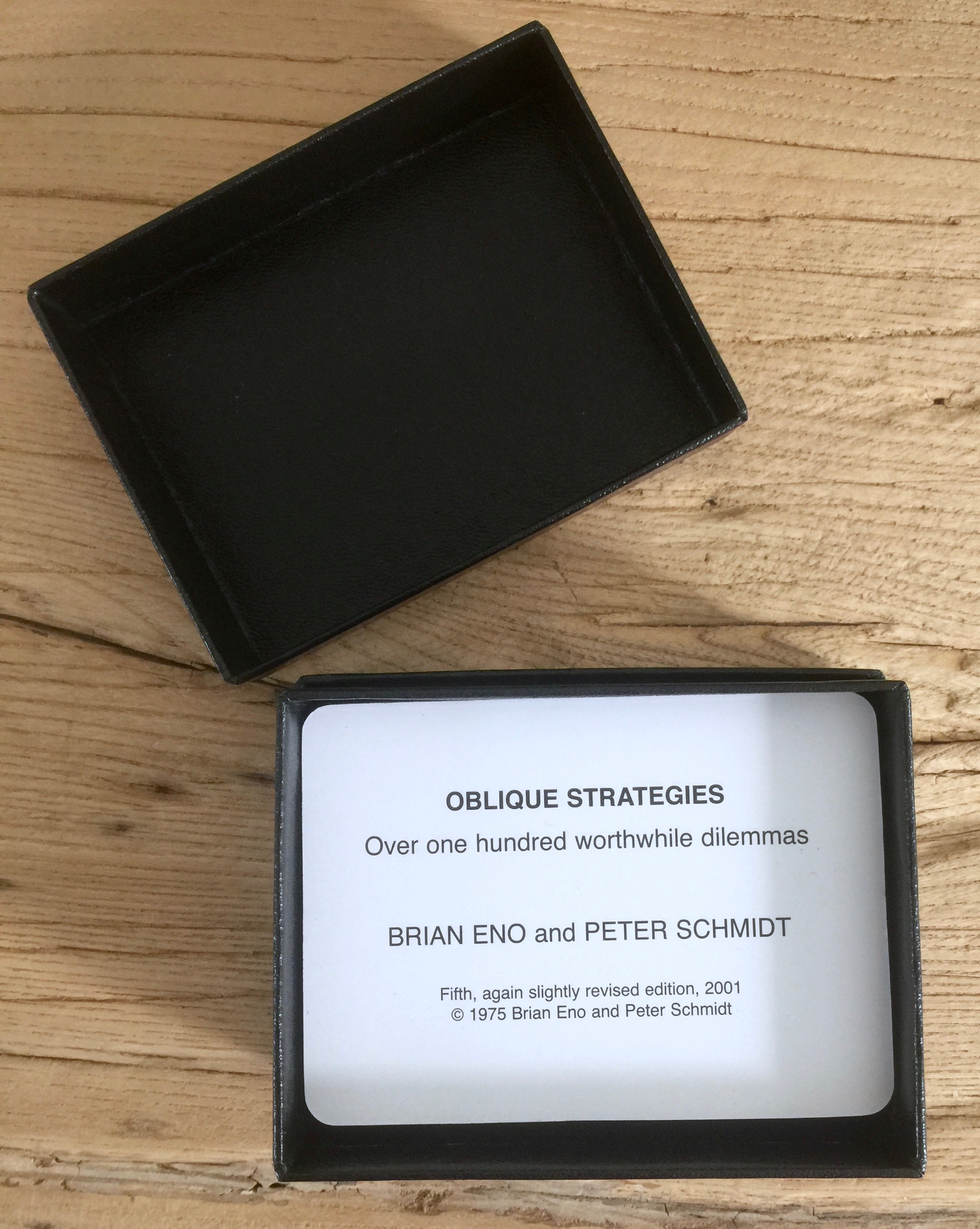
An open box which contains the card set Oblique Strategies

Oblique Strategies

Got a pack of the Oblique Strategies cards by Brian Eno and Peter Schmidt. I've known about them for a while but was reminded of them recently after seeing a pic of David Bowie's very well used deck. I was so happy to discover you…

A grid of 9 issues of Science of the Secondary

The wonderfully poetic Science of the Secondary

Recently I was given this bumper bundle of the amazing Science of the Secondary, an atlas of things not yet discovered from Atelier HOKO and I've just spent a very rainy Sunday in SF devouring each of them. I have the first six issues and each one…

A print from Gary Taxali featuring Maurice Sendak's character from Where the Wild Things Are

Wild Forever by Gary Taxali

I've been toying with getting a Gary Taxali print for a long time, no idea what held me back. Anyway I finally grabbed Wild Forever for Katrina for Christmas as it fits her perfectly. The illustration was originally commissioned by The New York Times' for…

A print by Moonassi of a sleeping person fox, laying down with a fox laying on them

Beautiful illustrations by Moonassi for Maison Kitsuné

Last year I bought a wonderful t-shirt by Maison Kitsuné. I fell in love with it the moment I saw it. It's from Kitsuné's K.I.M collection and has a marvelous fox/woman illustration on the front by the Korean artist Moonassi (Daehyun Kim). However, Santa brought…

The book Hate Mail, in grey with a golden octopus on the cover making the V sign with all 8 arms

The ever so Fine Art of Abuse - NSFW

Firstly, this will offend a lot of people out there, especially those that are sensitive to items with more colourful language. If you regularly use the phrase 'potty mouth' I suggest you leave this page immediately. I've backed a few Kickstarter books, and this has…

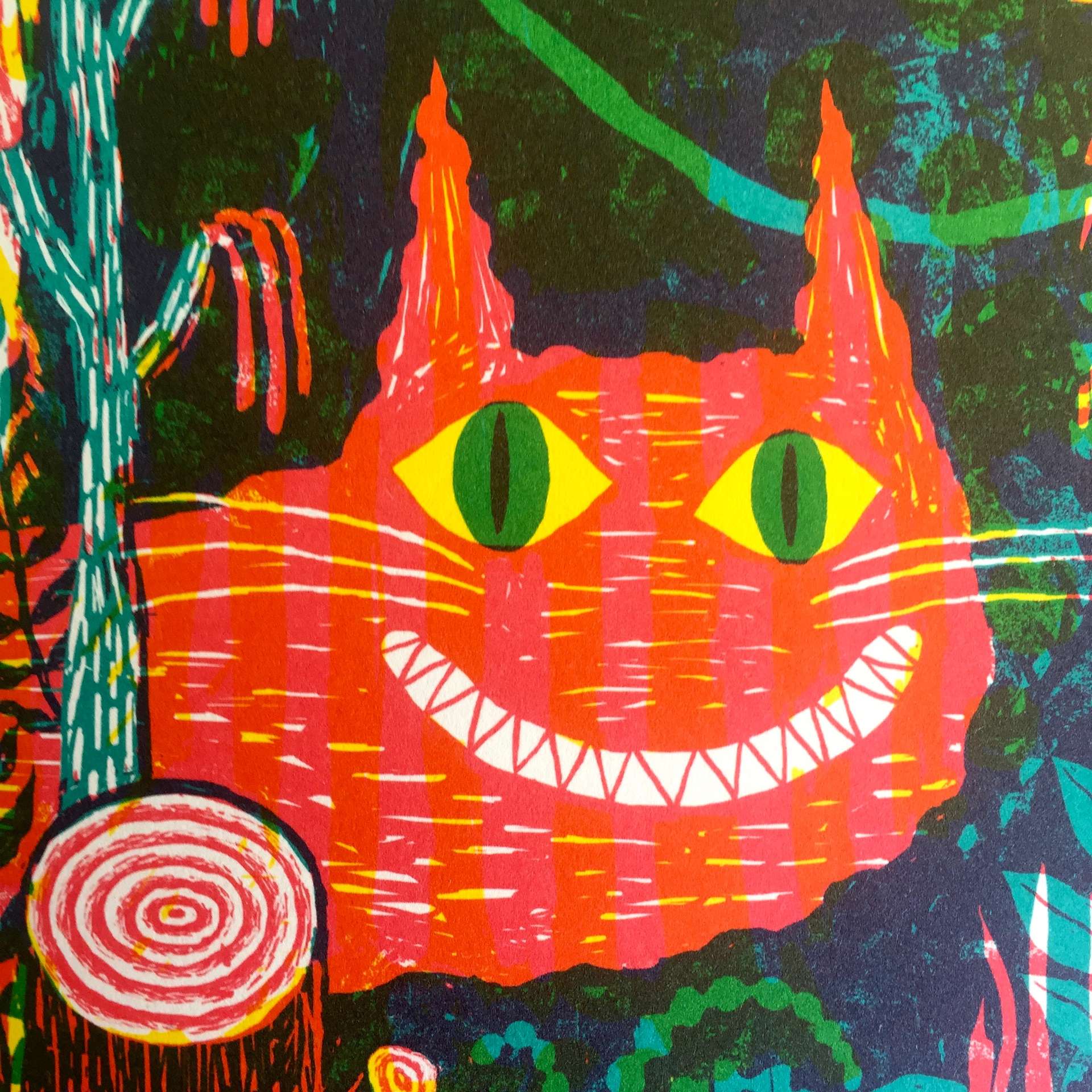
A bright and chaotic illustration of a grinning cat

Beautiful but Beastly Verse

Picked up a copy of the beautifully illustrated Beastly Verse by JooHee Yoon. It's a lovely collection of rhymes and poems about animals by various authors. Each has one of Yoon's wonderful, layered and rich illustrations supporting it. Incredibly rich and sumptuous colour. Available on…

A black book with HENRION written large and central in embossed, shiny, black text

Incredible collection of FHK Henrion's work

A great treat arrived today. It's an in depth look at the work of FHK Henrion, one of the most influential graphic designers in British design history. It's from Unit Editions and it's absolutely gorgeous. Not only is does it have a beautiful cloth bound,…

a print of a jar of fireflies

The wonderful illustrations of Ian Phillips

I first discovered Ian Phillips via his Instagram account and I totally fell in love with his style, and his wonderful sensitivity for print and colour. When I checked out his Etsy shop and couldn't resist these little gems. The Fireflies print is extra special as…

An open pack of Marshall McLuhans Distant Early Warning playing cards

Distant Early Warning: A deck of cards from Marshall McLuhan

I've always been a big Marshall McLuhan fan. As a young graphic design student the books created in collaboration with Quentin Fiore changed my outlook on what a 'serious book' could look like. They helped me understand that the designer is never neutral or passive…

the cover and a page excerpt from In Loving Memory of Work. The excerpt says: these works are the marks of principled and passionate people, made for a good reason out of necessity, and they are raw and powerful because of it

Remembering the Miners' Strike

Just received my copy of the spectacular In Loving Memory of Work: A visual record of the UK miners' strike 1984-85 curated by Craig Oldham. It's wonderfully designed by Craig Oldham and Aaron Skipper, and published by A Unified Theory of Everything. The wrap around…

2 fairy tale books, both black with cut out titles

Gorgeous Fairy Tales from Sybille Schenker

I spotted these over on the always inspiring Brain Pickings. They looked utterly stunning, so had to see if I could get hold of them. Thankfully Amazon has them and considering the UV spot gloss, special papers and laser cutting they are a bargain! First up is…

A box of strategic vision cards by Arup

Drivers of change from Arup

This is a few years old now (published in 2009), but they are still a great tool to stimulate strategic and global thinking. The cards are nicely designed as they manage to contain both a bite sized idea and pack in a reasonable piece of…

a partial view of the cover, showing the title, A history of the timeline

A long time coming: Cartographies of Time

I've had this fantastic book for a while, but I haven't been able to do it justice when it comes to photographing it. So I'm putting up anyway as it's too good to leave off this blog. Cartographies of Time: A History of the Timeline by…

A book, with a silvery blue cover and the title, Wait You're Not a Centaur.

Nate Denver's poems and songs

Recently I visited McSweeney's in their office on Valencia in San Francisco. They share a space in the building that used to be home to the rather magical little book/art store Little Otsu. They have since moved to Portland, but it reminded me of this…

Issue 1 of the  The Office for Creative Research journal

Issue 1 of The Office for Creative Research's journal

This was an absolute must for me. Not least because I'm a print and design obsessive but also because I work in the data visualisation and analytics field. And it didn't disappoint! Beautiful. A lovely piece of design from The Office for Creative Research (o-c-r.org) . Best of all the…

a small hardback book - 101 things I learned in Architecture school

A lovely little book - 101 things...

Picked up this lovely little gem, 101 Things I Learned in Architecture School by Matthew Frederick. Each spread is a single idea, technique or concept. Great illustrations and wise words throughout. I really love the board cover and binding. Another nice touch is the numbering and the…

5 books arranged on a floor, from McSweeneys

A bumper haul of McSweeneys

This weekend I went to the McSweeney's pop up kickstarter event on Valencia Street in San Francisco. I'd already backed the campaign but thought I'd swing by anyway. So glad I did! Met some great people and came home with this small haul of books.

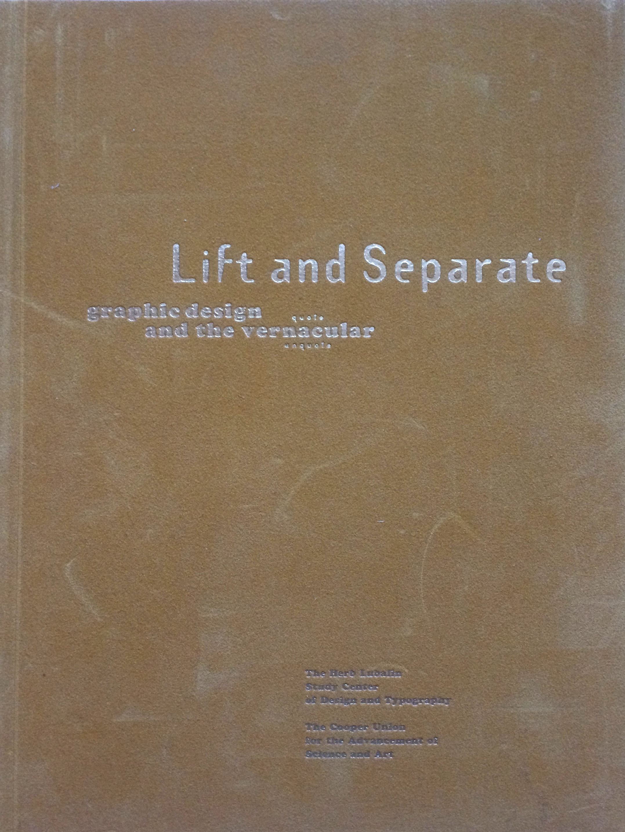
A typography and design journal called Lift and Separate

Lift and Separate - a graphic design journal

Lift and Separate is a lovely tactile journal, very much in the spirit of Emigré and Eye. It was published circa 1993 by the Herb Lubalin Study Center. What I really like, is the piece on vernacular and the journey from drawing fanciful letters in a note book to purging the ornaments…

2 heavy, orange bound tomes featuring Emigre magazine

Emigré the journal issues (33-49 bound)

I have a few loose issues of Emigré so when the bound volumes were released I had to grab them. These are from the more theoretically engaged period, epitomized by the mouthpiece series. Great to look back on and see the issues that raged and in…

Issue 26 of Emigre magazine, with blue cover with flame motif

Issue 26 of Emigré magazine

This is one of the later issues (No. 26 Spring 1993) of Emigré that was published in the large format. Fairly soon after this it went to a smaller journal like publication. Interestingly this coincided with a shift in graphic design writing. A move away from pure design expressions…

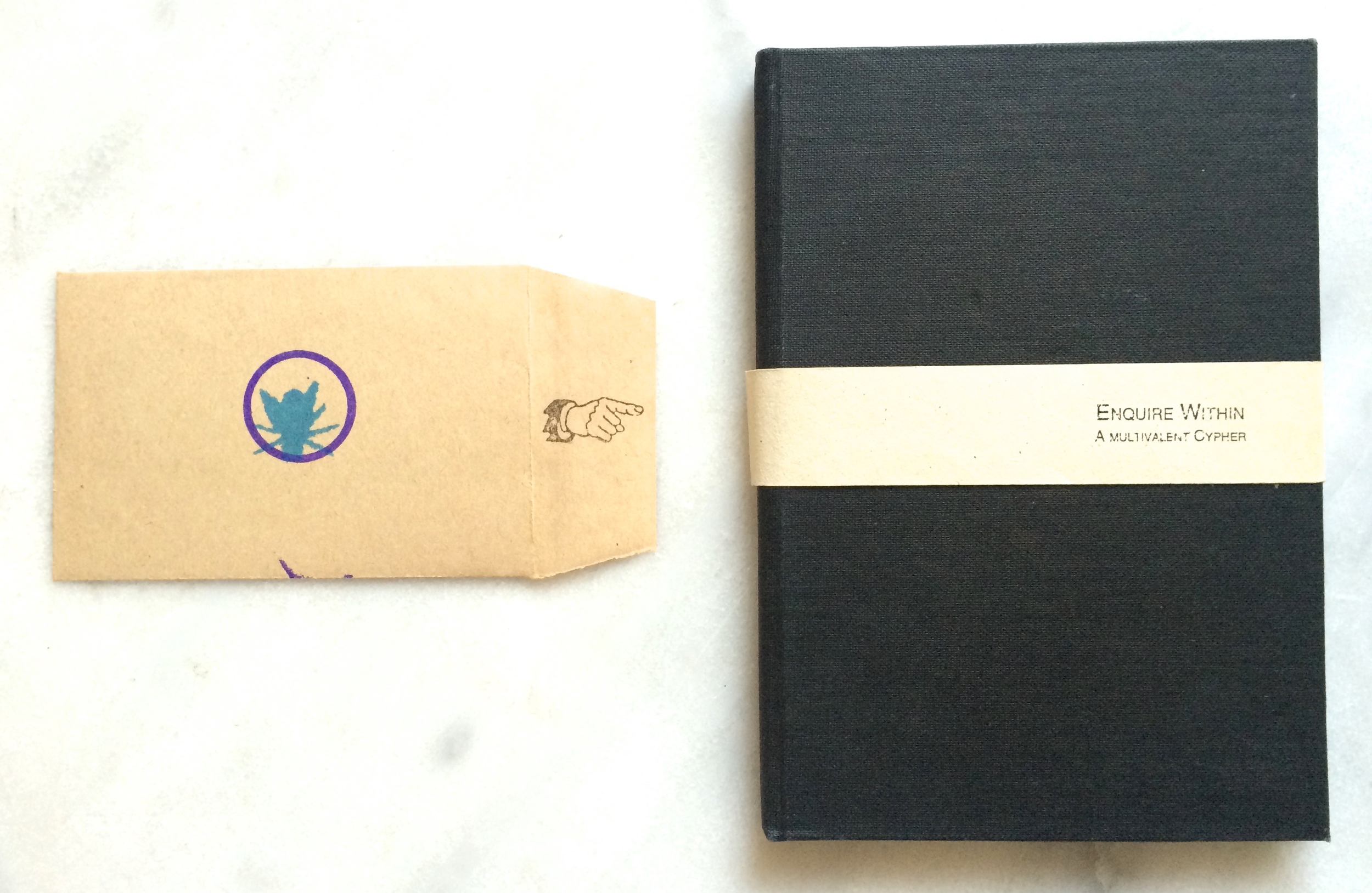
A black book next to a small envelope with a hand and fly rubber stamped on it

Enquire within - a designer's art

This wonderful little design artefact was created by the late, great Ian Noble. It's self published and I believe was created for his Masters work at Brighton. Part puzzle and part intellectual exercise - it's a lovely design object. One of the things I love about it…

A newprint pamphlet in bright yellow with the test Legalize LA in bold black letters

American Apparel's Legalize LA

With hindsight, perhaps this campaign may have been a little misguided, after all this is a cheap clothing manufacturer. However it's still a great stance and an important issue (Edit: even if the founder was a horrible person - as it turned out). I particularly…

The first issue of Dot Dot Dot magazine

Dot Dot Dot magazine

This is Dot Dot Dot or ... or maybe even ellipsis. It's the first issue of a graphic design journal started in 2000 that ran until January 2011. It was the brainchild of Peter Biľak and Stuart Bailey and as Peter puts it, it was an "after-hours…

The large A3 sized landscape journal that is Semiotext(e) Architecture. The photographic cover features the title inside 2 syringes

Semiotext(e) Architecture

This is Semiotext(e) Architecture from 1992. It's a massive (44x28 cm) landscape orientated collection of essays, experiments and ideas focussed on design, architecture and theory. I included the shot with my feet just to show it's size when opened. Totally unmanageable and doesn't fit on any of my…

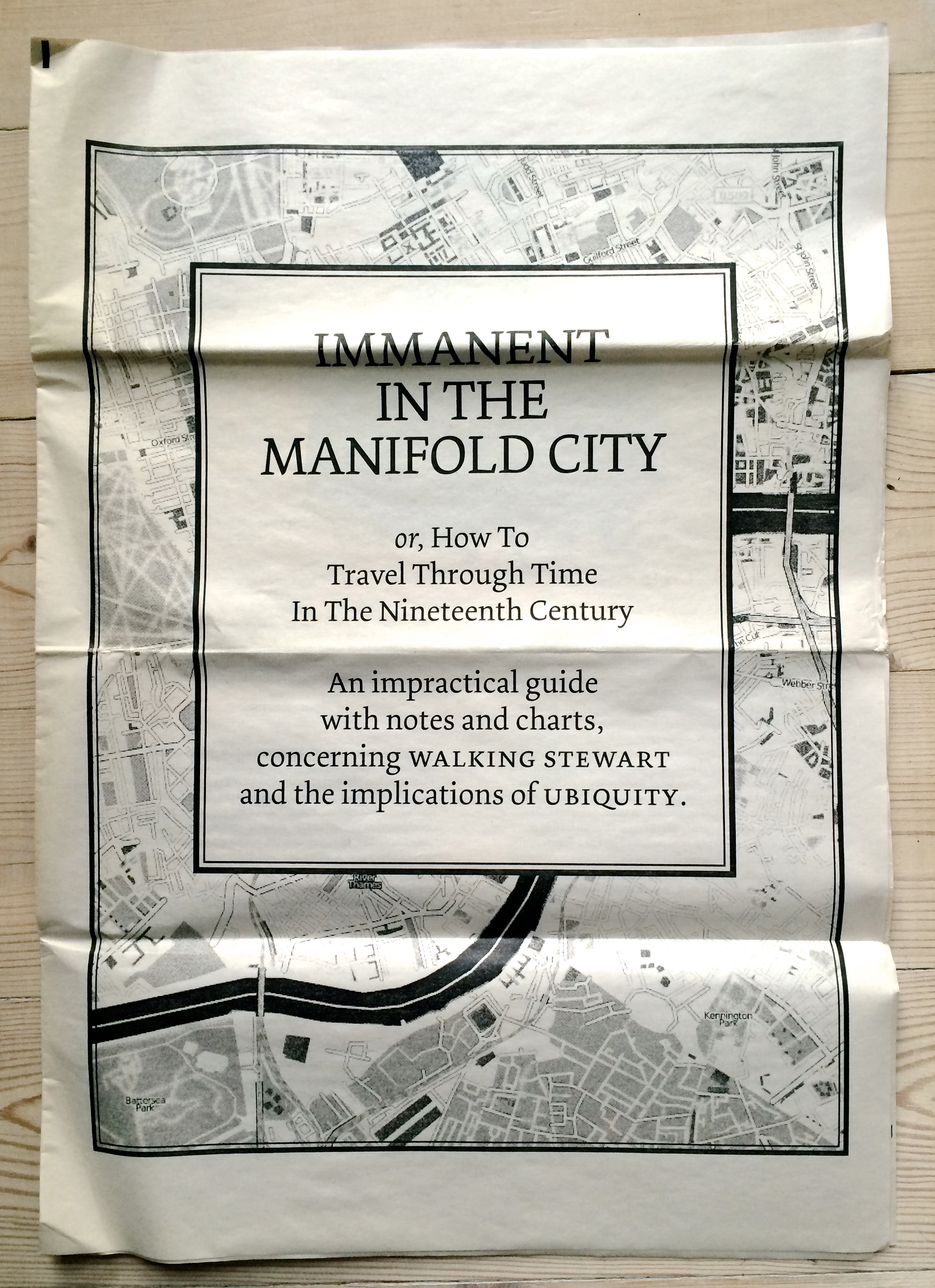
A newsprint piece titled Immanent in the manifold city

The first thing I bought from Newspaper Club

Here's another gem from the cellar that deserves to see the light of day. It's the very psychogeographically inspired Immanent in the Manifold City from James Bridle. There's more than a touch of 'pataphysics at play here too, with the "manual of operation" enabling you to…

Issue 136 of i-D magazine, featuring a women smiling and winking on the cover

20 years ago this month - I-D Magazine (issue 136)

I held on to this issue of I-D magazine from January 1995 mainly because it featured people I knew back then, but also because my vanity got the better of me (you can see a poster I designed in the background of one of the photographs). I hadn't seen…

A magazine with an intricate cut out green cover suggesting a thicket, fairies and real treasure stuck in a hole cut into the magazine.

Lavish production - Amelia's Magazine No.2 (a.w 2004)

Here's another item from the archive, 10 years old this time, Amelia's Magazine from A.W 2004 (issue 2). They must have come into money when they put this out. It's thick with plenty of content, laser cut cover and die cut pages to make room for the added…

The cover of Tove Jansson's Alice in Wonderland

Tove Jansson's Wonderland

Over Christmas I've been rummaging through several boxes of books and paper ephemera stored in the cellar. One of my finds is this edition of Alice's Adventures in Wonderland, beautifully illustrated by Tove Jansson (the Moomins). It's from the Delacorte Press in 1978, however the illustrations…

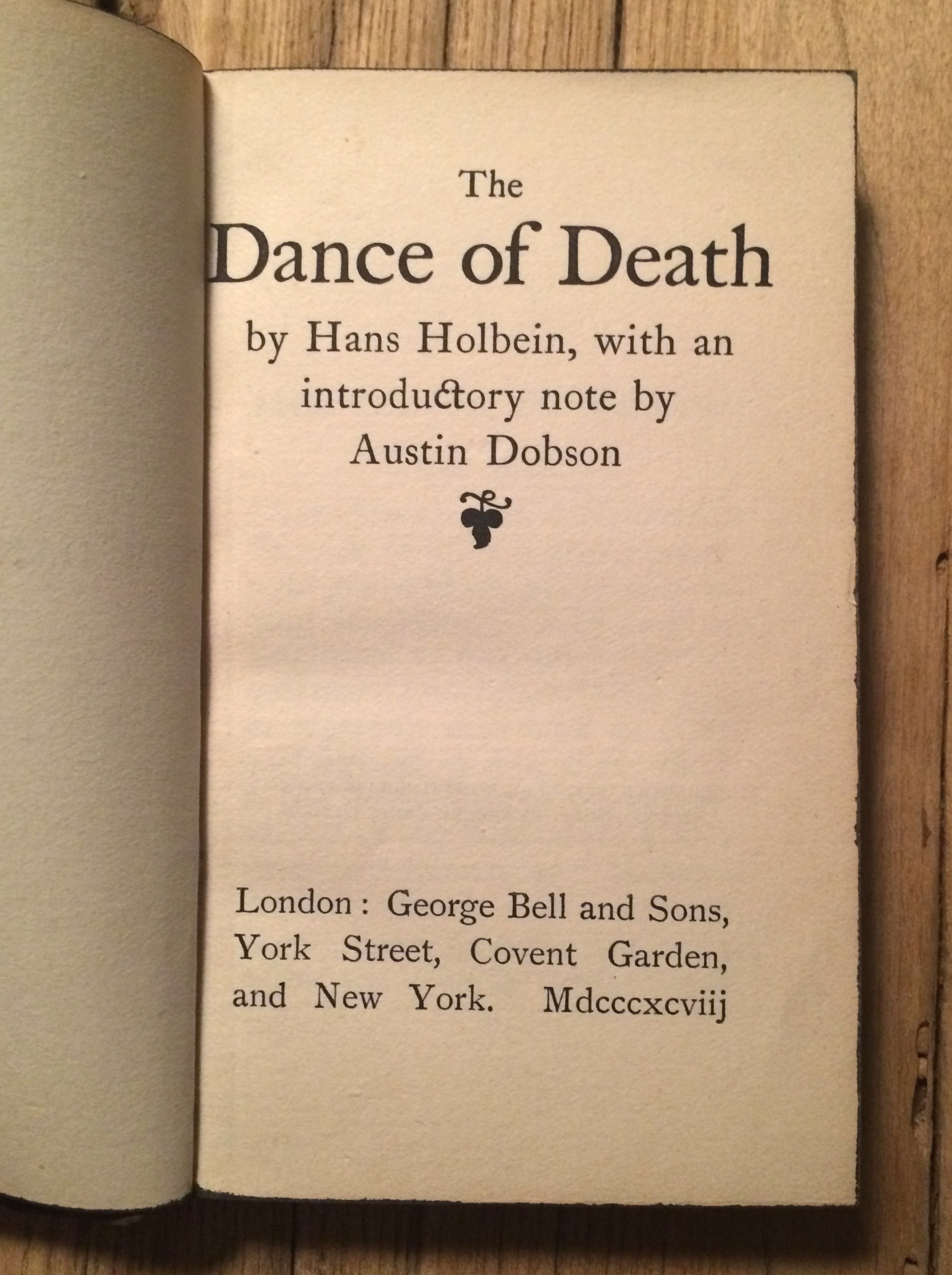
The title page of a small, old edition of The Dance of Death

One for Halloween - The Dance of Death

View fullsize View fullsize View fullsize View fullsize View fullsize View fullsize View fullsize View fullsize View fullsize View fullsize View fullsize View fullsize View fullsize I found this in a second hand bookshop many years ago. Although it's rather battered and all the guilt…

A print of an etching of James Joyce meeting Silvia Beach by Peter Blake

James Joyce meets Sylvia Beach

Sylvia Beach and James Joyce in front of her Bookshop by Peter Blake. From: James Joyce in Paris, 1983-4 A series of 6 etchings Paper 33.0 x 25.1 cm Image 17.9 x 12.9 cm Edition of 75 I've had this print for a while and…

A die cut cover of the catalogu for Arab art, architecture and culture at Louisiana Museum, Denmark

Another great book from Louisiana Museum DK - Arab Contemporary

Superb book and exhibition covering contemporary Arab art, architecture and culture at Louisiana Museum, Denmark. The exhibition was truly inspiring with some amazing and very diverse pieces (more here: http://en.louisiana.dk/exhibition/arab-contemporary ). As always the graphic design around the exhibition was excellent and the accompanying book is…

2 books by Manual Limas. On the left is an orange and white visualization and the title Visual Complexity, on the right 2 tree diagrams and the title Book of trees i

A Pair of Manuel Limas

Continuing my two of kind theme, I've just received my copies of Visual Complexity and The Book of Trees both by Manuel Lima. If you're a fan of Edward Tufte or just into information graphics and data visualisation, you'll love both of these. There's a…

@ books by Umberto Eco, featuring classical art on the covers

A Brace of Umberto Ecos

Finally picked up The Book of Imaginary Lands, the partner to The Infinity of Lists both by Umberto Eco. These two are gorgeous books, and written in Eco's erudite but warm and accessible style. I was introduced to Eco when I was at art college, and…

A paper pop up house model featuring a scene and characters from Olive the other reindeer

J Otto Seibold Advent Calendar

My wife and I have always been fans of J Otto Seibold. We have many of the books he illustrated with Vivian Walsh and a great poster for Penguin Dreams. So we couldn't resist this Olive the Other Reindeer Popup advent calendar.

an excerpt from the comic Jaws, which shows a Snoopy themed retelling of the film

Jaws X Peanuts mashup

A couple of years back I bought this fantastic Jaws X Peanuts mashup strip by Chuck Forsman. Finally found an apartment and a space deserving of it. still a few copies available here: http://oilyboutique.bigcartel.com/product/jaws-peanuts-mash-up-print thanks @trigjoh for reminding me.

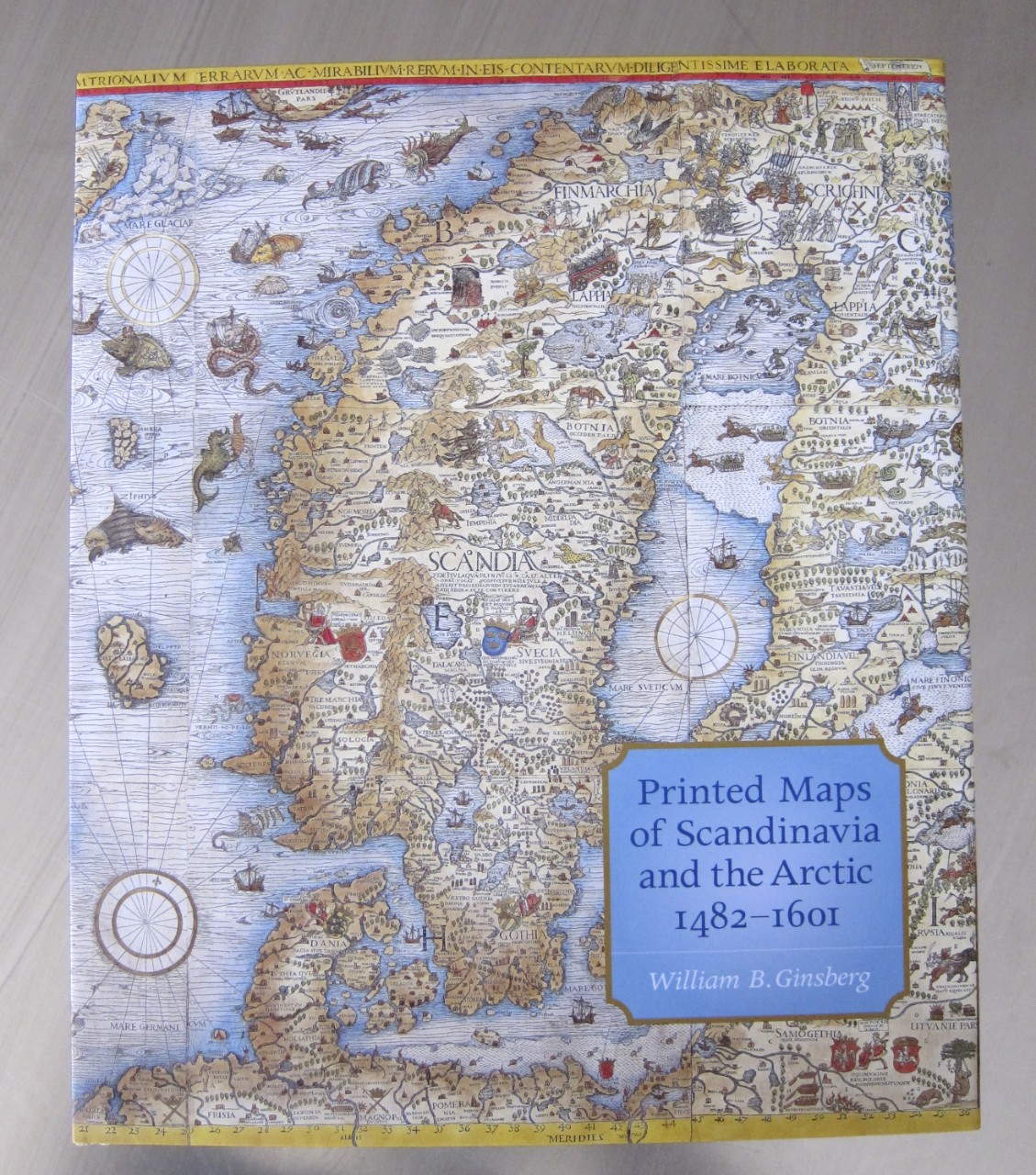
The book Printed Maps of Scandinavia and the Artic 1482-1601

Map porn - Scandinavian maps from 1482-1601

So the visit to Louisiana Art Museum in Denmark was as inspiring as always. Not only a great exhibition catalog (Arktis) but also a fantastic range of accompanying books. I could't resist Printed Maps of Scandinavia and the Arctic 1482-1601 by William B. Ginsberg . This is…

A poster for the Arktis exhibition. It features an arctic snow scape in monochrome orange and stark blue text

Arktis exhibition at Louisiana Art Museum Denmark

Great catalogue and poster for the Arktis exhibition at Louisiana Art Museum Denmark. Superb use of the fluorescent orange with the dark blue, really reminded me of some of the work CYAN did in the '90s and their beautiful Form und Zweck magazine. However only…

Head magazine, featuring a fish interlaced with a barcode on the cover

More from the '90s self publishing scene

Head Magazine I've posted previously about how there was an idea in the early 90s of DIY culture. This manifested in many ways from 'crusty squatters' and indi-networks through to self publishing and a revival of the punk aesthetic and the 'zine. This post is…

A print of a drawing of a werewolf transformation in purple and black

Fantastic poster by Tom J Newell

Love this guys illustration style, beautiful ink. The poster was put out by Skull & Heart, check out more here: tomjnewell.com or on instagram @tomjnewell. skullandheartprints.com

the book Forgotten Bookmarks

A myriad of gifts hidden between the pages

Just got hold of Forgotten Bookmarks by Michael Popek and it's full of wonderful little insights into people's book lives. These wonderful juxtapositions between the book and bookmark are fascinating, whether it's the subject or context each creates it's own narrative. The book is based on his blog…

A feature from the cover of the book Pig 05049, showing the the official control stamp

Waste not want not

Christien Meindertsma: PIG 05049 by Christien Meindertsma I've been after a copy of this book for a while. The idea of tracking all the 'uses' of an animal in the modern industrialised food chain was just too fascinating and macabre to miss out on. The book…

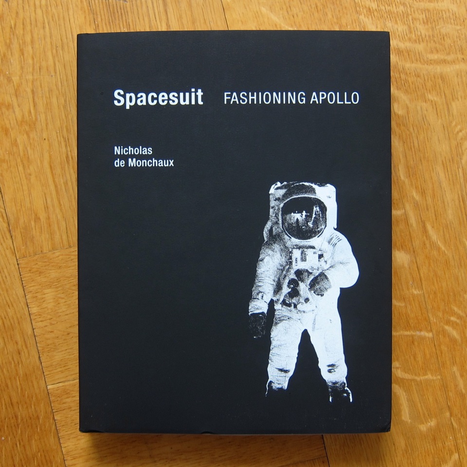
The book Spacesuit, with stark black cover and image of an astronaut in a space suit

I'm happy judging a book by it's cover

Spacesuit, Fashioning Apollo by Nicholas de Monchaux I saw a review of this fascinating book over at Maria Popova's Brain Pickings and I couldn't resist getting a copy. It's a wonderful account of how the ingenuity Playtex trumped the established military contractors in the race…

A small part on the poster Water Footprint, explaining how much water (5000 litres) is needed to make a single pack of 500 A4 shhets of paper

Virtual Water Footprint Poster

I picked up this poster a couple years ago, and I must admit I've neglected it a bit. However I've finally got the wall space for it in my new office (it's A0), so it's going up. I love the simplicity of the graphics and…

A calendar featuring an old time boxer

2012 calendar

I quite like this approach for calendars. Having a hand printed single image that remains all year with the months as simple tear off sheets. This one is by Hammerpress ( http://hammerpress.net ).

an old illustration of lighthouses

Swedish lighthouse drawings

Spotted these wonderful drawings on the side of the lighthouse at Sandhammaren on the South Eastern tip of Sweden. They depict the different lighthouse types along that stretch of coastline.

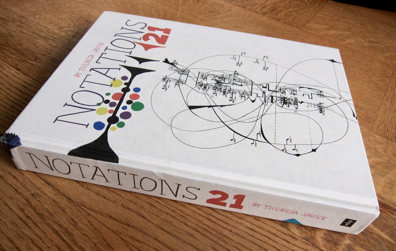
A book, Notations 21, with an elaborate diagram on the cover

Visualising music - 21 Notations

Notations 21 by Theresa Sauer, from Mark Batty Publisher. I was really excited to get this in the mail, I'd seen a few blog posts and it looked great. I'm lucky enough to have a couple of issues of Source Magazine which first sparked an interest…

A cropped image of a book called The Englishman Who Posted Himself and Other Curious Objects

Another beautiful book from the Princeton Architectural Press

Picked up a copy of The Englishman Who Posted Himself and Other Curious Objects by John Tingey (http://www.papress.com/html/book.details.page.tpl?isbn=9781568988726). Yet another beautifully designed book from Princeton Architectural Press. Hats off to the designer Deb Wood for the great typography and managing to capture that essential 'englishness' in…

a box of cut out and make animal characters

2D/3D Swedish animal puzzle

Went in a lovely little shop today on Davidshalltorg in Malmö called Liebling (http://www.byliebling.com/). Great little boutique that amongst the clothes etc had a few beautiful design objects. I fell for these children's animal puzzles immediately. Wonderful stuff. They also stock more of the Omm…

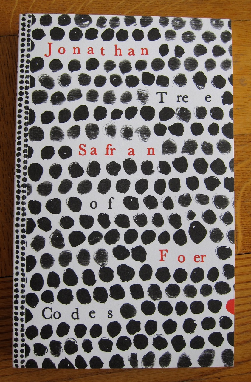
Jonathan Safran Foer's book Tree of Codes

Tree of Codes - The book that couldn't be made.

From the minute I saw Tree of Codes by Jonathan Safran Foer over at http://www.fastcodesign.com I wanted a copy. This notion of the book as both object and narrative is such a hook for me. Call me shallow, call me a sucker I don't care I…

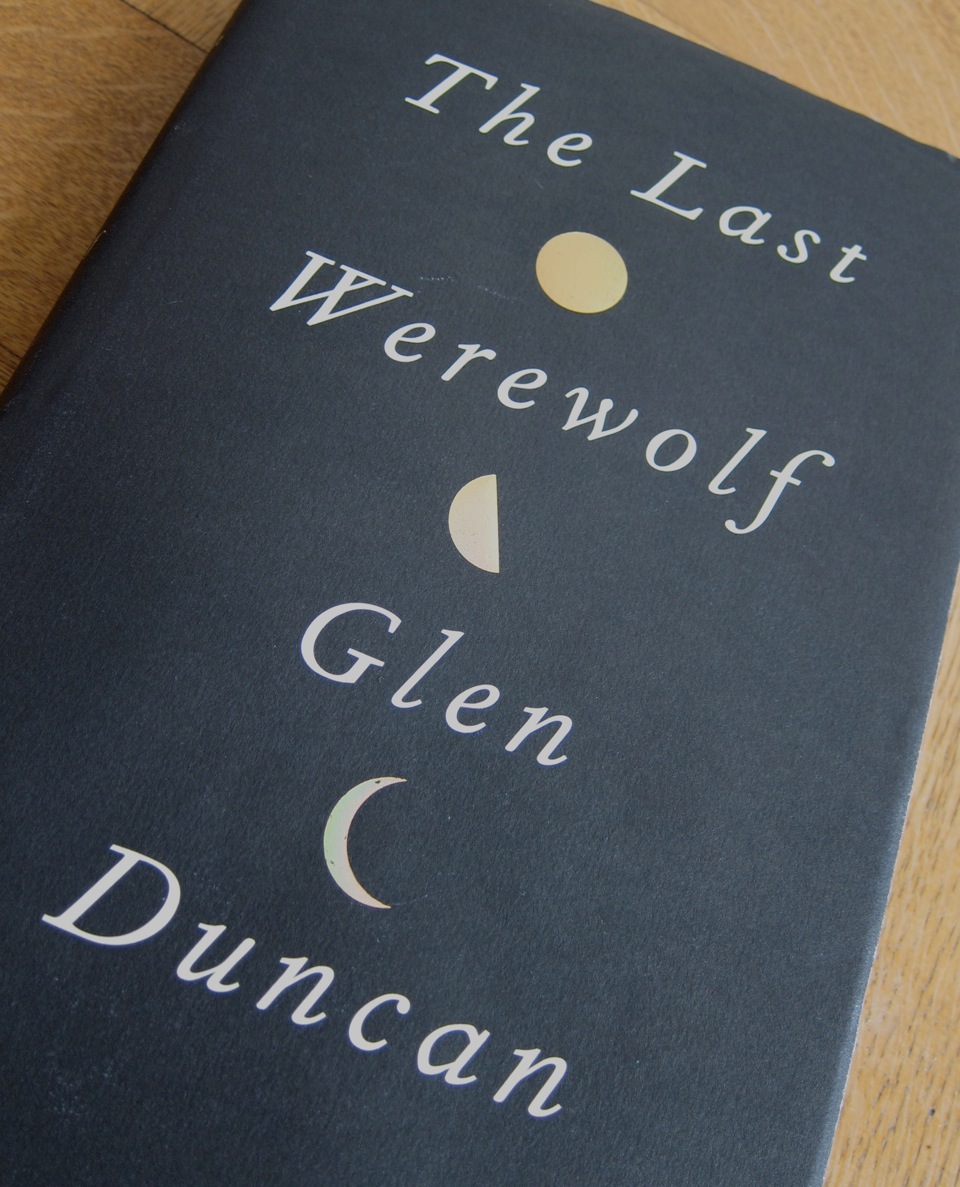
a cropped image of the book The Last Werewolf

Lovely book/object from Glen Duncan

I've been a long time fan of Glen Duncan ever since I was lucky enough to read the prerelease of Hope whilst working at Penguin. It's something about the way he gets under the skin and reveals that dark male psyche that we all try…

Issue 3 of a newsprint paper, Underground

Underground - "A free broadsheet for London"

Warning: may cause offense Underground was an alternative free paper for London. It was compiled and published in the early 1990's by Graham Harwood and Matthew Fuller amongst huge group of contributors and helpers. It spans the death of Thatcher's legacy (John Major) through to…

a collection of small artist books by Mark Pawson

Mark Pawson's little books

Mark's "little books" are lovely snapshots of his various obsessions. I picked these up a very long time ago (hence the slightly battered quality) and I'm really happy to see he's still going strong. His mix of ephemera, collected/found items, printing/production techniques and disposable culture…

A cropped image of the mast head of Issue 3 of the newspaper Mute

Mute - mid 90s art/tech paper

This UK based art and technology newspaper took the format of a classic broadsheet, it was even on the same paper as the FT. It later changed into a standard format magazine, probably when the cost of newsprint went up. The mag is still going…

A type specimen pamphlet for Virus Fonts

Virus fonts by Jonathan Barnbrook

This virus font catalogue is from years back but still looks as cool as ever. Jonathan Barnbrook's fonts always have so much to say, politically and socially charged even though they often end up being used just for the stylistic clout they have. I love…

the Emigre roundel and hat motif on a piece of type ephemera

Emigre type catalogues and promo bits

I've got a box full type catalogues and promotional bits and pieces from Emigre and a few other foundries. They are quite interesting snapshots of type trends in the '90s and have that signature Emigre feel.

a calendar with an illustration of a fox on it

Studio on fire calendar 2010

So I've had almost a whole year of enjoyment looking at my Studio on Fire calendar for 2010. Each month's wonderful card with it's illustration by them and/or their friends. I'm really looking forward to seeing what the 2011 calendar/piece will look like. Check out…
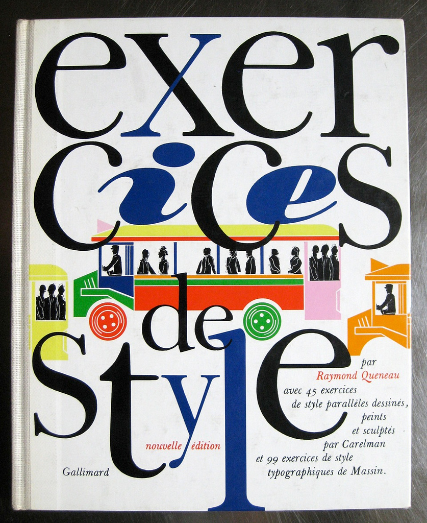
A hardback version of the book Exercices de style by Raymond Queneau

Exercices de style

Exercices de Style by Raymond Queneau. This has to be one of my most treasured books. What makes this so special is again collaboration. This time between the author (Raymond Queneau), the designer (Robert Massin) and the illustrator (Jacques Carelman). This edition published by Gallimard…

The book and ship case for The Oulipo Winter Journeys

Atlas Press

Atlas Press are a small(ish) publishing house that specialize in avant garde literature. If it's Oulipian, 'pataphysics, Dada or Expressionist these guys are likely to publish it. I first found out about them when I discovered George Perec and the OuLiPo, and through their books…

A case and deck of cards for Regime change begins at home, features US,UK politicians and leaders

Iraq war alternative regime change playing cards

Graphic design in the service of opposition, protest or giving a voice to those that don't have one has always been an interest of mine. I've got tonnes of stuff from politically charged individuals who use their talents to disrupt, upset and challenge the status…

The silver and black version of the book I seem to be a verb by R. Buckminster Fuller

The rather wonderful - I seem to be a verb

Here's another 'flip it round to read the other half' style book. This one is the brilliant I Seem to be a Verb by the legendary R. Buckminster Fuller. One of those magical social/utopianist paper backs from the end of the '60s. It's designed by Quentin…

The grey cover version of Sam Winston's artist book A Dictionary Story

A Dictionary Story by Sam Winston

A few years back I saw some of Sam Winston's work at a Courtauld Institute show. He's London based and I really love his work, it ticks all the right boxes for me - language, literature, words, typography, process, patterns, story telling and humour. Last…

A print cartoon of 2 space suited angel children, with the text, We are not evil written on it.

Little Otsu

Picked up this cute little print in San Francisco at the wonderful shop, Little Otsu (http://www.littleotsu.com/). They are a small independent publisher with a store in the Mission district. The place is chocked full of gorgeous things - prints, books, t-shirts and all manner of design…

An illustration and catalogue for 300 by Gary Taxali

Gary Taxali 300

I've long been a fan of Gary Taxali's work. Picked up this little postcard size print with the catalogue from a recent show. To see more of his work, check out his site: http://www.garytaxali.com/home.php

Issue 11 of the music and art journal Source

Source Magazine: Music of the Avant Garde, Pt 2

Here's Issue 11, which I think was the last issue. I'd love some of the earlier issues, but they are pretty rare and are little out of my price range by the looks of things - http://brickbatbooks.blogspot.com/2008/08/new-arrivals-source-music-of-avant.html . For more on the magazine see wikipedia http://en.wikipedia.org/wiki/Source:_Music_of_the_Avant_Garde There's…

Issue 7 of the music and art journal Source

Source Magazine: Music of the Avant Garde, Part 1

I first saw a copy of Source when I was a student. I instantly feel in love with it - a real treasure trove from the past, full of weird ideas and interesting people. The blend of art, performance and music (very challenging music to me…

A piece of rubberstamp mail art. It's a large sheet of paper with close to 100 different stamps on it

More mail art from the early 90's

In 1992 there was an event called "year of the networker", which was about international collaboration between individuals and small groups. People were using bulletin boards, news groups and email but most of the creative work was still being done through the postal system. BW…

A packaged set of mail art called Fly-poster set

Items from Cactus

Cactus was a great project set up and run by Tony Credland and Glenn Orton back in 1989. It was essentially a mail art project based around fairly mass collaboration (well in pre-digital terms) . The idea was simple and elegant. Cactus sends out a…

A postcard from Adbusters, spoofing the Absolut ads and showing a foot with a toes tag and the words Absolute on ice

Early Adbusting

These postcards are from some 90s Adbusters work. I think they came with the magazine.

A poster with the quote, Civil disobedience on grounds of conscience is an honourable tradition in this country and those who take part in it may in the end be vindicated by history

Sometimes judges are OK

Back in the days when we had other stuff to worry about. This was just after the DIY culture movement of the early 90s and was in relation to the growing environmentalist movements

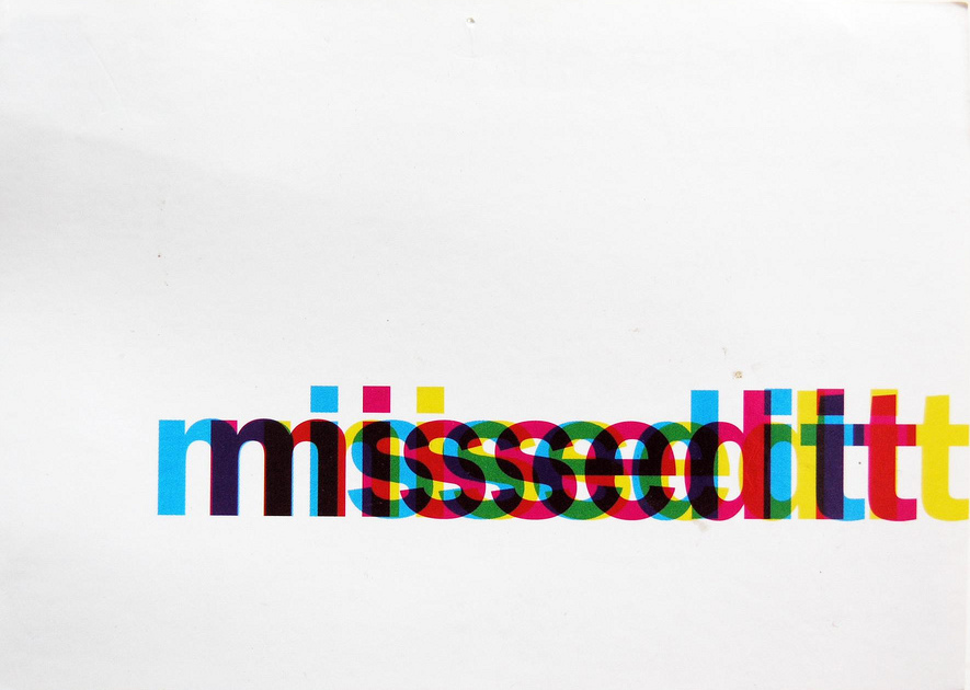
A postcard showing the words missed it, by the CMYK offset is horizontal offset too much

Designer humour

Great visual pun for TimeOut magazine - even if it is a graphic designer joke. I love this little piece of promo work, it was one of the first bits of paper ephemera I picked up and kept. That's why I use it in the…

A postcard with bold text saying Websites are a waste of time and money

It'll never catch on

This postcard is from the late 90s. I found it discarded on the pavement, I think it was for a print agency.

A postcard showing a sock puppet made to resemble Travis Bickle from Taxi Driver

ITV digital promocards

The ill-fated ITV Digital sent out these promotional cards using the Sock monkey. This was way before PG Tips adopted the Sock Monkey and Johnny Vegas. I love the Raging Bull one.

🦣 🦣 masto.paperposts.me
🦣 🦣 🦣 🦣