Letterform Archive - brand and design guidelines

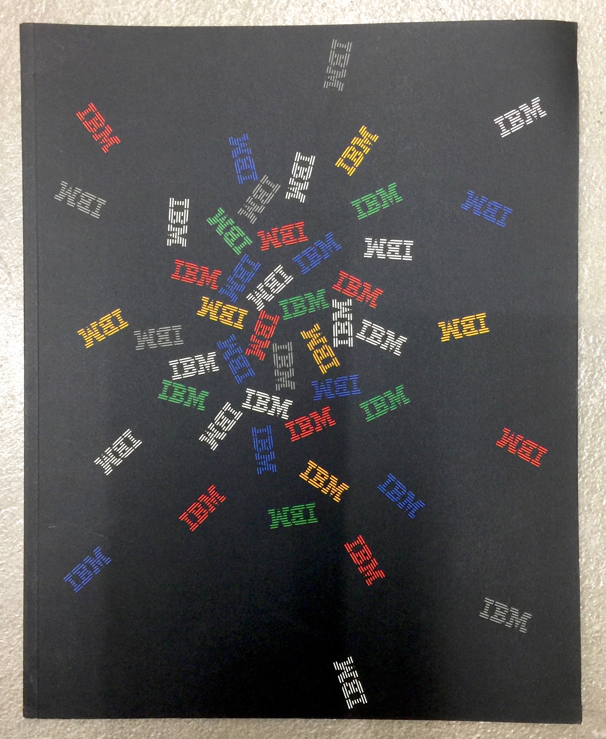
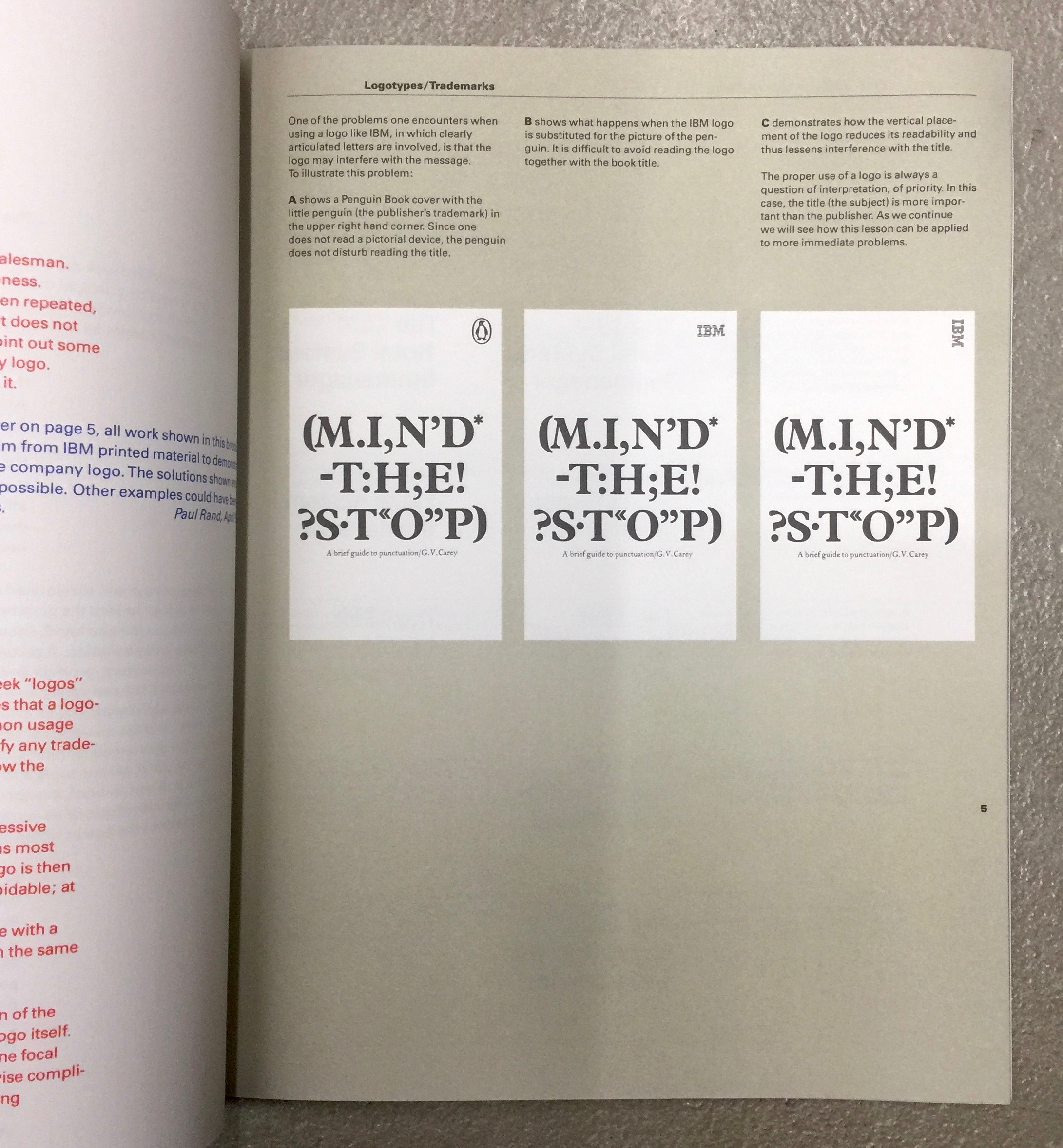
Here are a few highlights from these original IBM, NASA (see the book reissue) and Olivetti guidelines:



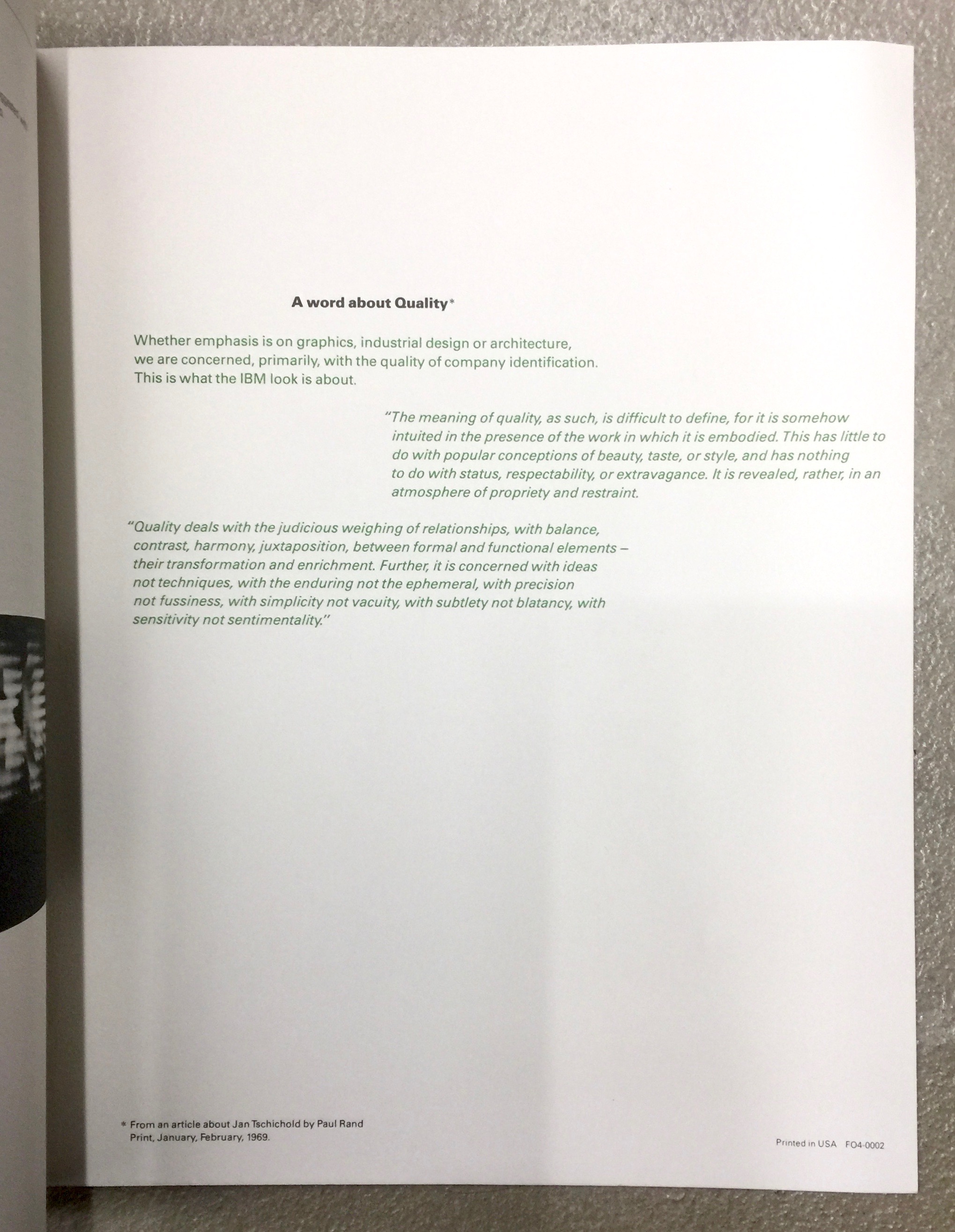

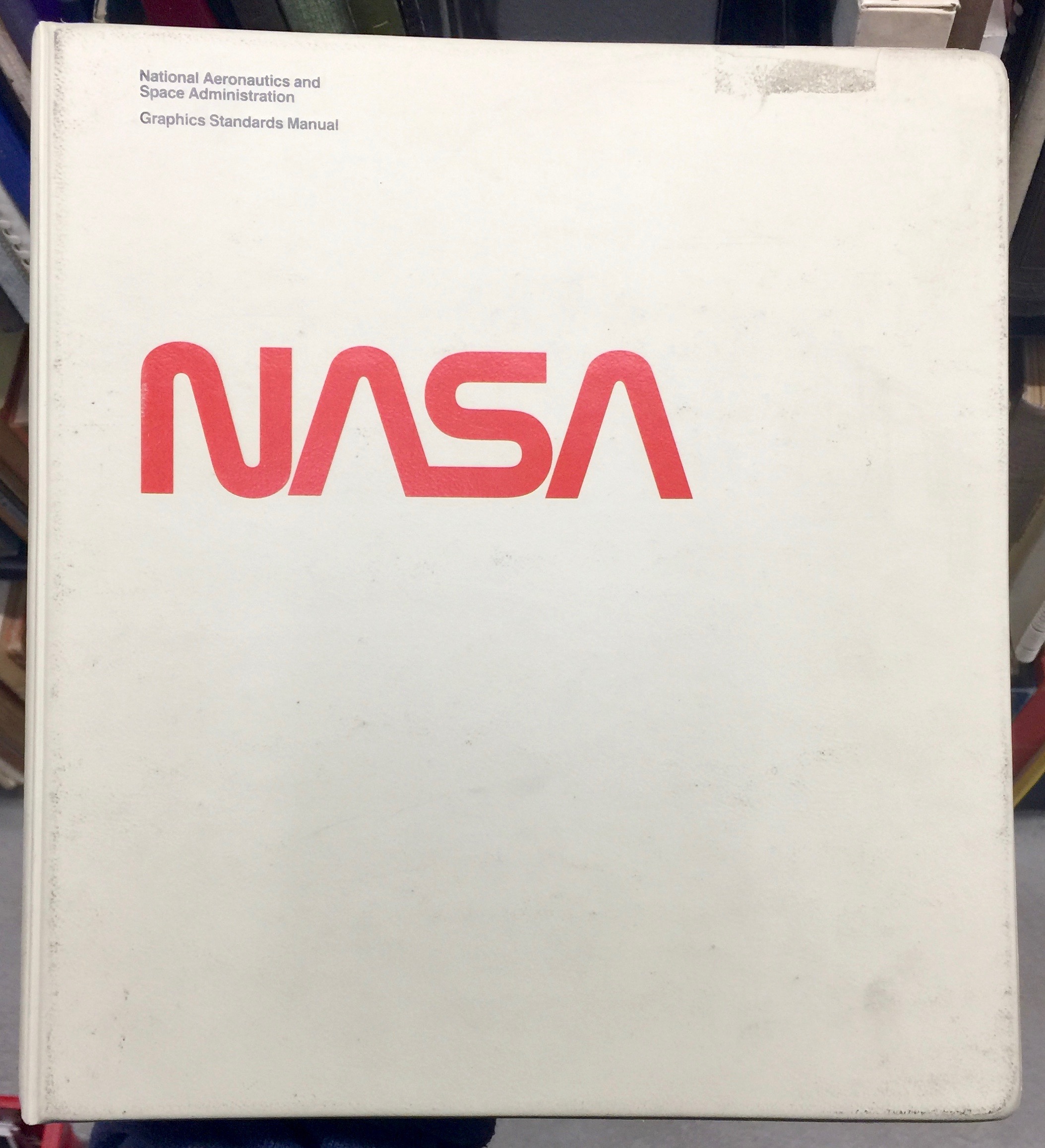


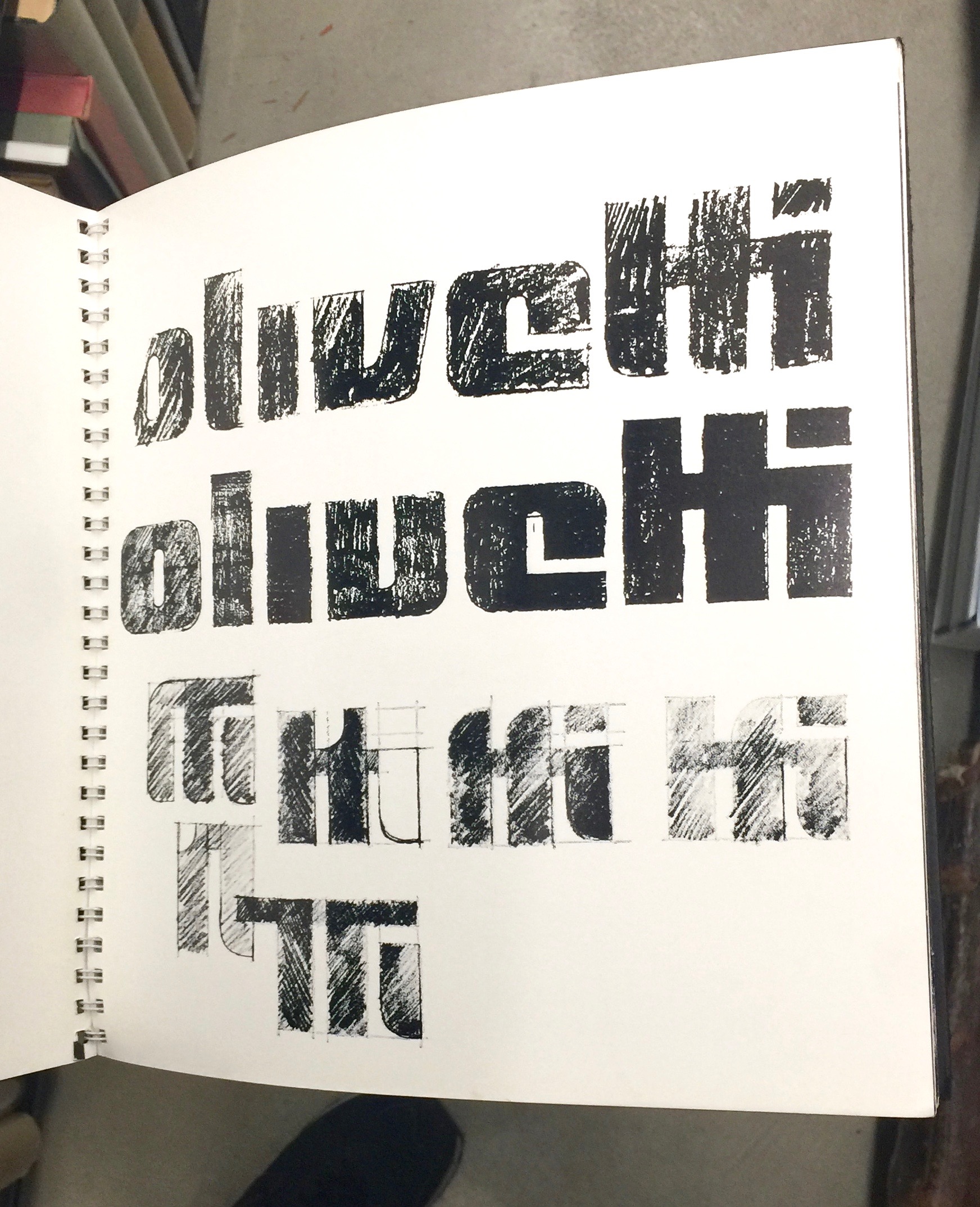

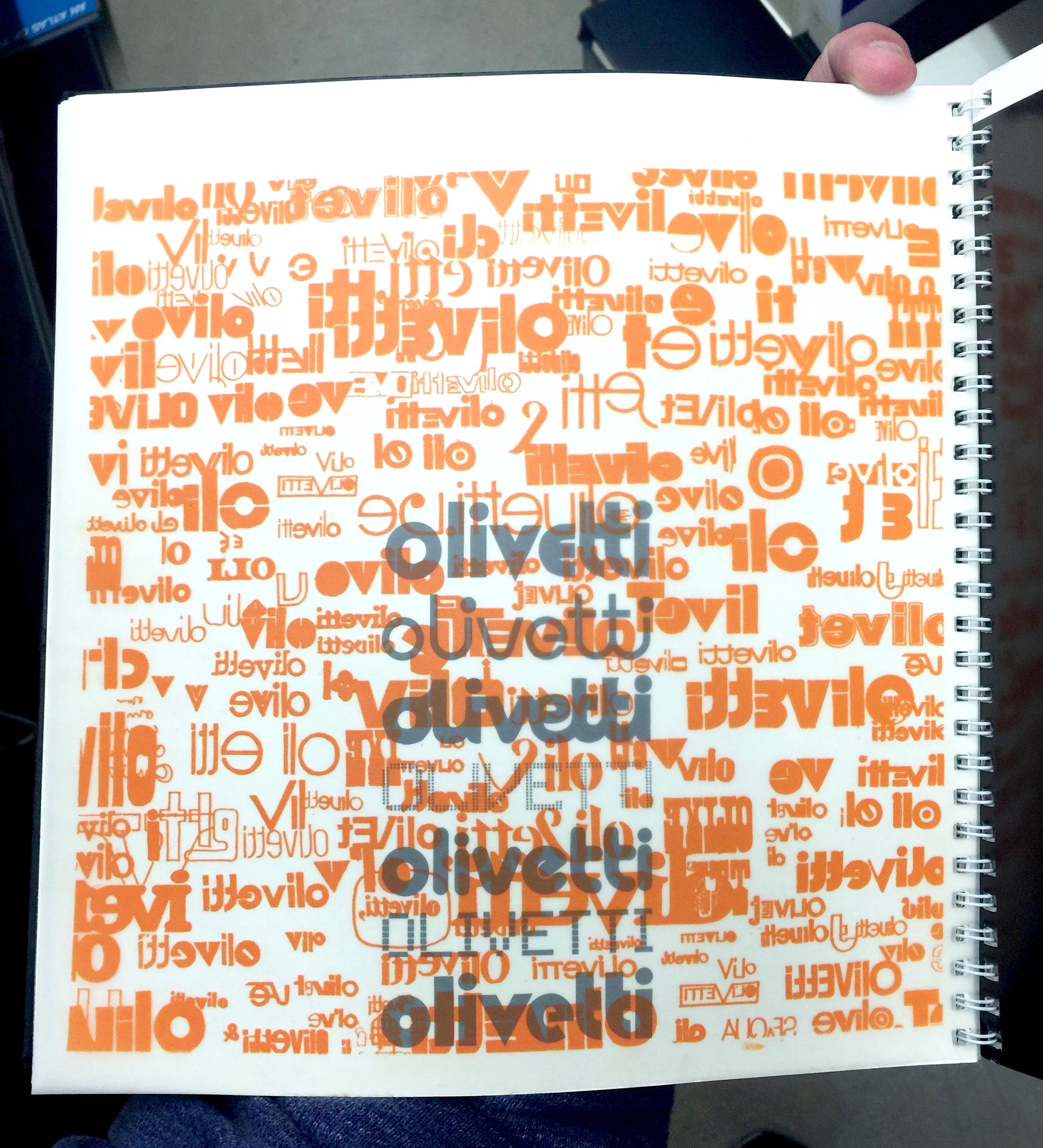
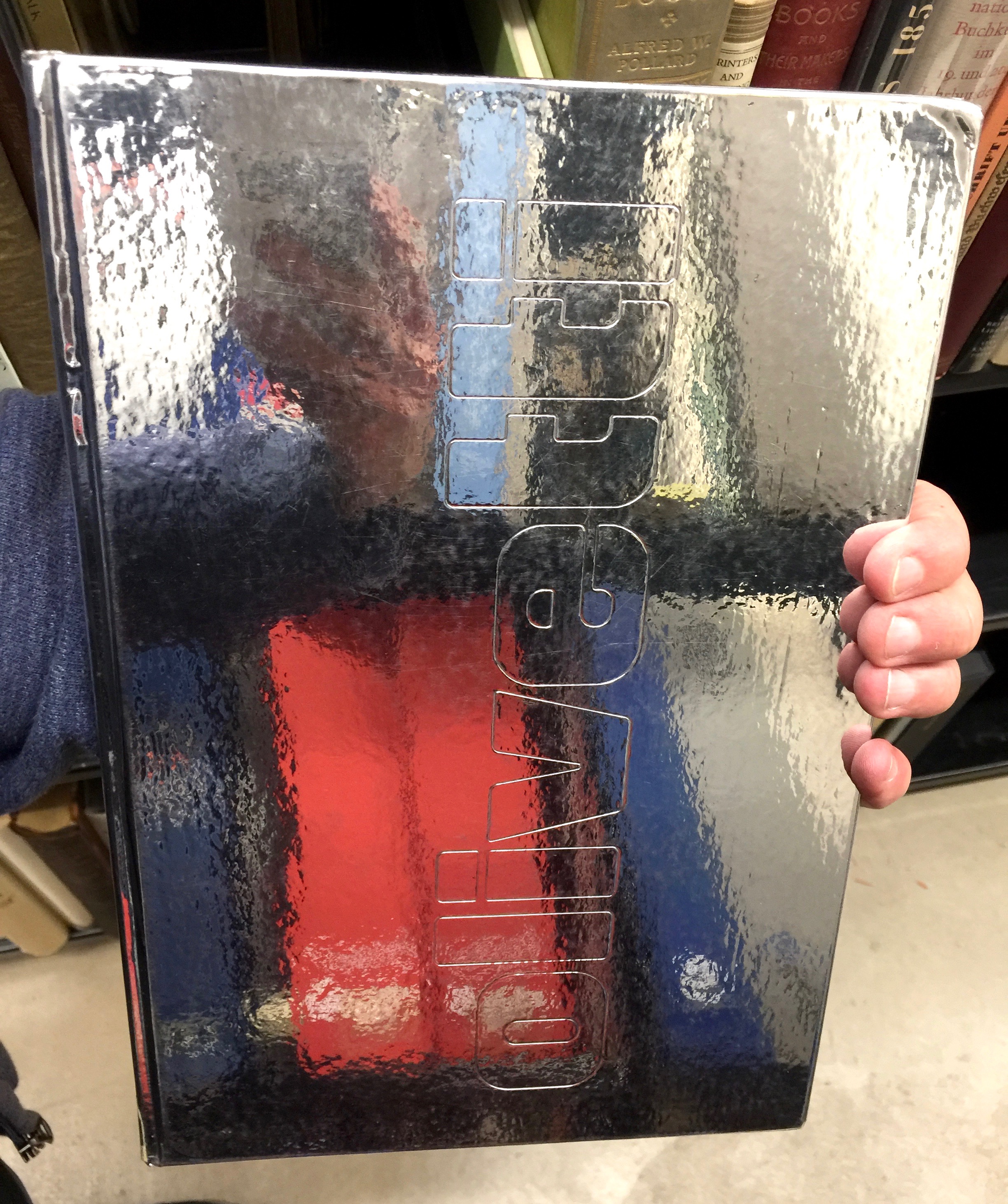

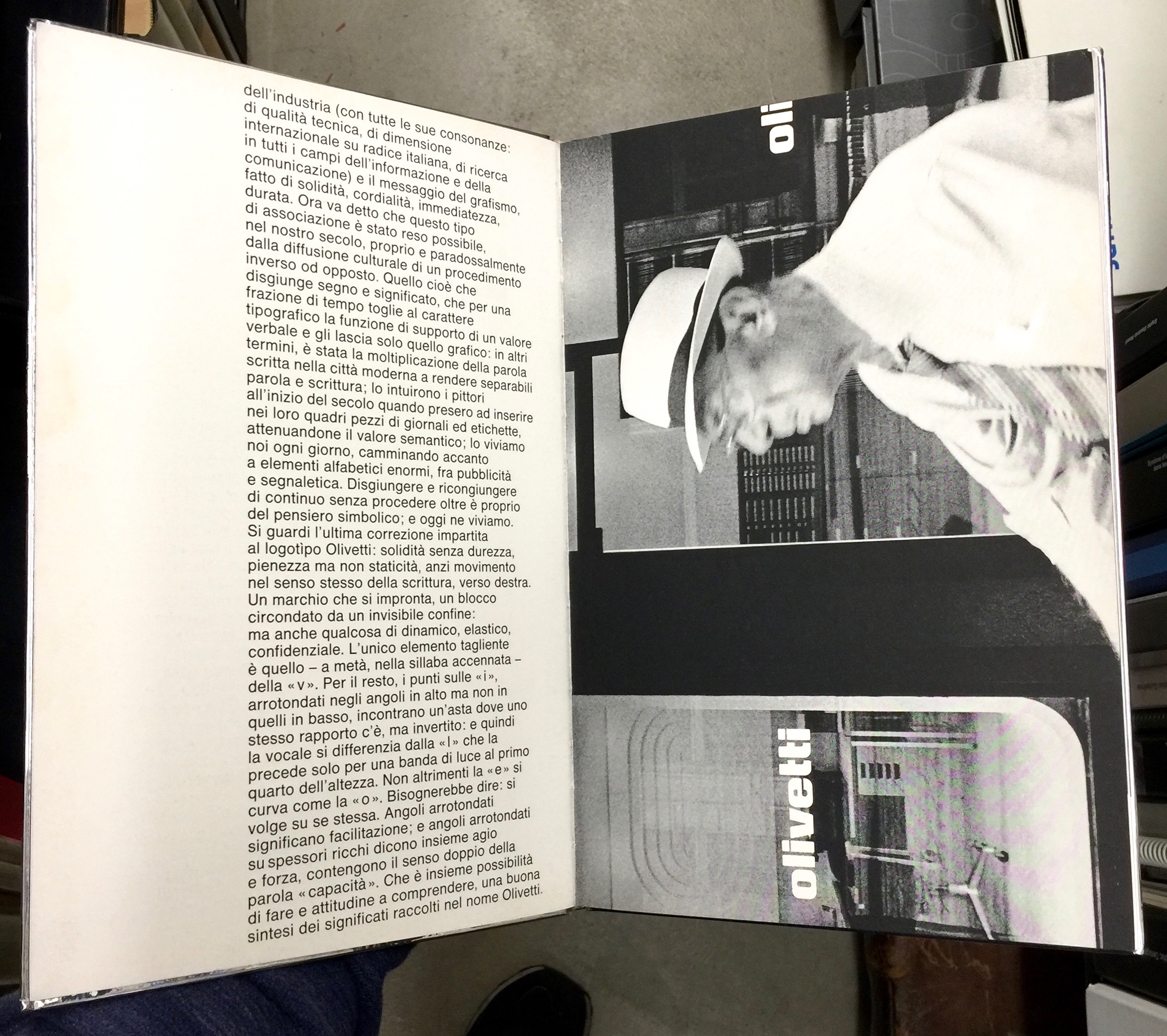
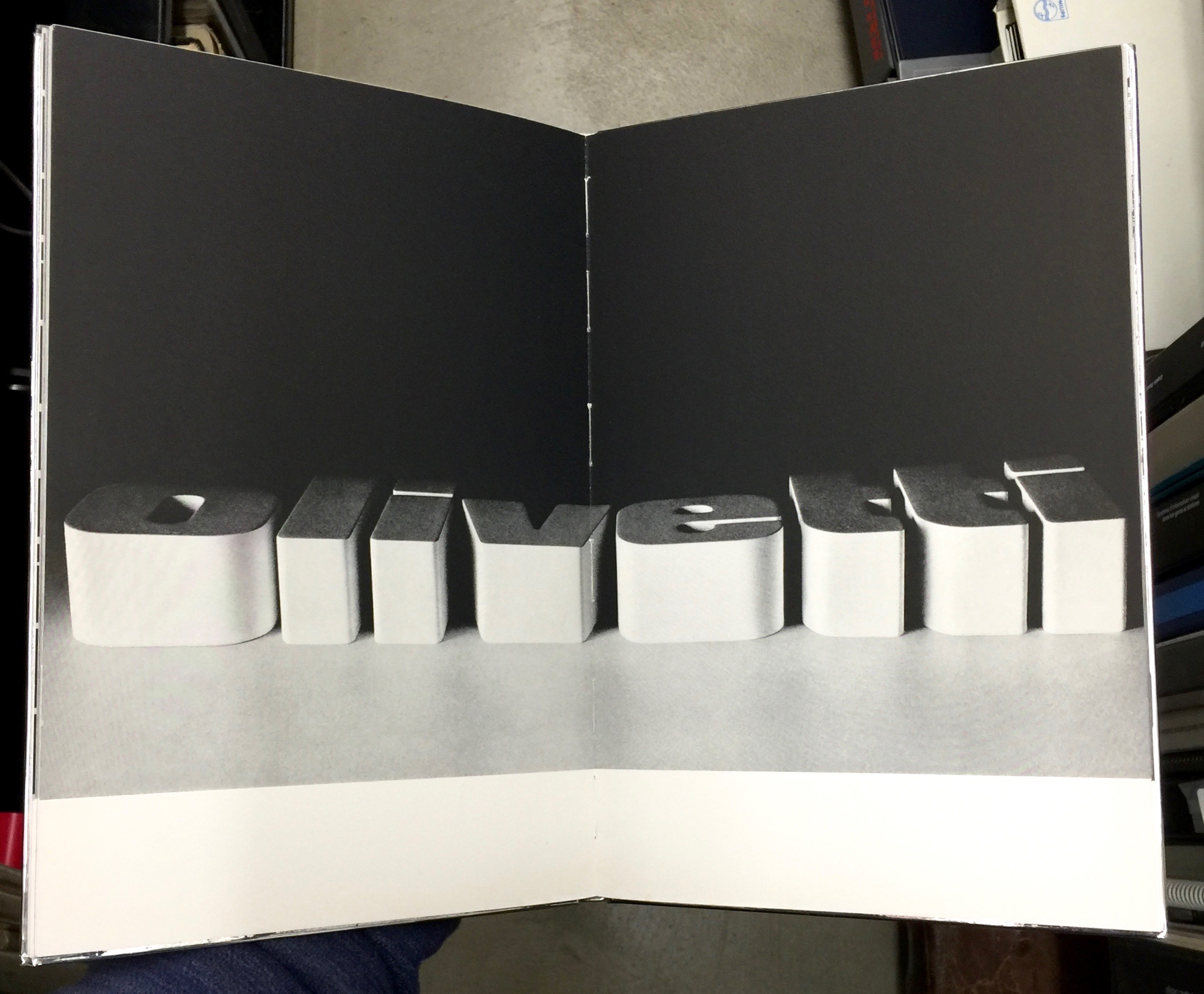


Here's a close up of Paul Rand's wonderful reference to Jan Tschichold on quality in the back of the IBM book.

You should also read:
Designer humour
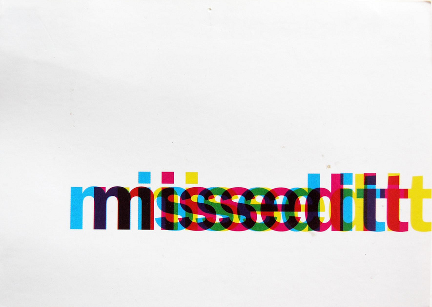
Great visual pun for TimeOut magazine - even if it is a graphic designer joke. I love this little piece of promo work, it was one of the first bits of paper ephemera I picked up and kept. That's why I use it in the…
Enquire within - a designer's art
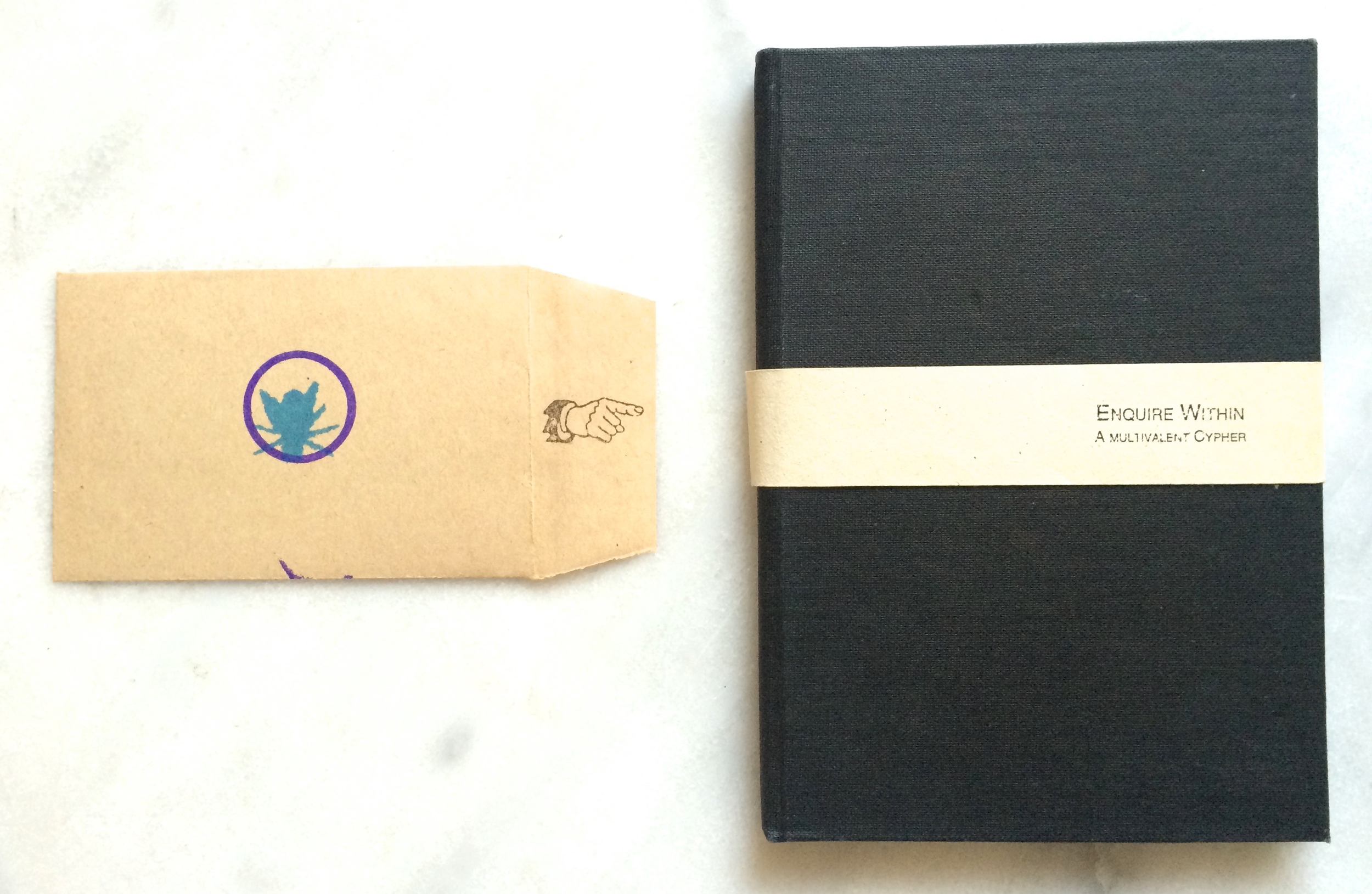
This wonderful little design artefact was created by the late, great Ian Noble. It's self published and I believe was created for his Masters work at Brighton. Part puzzle and part intellectual exercise - it's a lovely design object. One of the things I love about it…
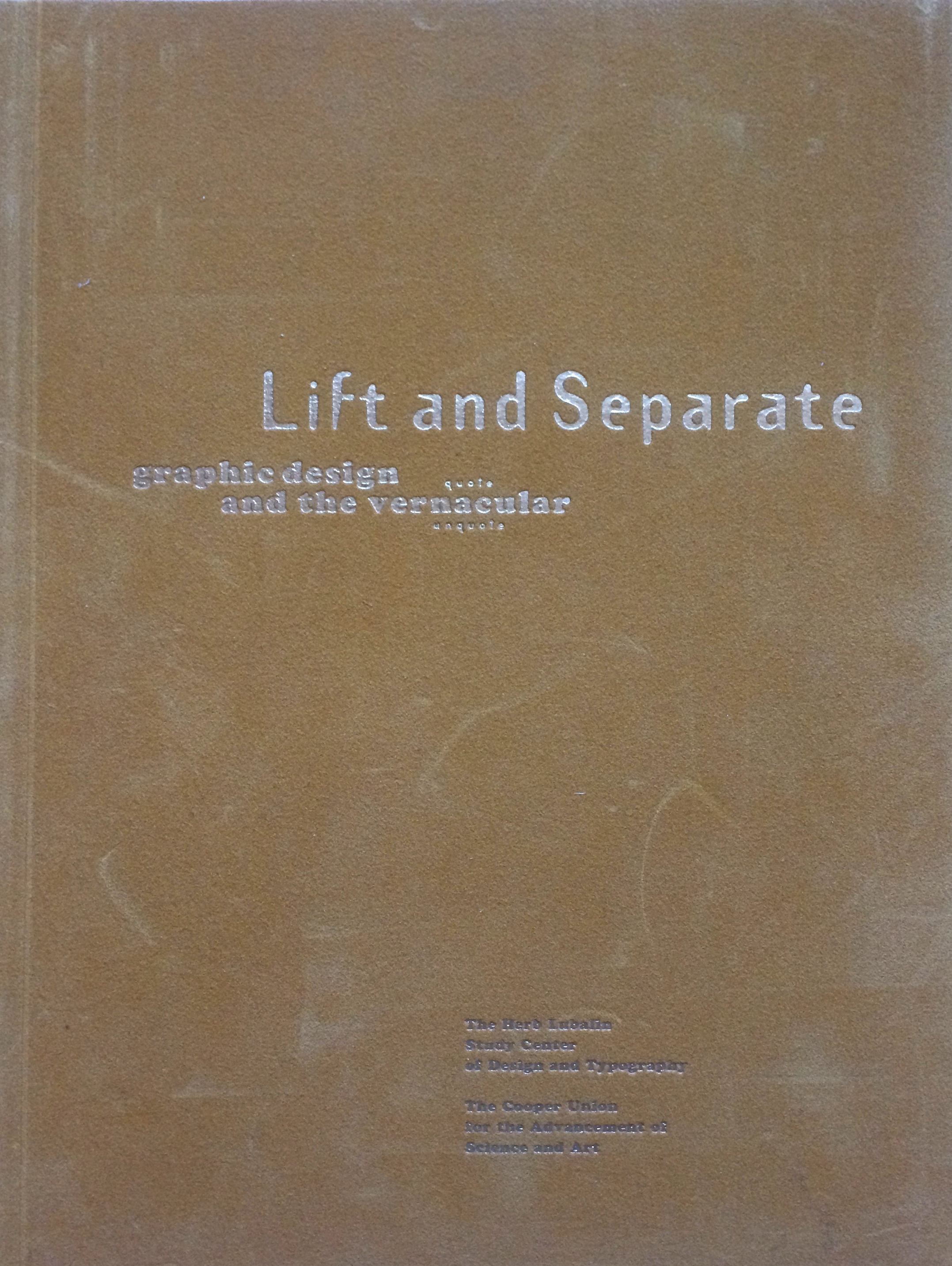
Lift and Separate - a graphic design journal
Lift and Separate is a lovely tactile journal, very much in the spirit of Emigré and Eye. It was published circa 1993 by the Herb Lubalin Study Center. What I really like, is the piece on vernacular and the journey from drawing fanciful letters in a note book to purging the ornaments…
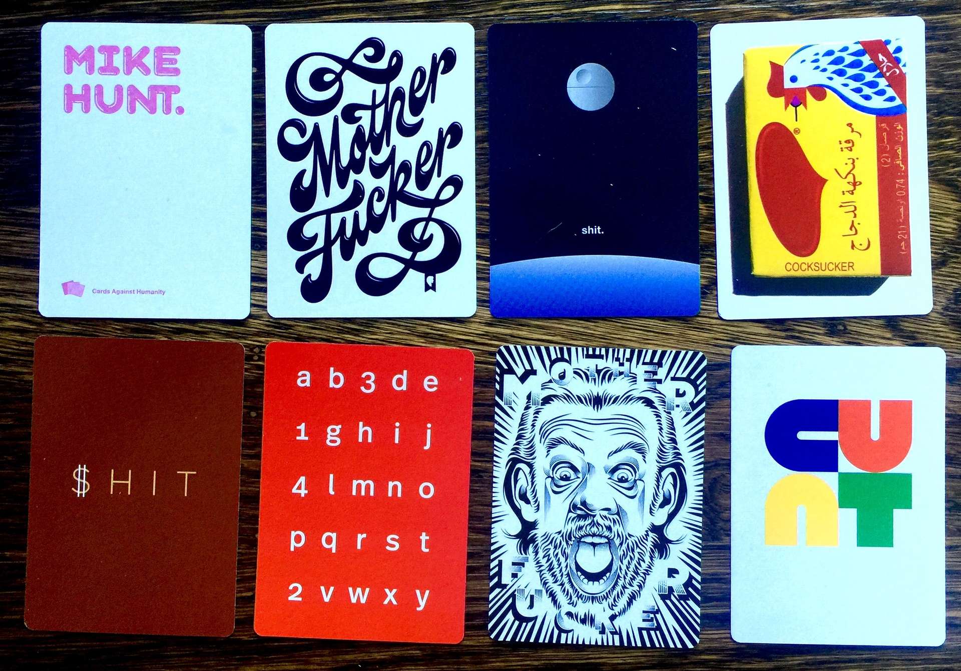
Designers have fabulously foul mouths
Just received my Design Cards Against Humanity expansion pack (and some others). A wonderful example how truly filthy mouthed designers can be.

Zembla Magazine issue 1 - words, pictures and graphic design gorgeousness
Since the early 2000s there's been an explosion in high quality independent magazines. These are often lovingly crafted, hugely indulgent, hyper focussed niche offerings. Not aimed at mass distribution or high ROI and usually not the most successful business models. One of these magazines that appeared…

Letterform Archive - SF's graphic design treasure trove
A small selection from Letterform Archive's Instagram feed. For the past few months I've been visiting and volunteering at the Letterform Archive in San Francisco. It's a collection of over 30,000 lettering, typographic, calligraphic and graphic design related items. From stone artefacts and illuminated manuscripts through…
Letterform Archive - an eclectic sample
One of the things I love most about visiting the Letterform Archive is the impromptu discovery of awesome bits of design. You can book a research session with them and get a focussed deep dive into a particular subject area, but as a volunteer you…