The intricate themes of Inscription Journal

With the up coming launch of Inscription: The Journal of Material Text – Theory, Practice, History #5 'Containers' on May 14th 2025, I thought is was about time I posted something about this wonderful journal.
I have the first 3 issues, I missed issue 4, maybe partly due to the trauma of opening issue 3, more about that later. It seems each issue has a physical theme to it hence 'material text' and it's designed by The Fraser Muggeridge Studio, who must have the time of their lives on it.
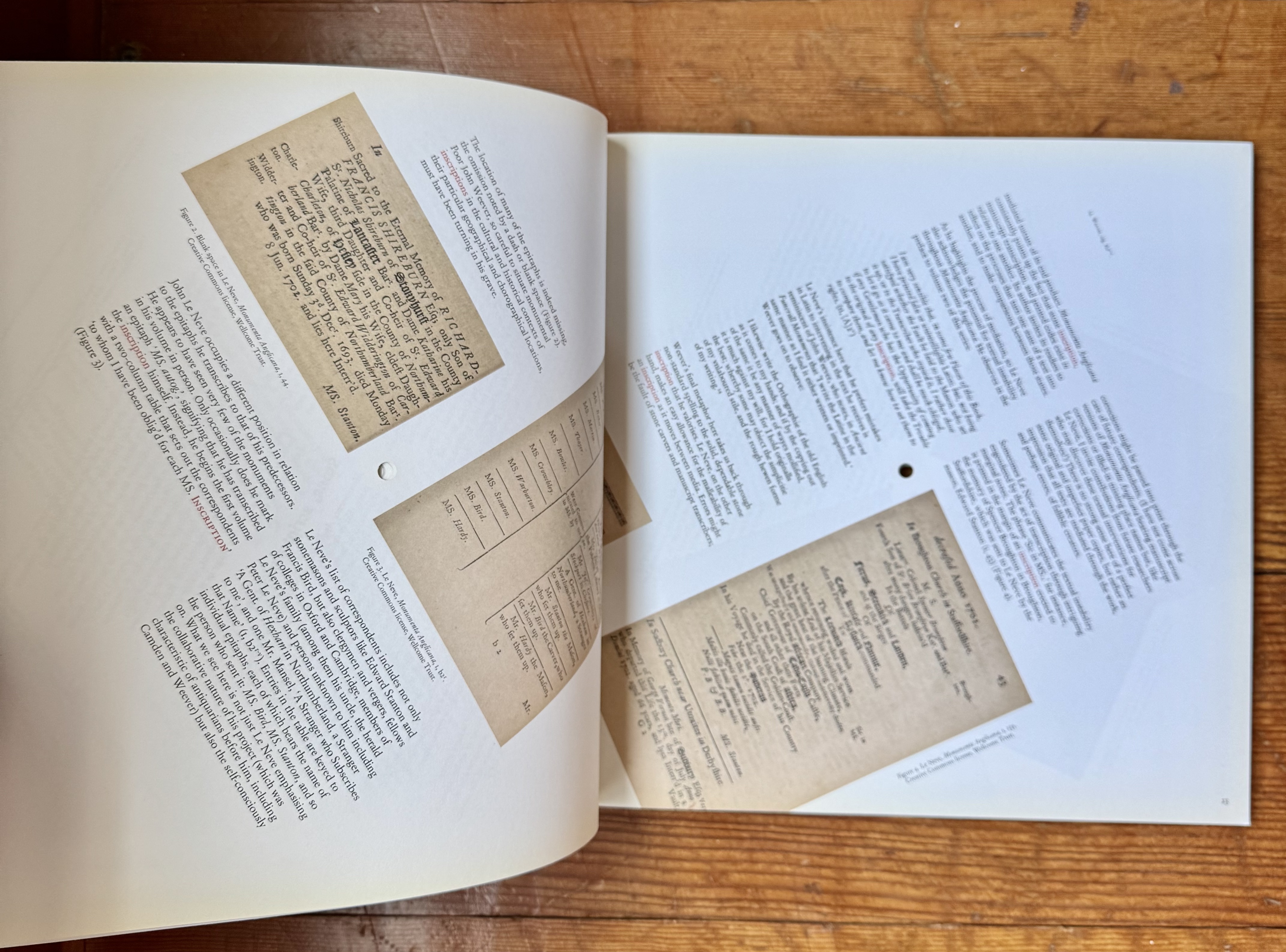
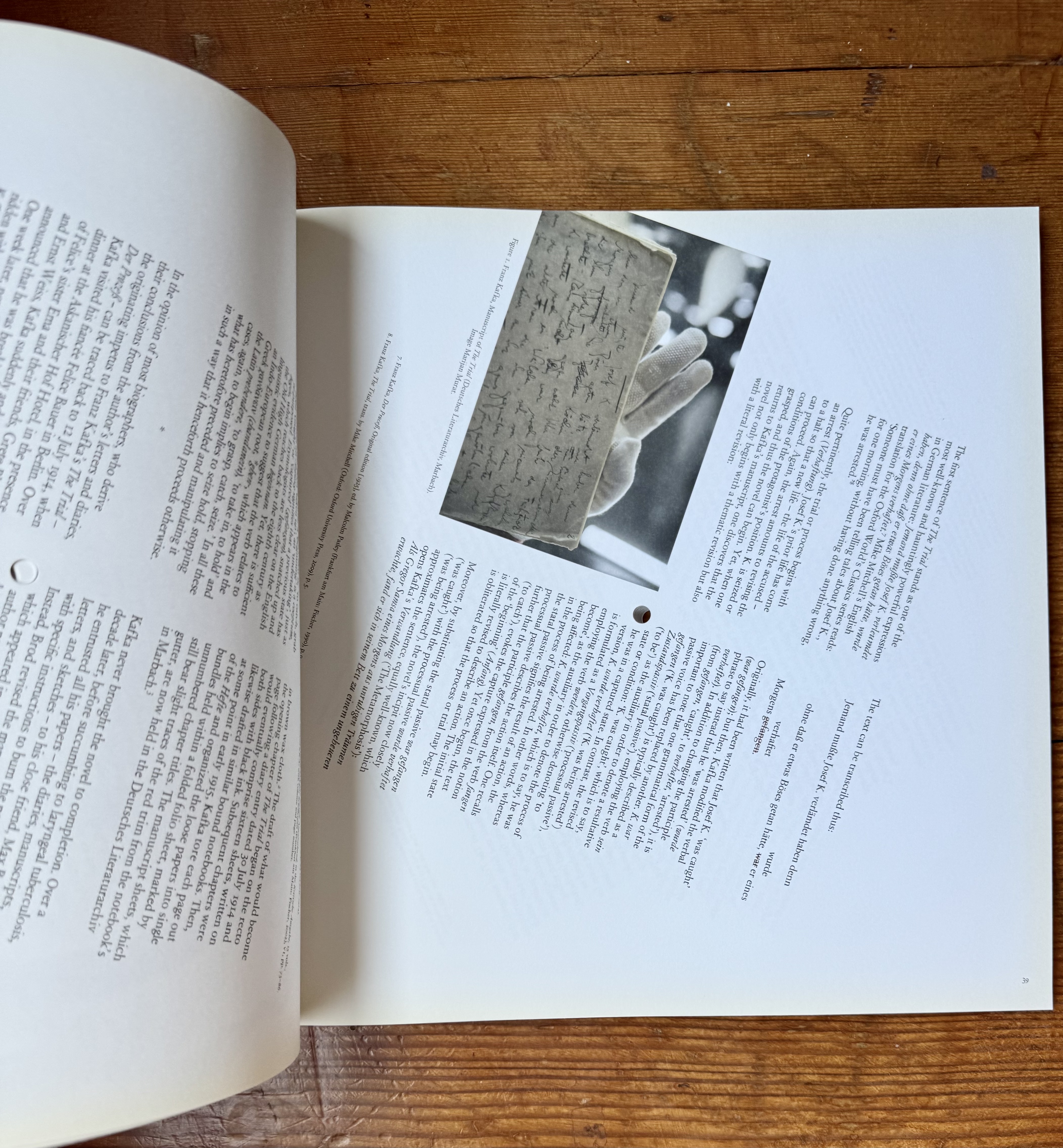
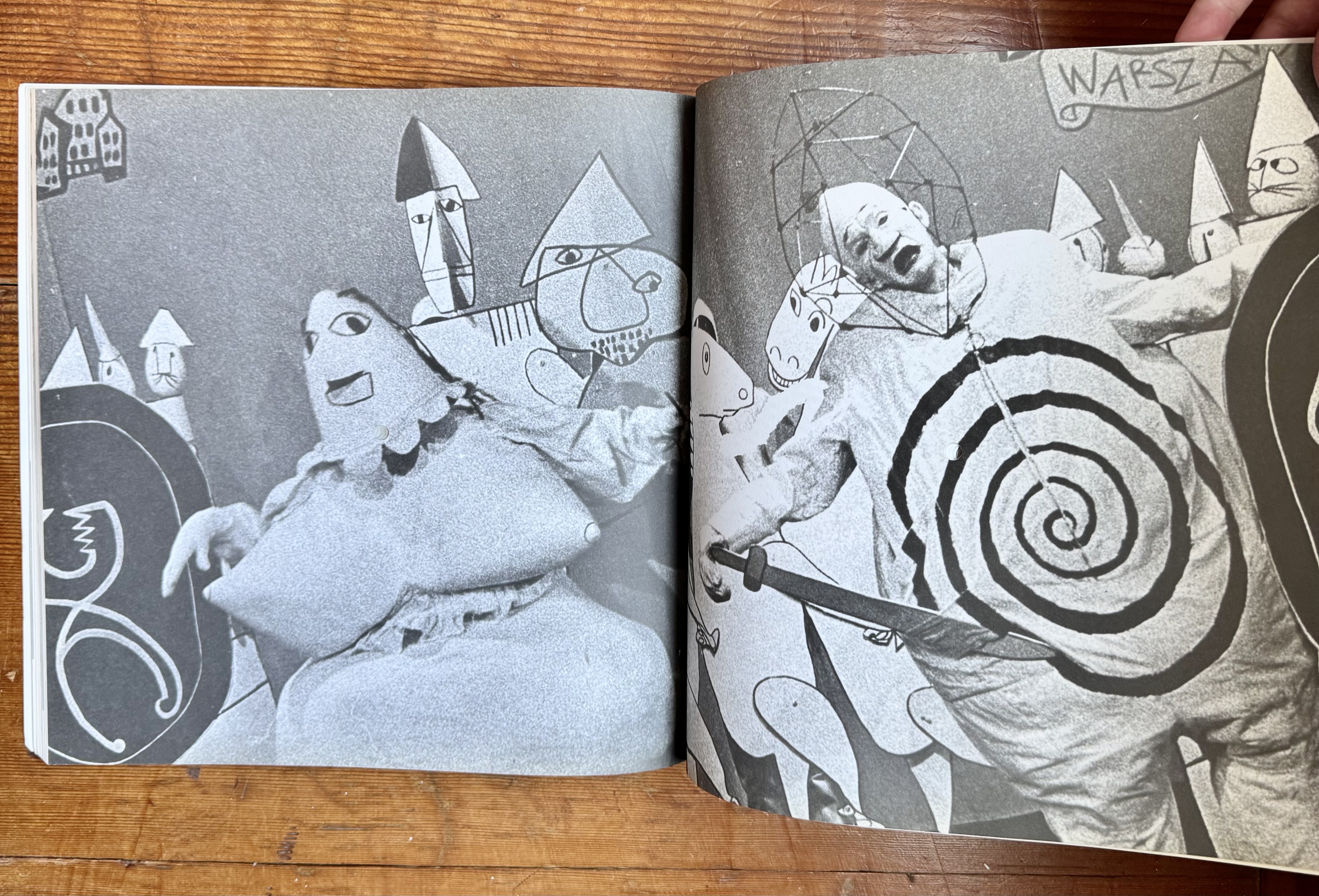
Issue one was was called Beginnings, but could have easily been called 'spiral', as the content rotates through out the journal. And it has (of course) a bit on Ubu Roi. Also it had a hole through the center, which means I keep confusing it with Issue two which was called Holes, and then there is Issue three, Folds. Folds was spectacular, terrifying, and frustrating. The issue is constructed through folded pages and it's an incredible feat.
Each issue came with a bunch of extras, from additional pieces and pamphlets to wonderful records on vinyl. So these journals are amazing material objects with deep, well written content. Utterly fantastic!

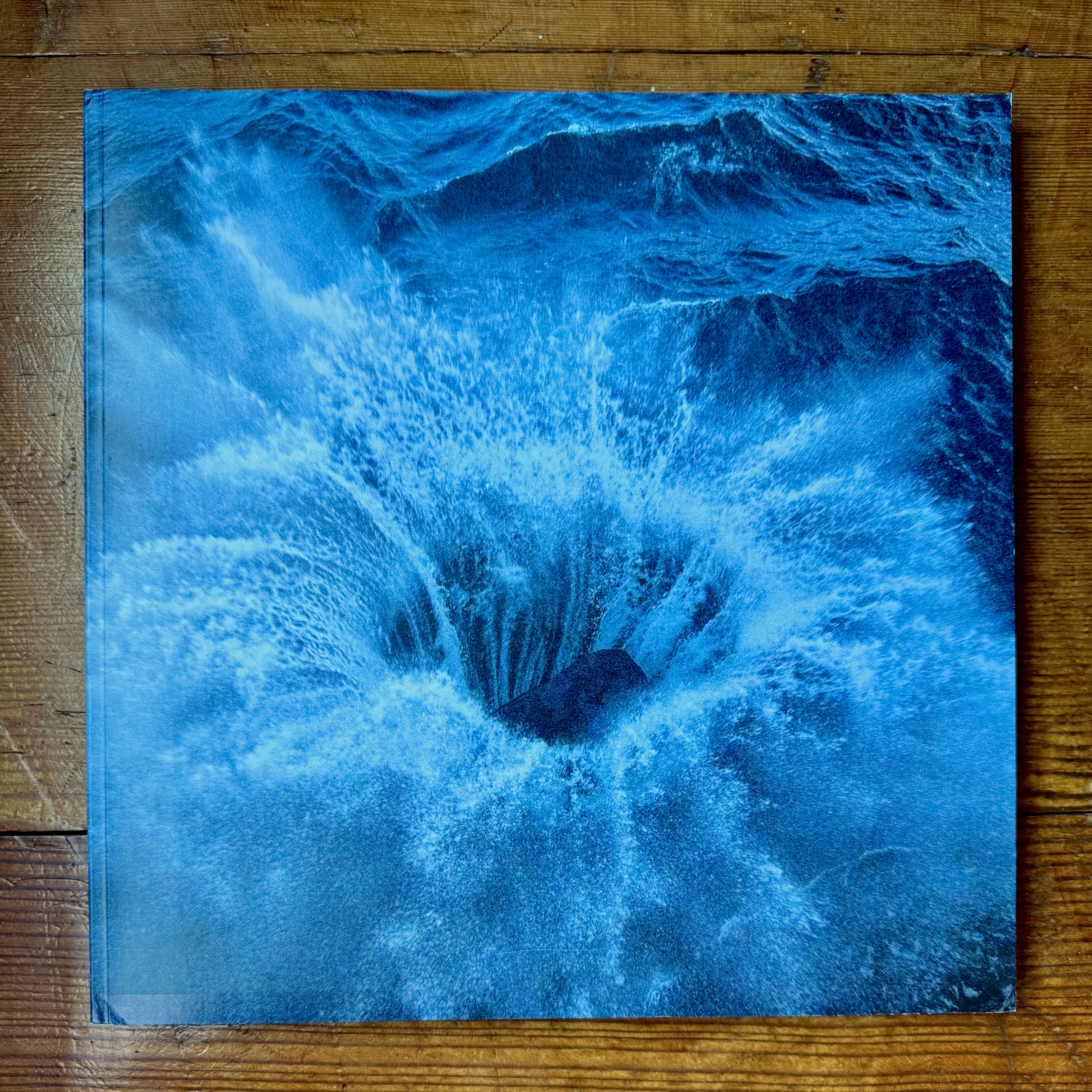
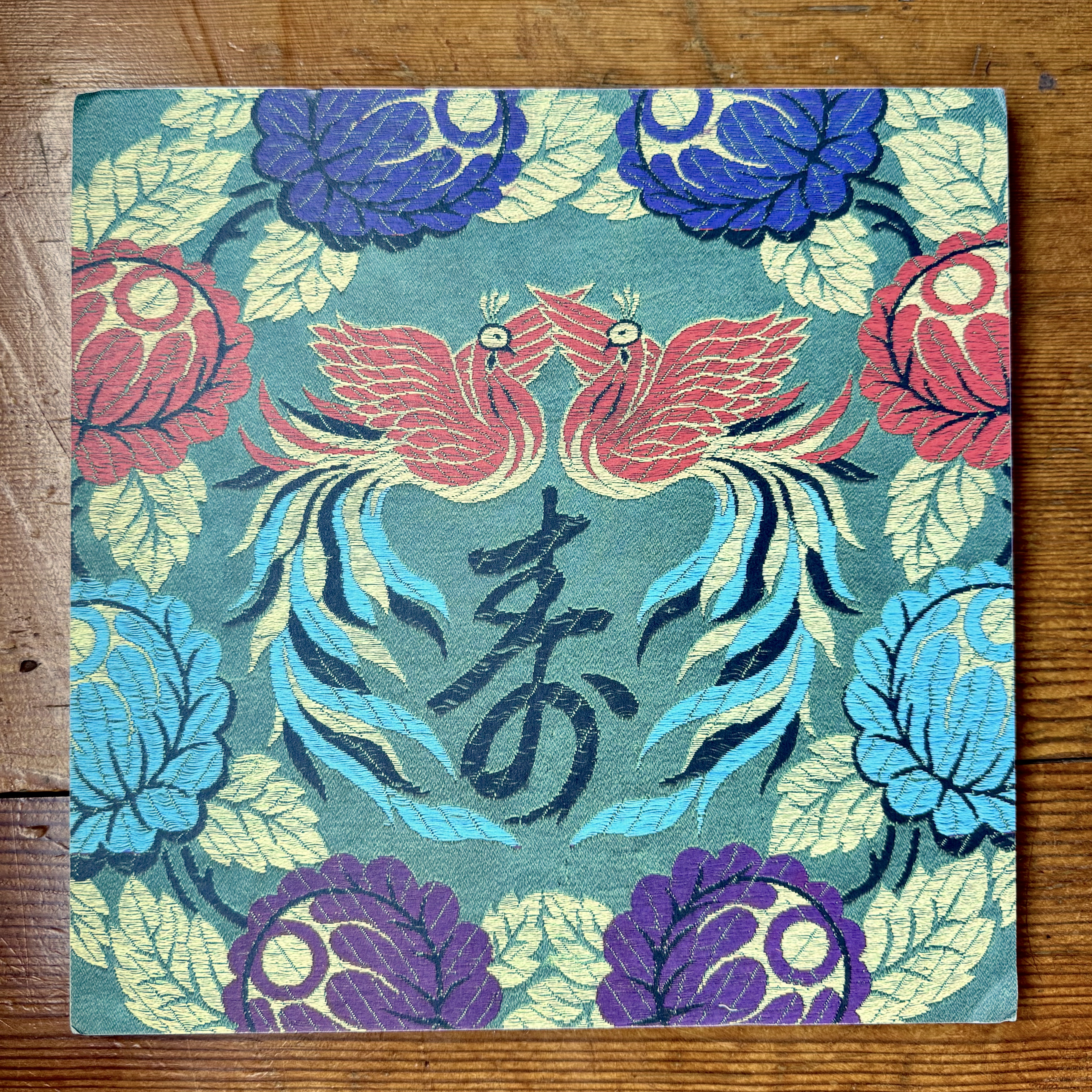
Issue 1: Beginnings
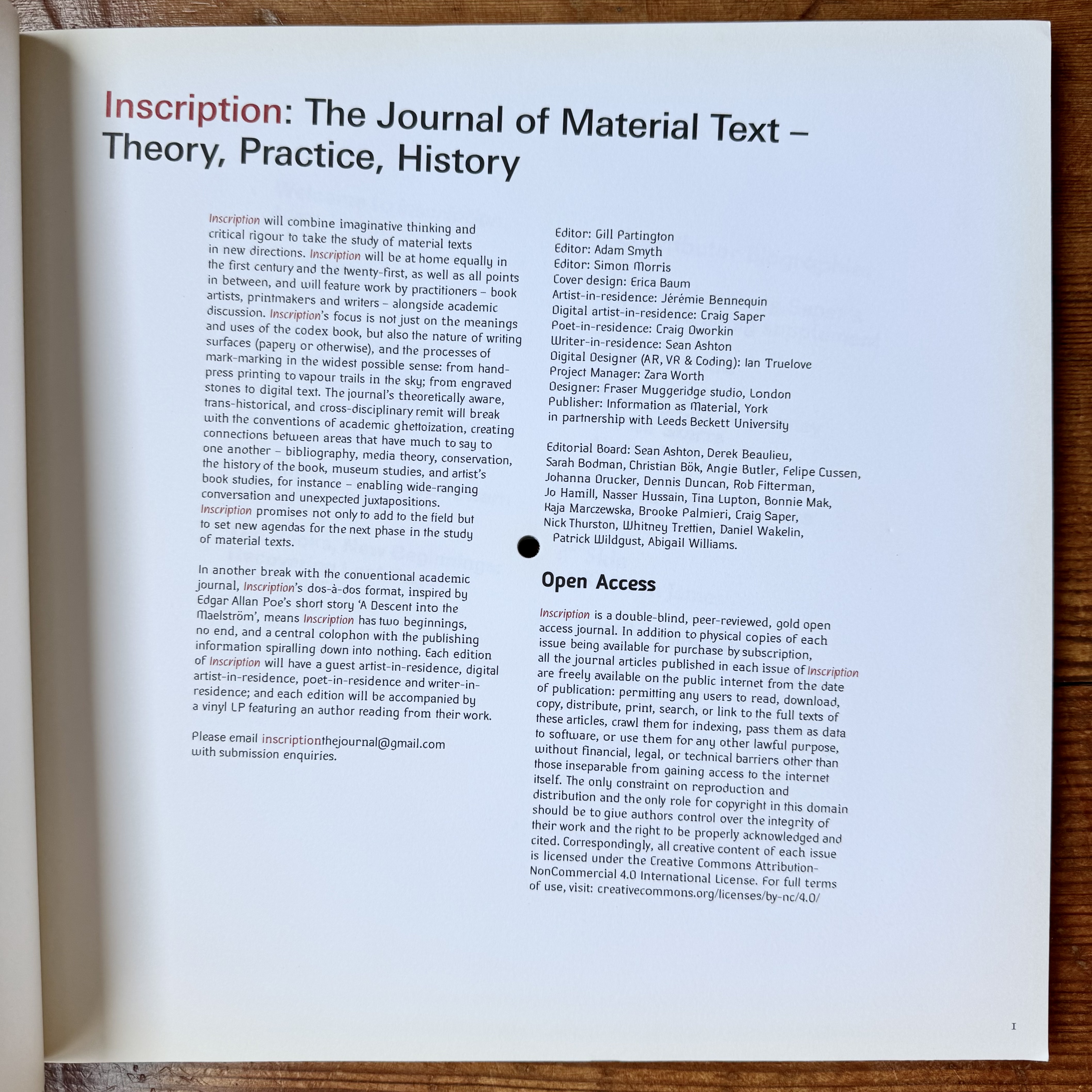
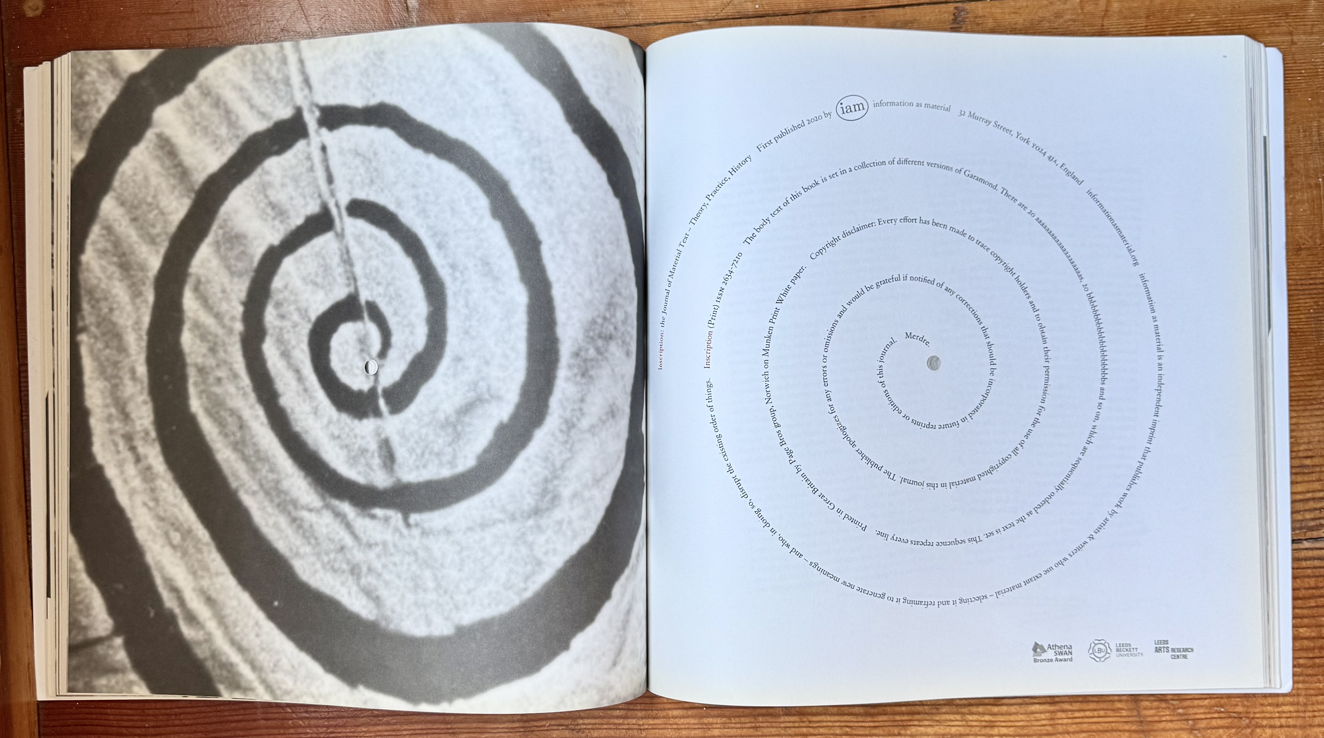
I call this one the 'spiral' issue. The entire contents rotates around the central hole, incrementally, spread by spread. Also this reads from front to back and back to front with the 2 items joining in the middle at Pere Ubu.
The spiral copyright/publisher statement is a joy unto itself.





Issue 2: Holes
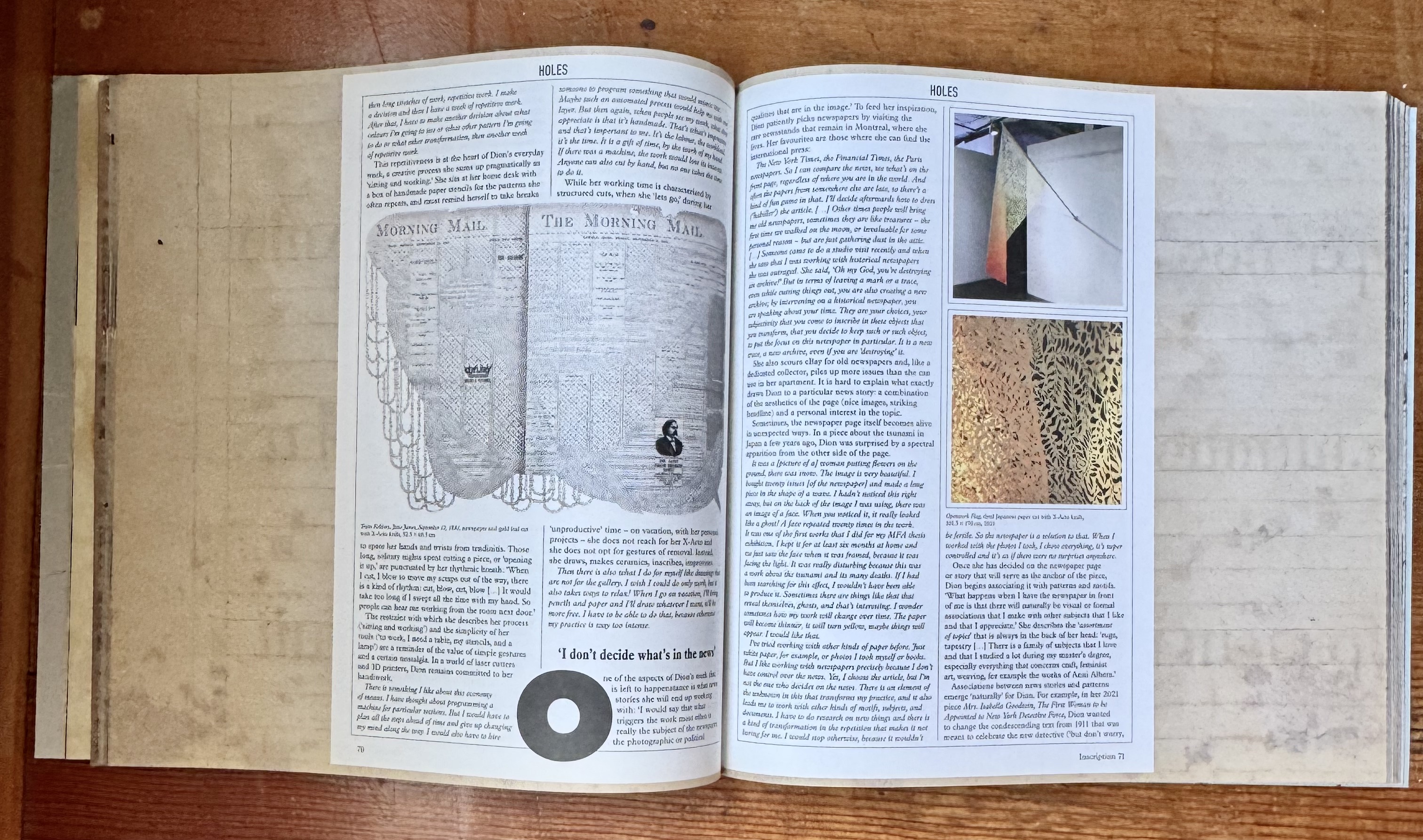
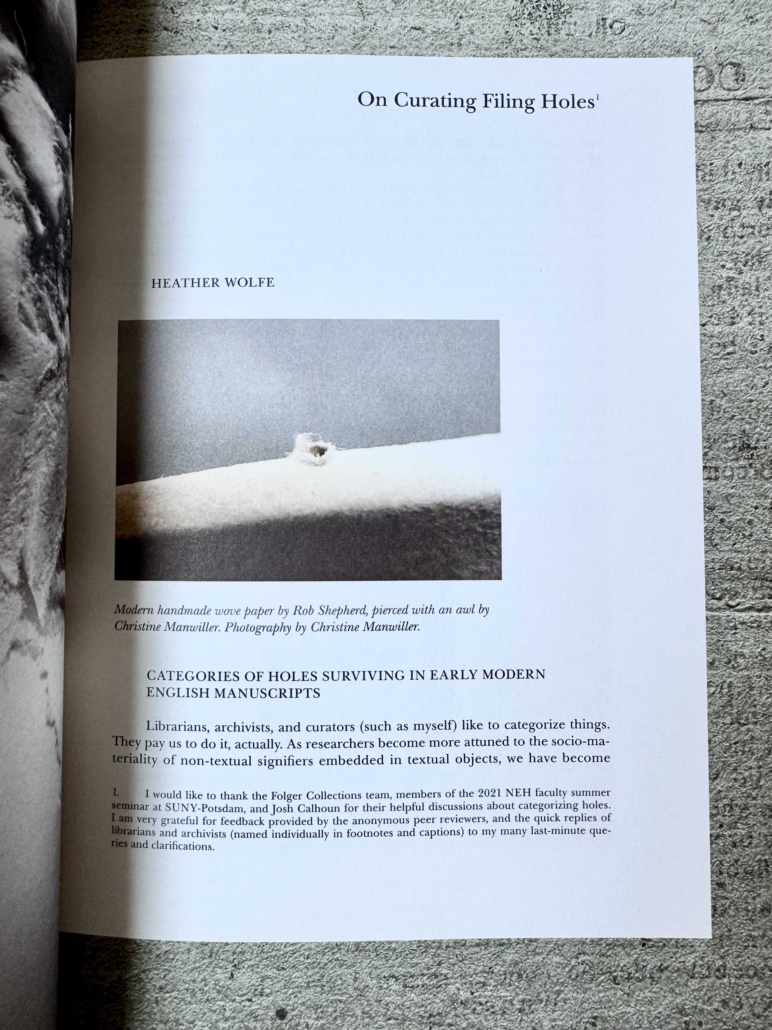
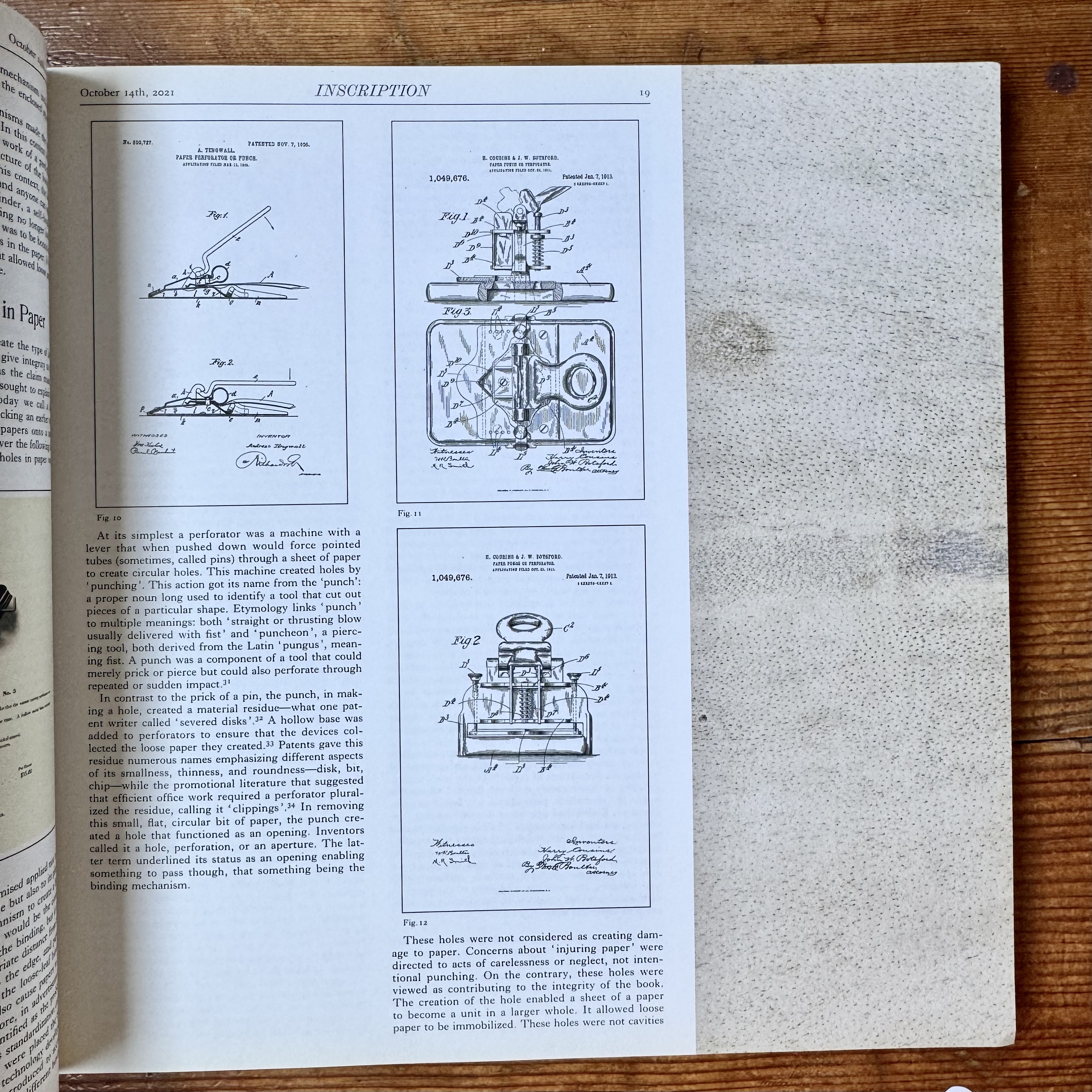
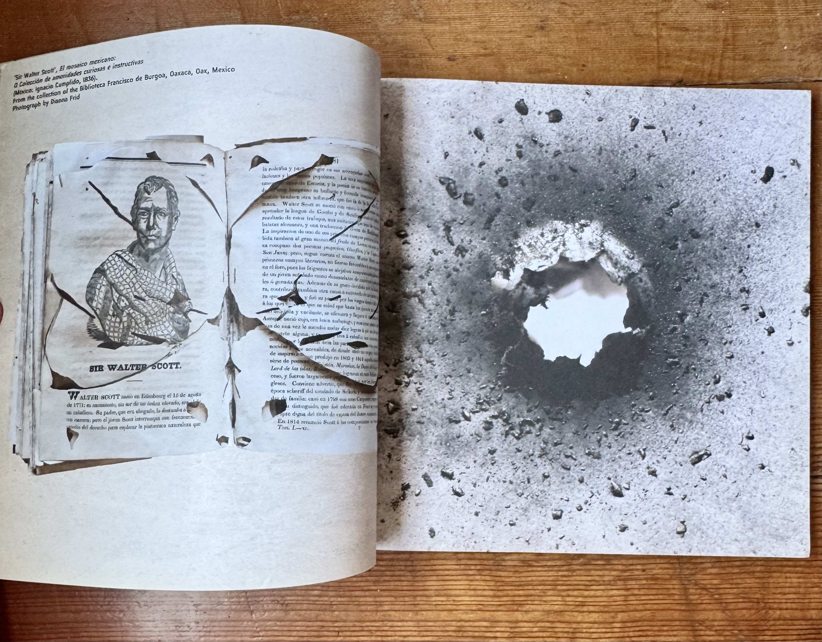
Holes is a very content rich issue, less challenging to physically read but deep in quality essays and articles. The addition of the bookmark, based on Finger Tablet by Miranda July is an exceptional touch.






Issue 3: Folds
This issue is both brilliant and an absolute nightmare. Each spread folds out to a larger spread 4x the size of the closed journal. This doesn't happen in a simple gate fold way (as you may expect), rather in a very specific, open and rotate technique, that I can't seem to master. But even with that and my absolute inability to fold it back together in correct fashion, I still adore this issue. It's incredible.
There's something wonderful about when you do get the fold correct and you get to see an entire piece laid out across the vast tableau of the the 4 up unfolded sheet. It's equally magical when you are folding and unfolding, and a piece is suddenly intersected with another, or a large text quote fills a quadrant.

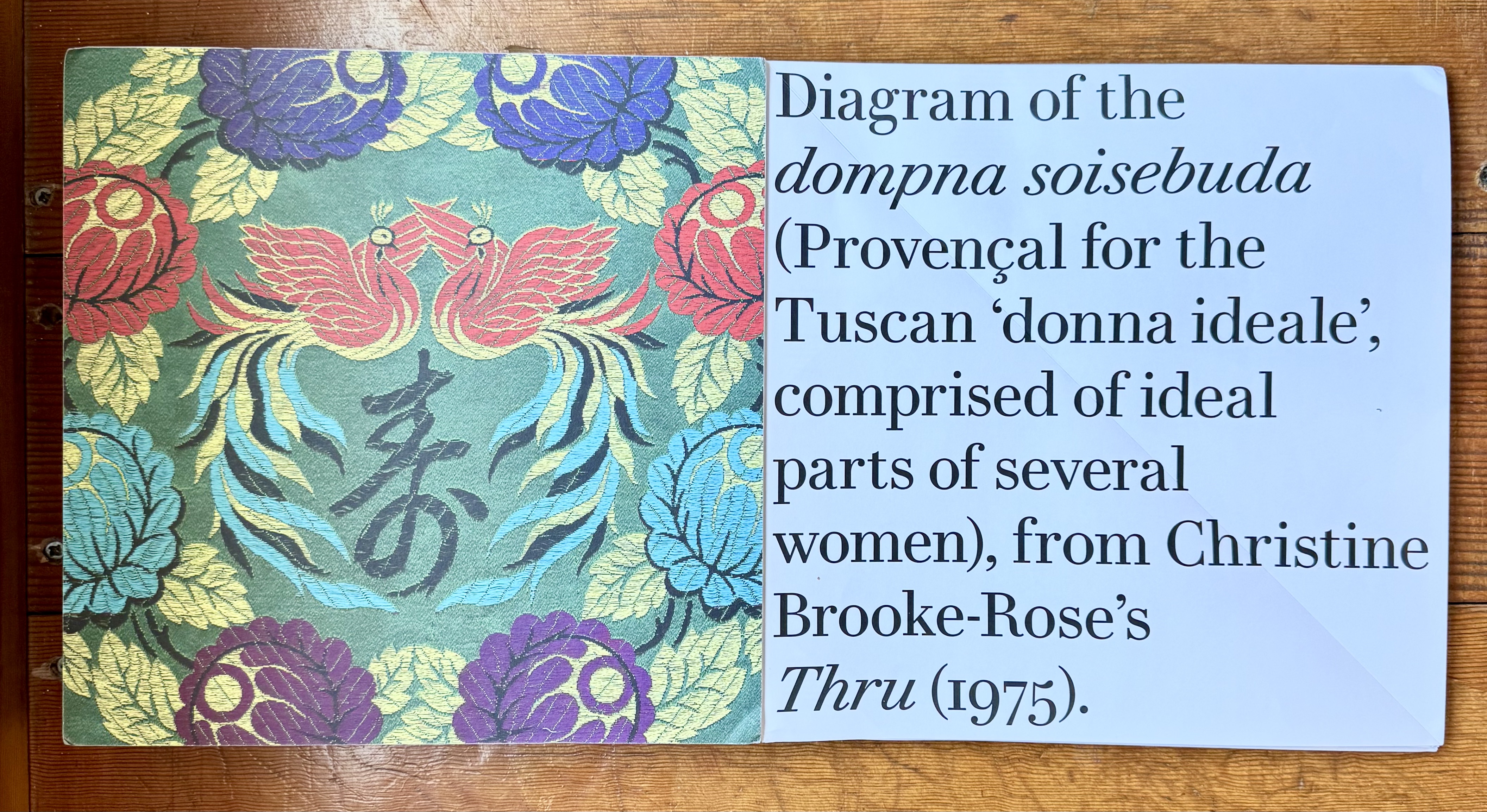


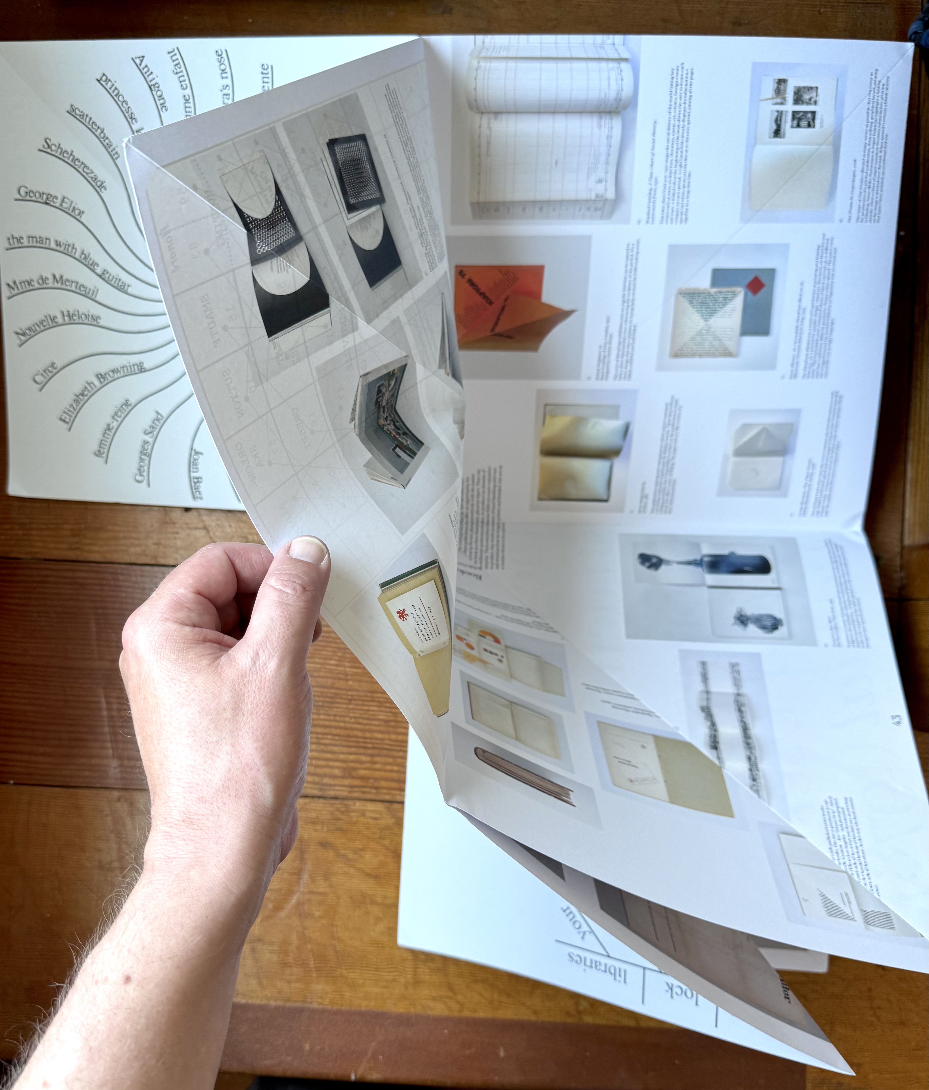


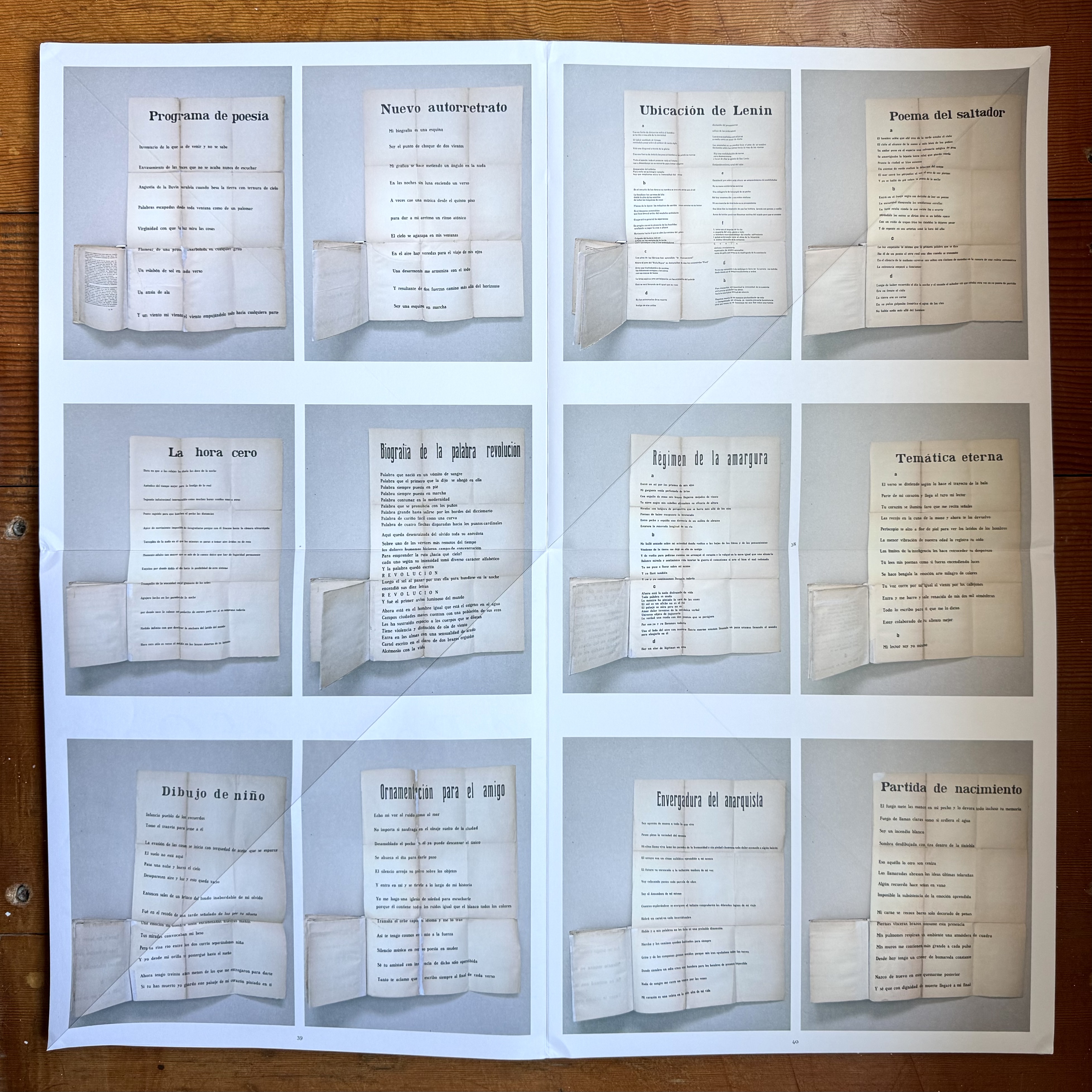
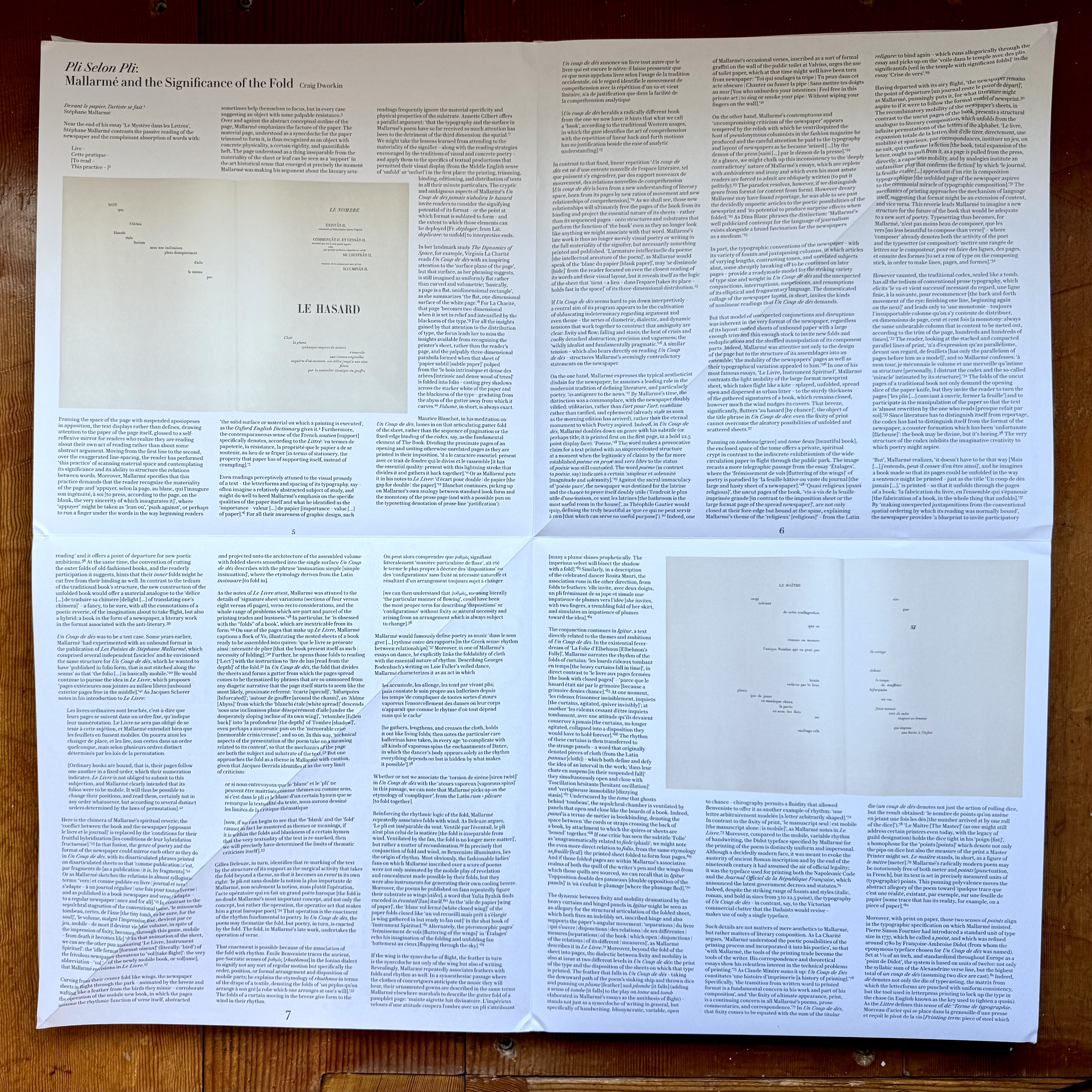
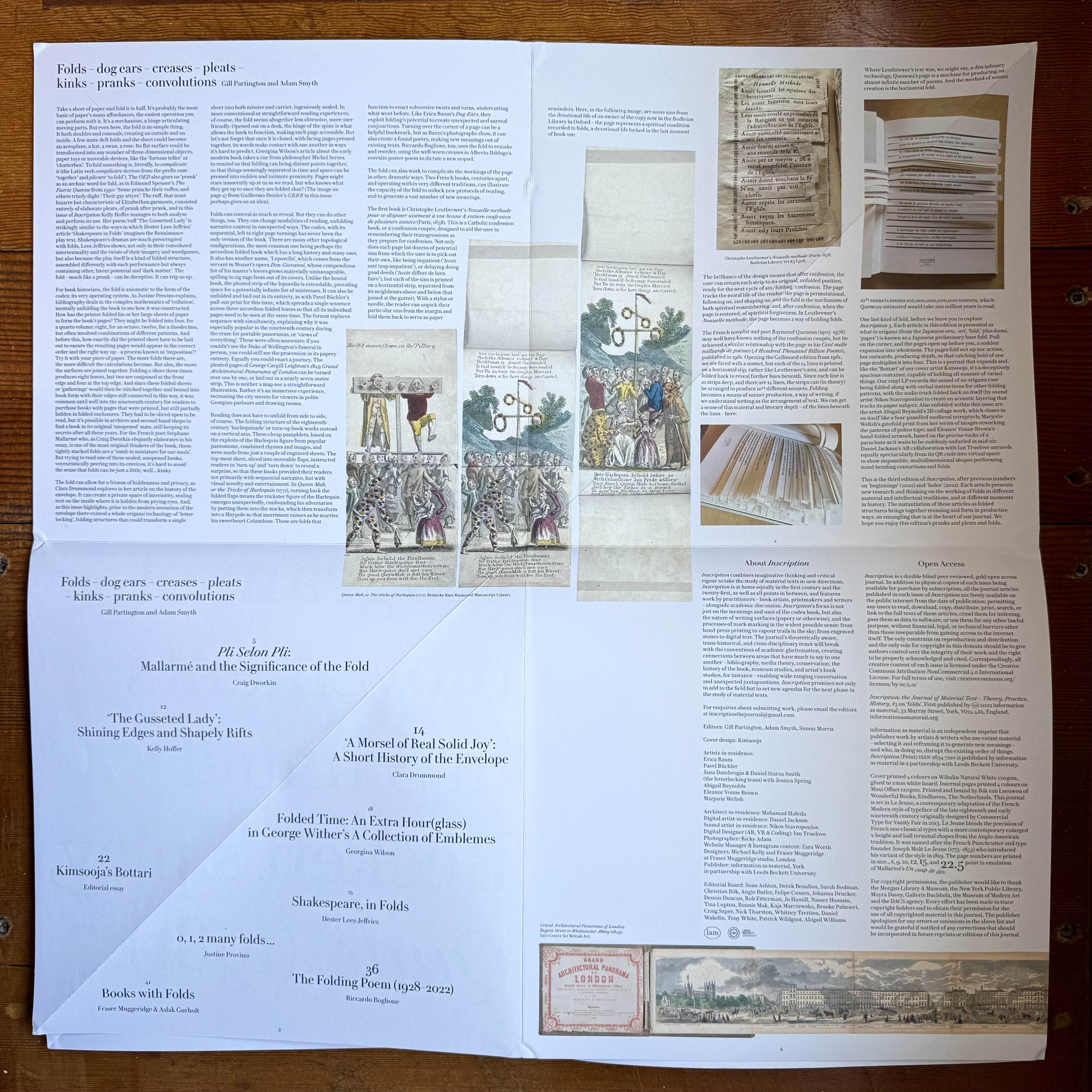
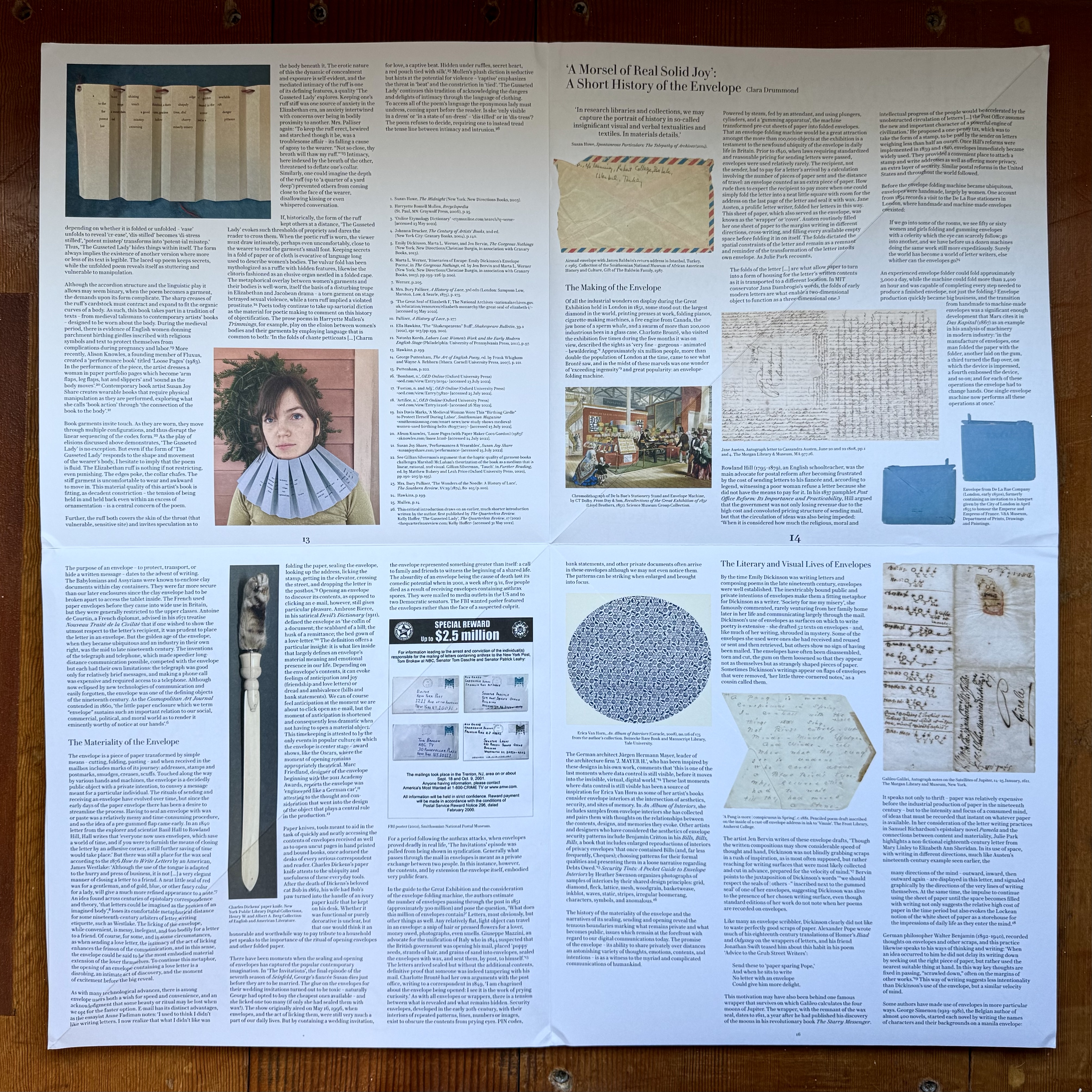

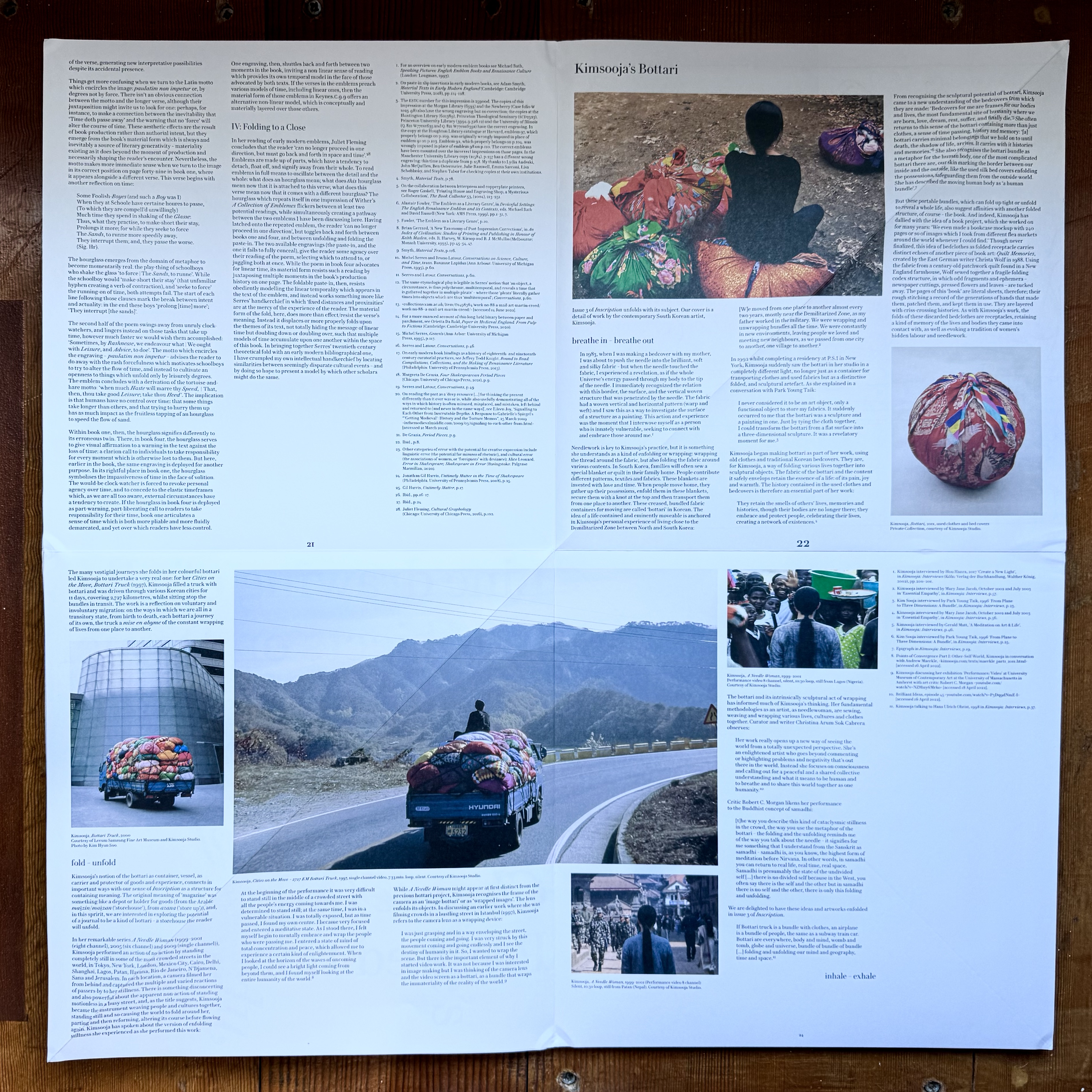
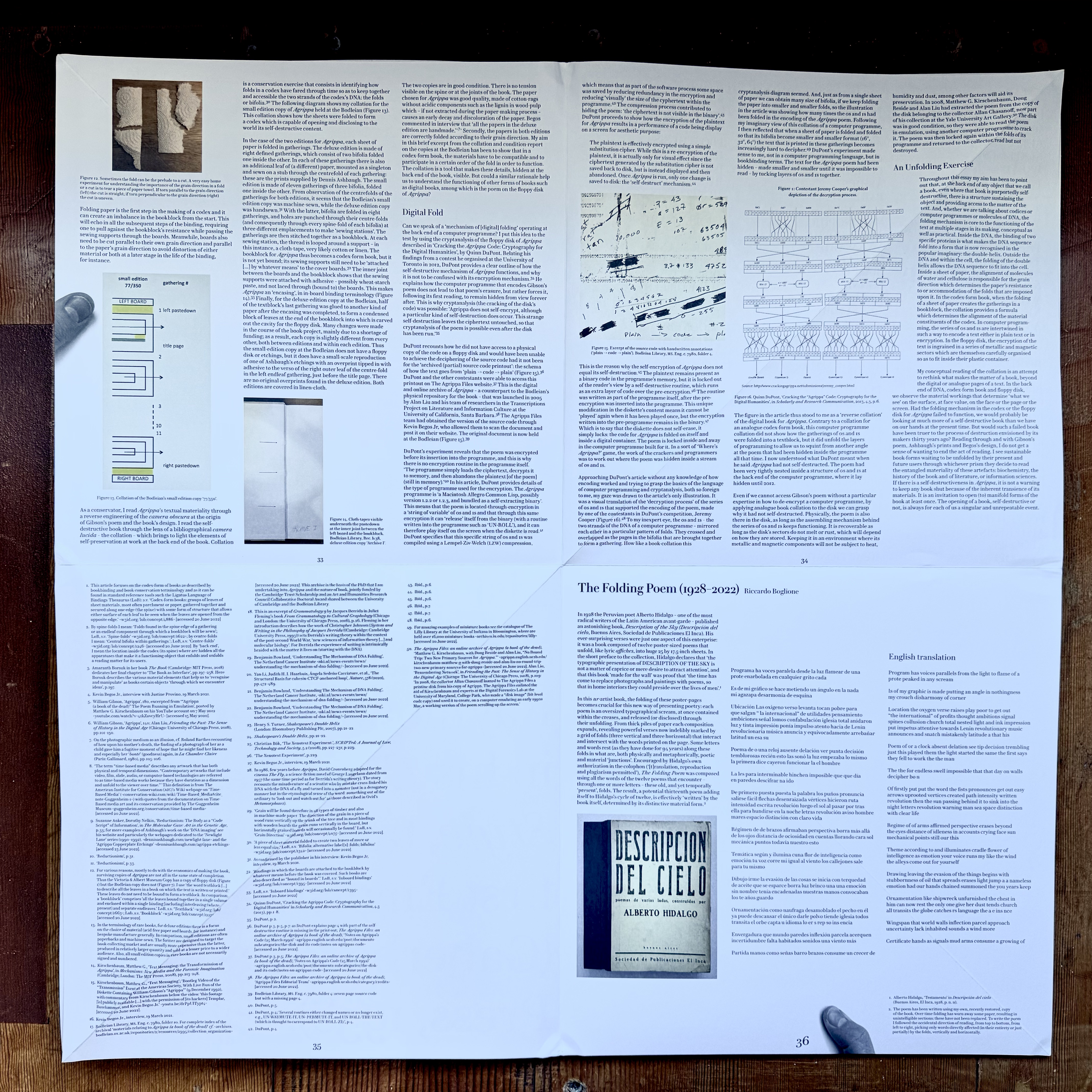

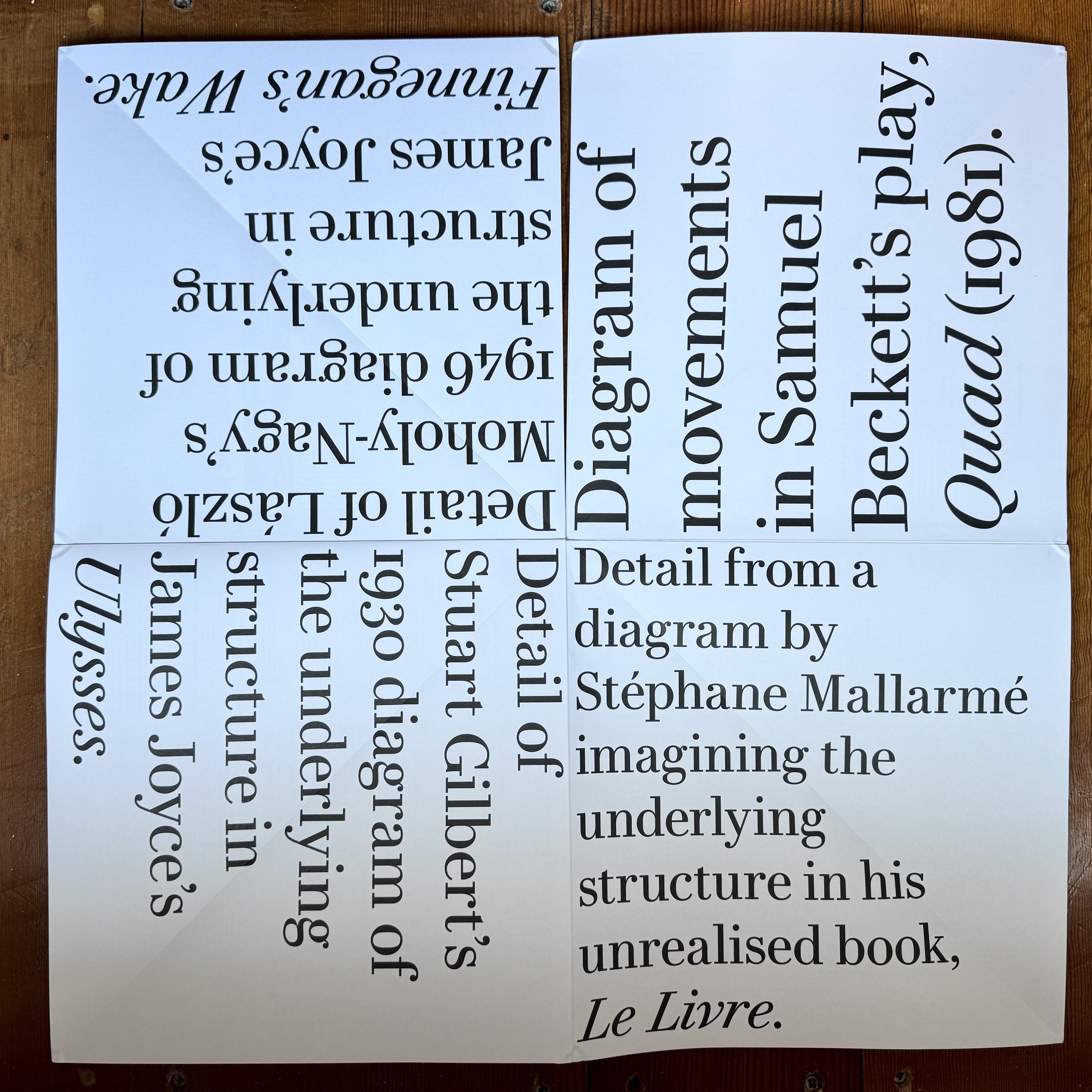
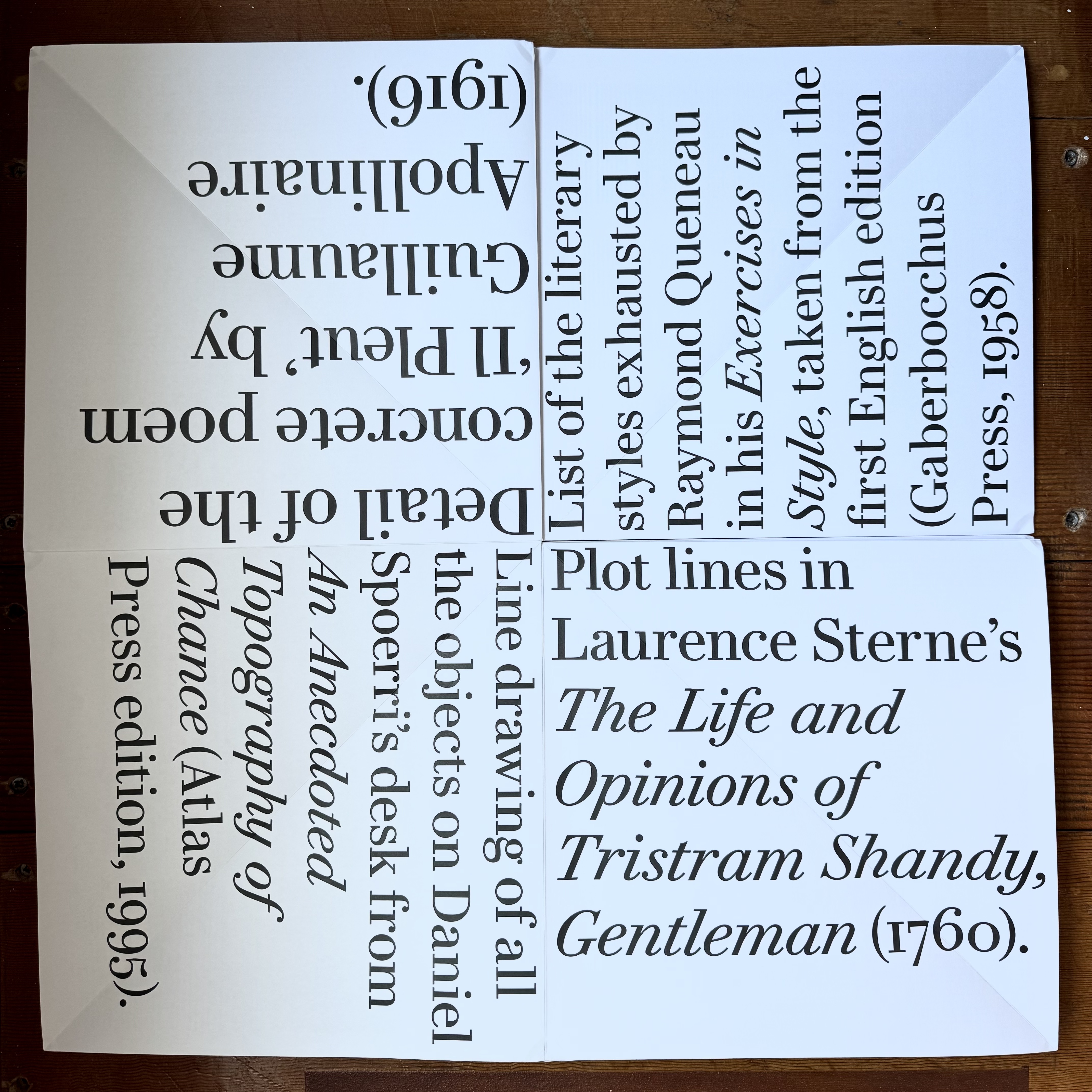
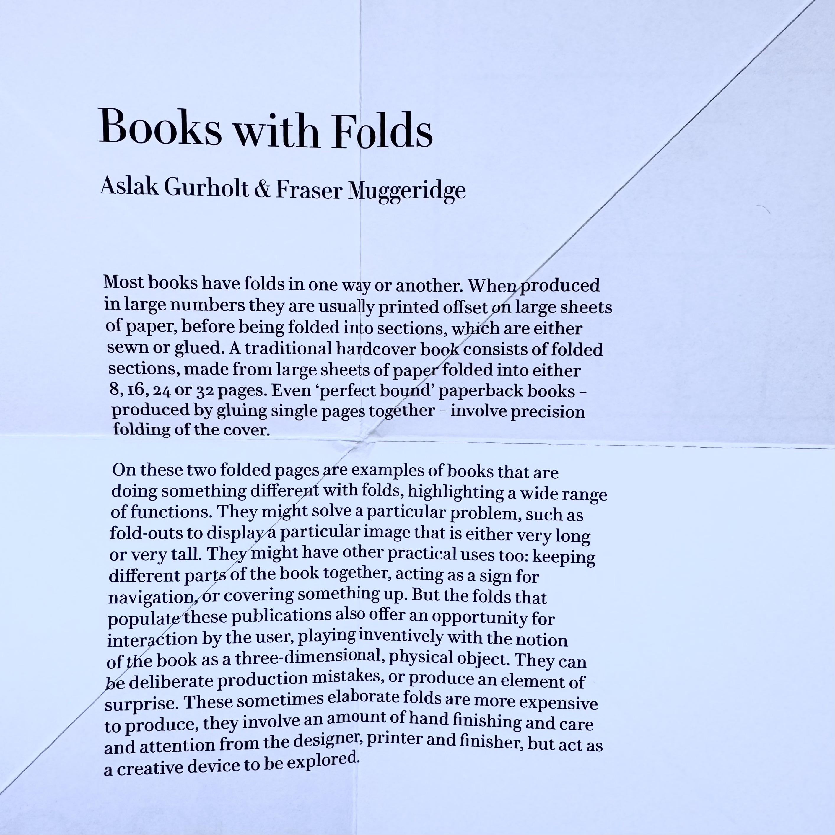
The thing is I can't seem to get it back together correctly, whenever I look at it. In fact when I showed it to a group of folk at the Letterform Archive, it still took us 10 mins to close it, are they are specialists!
Thankfully the creators do supply a tissue for your tears of frustration.

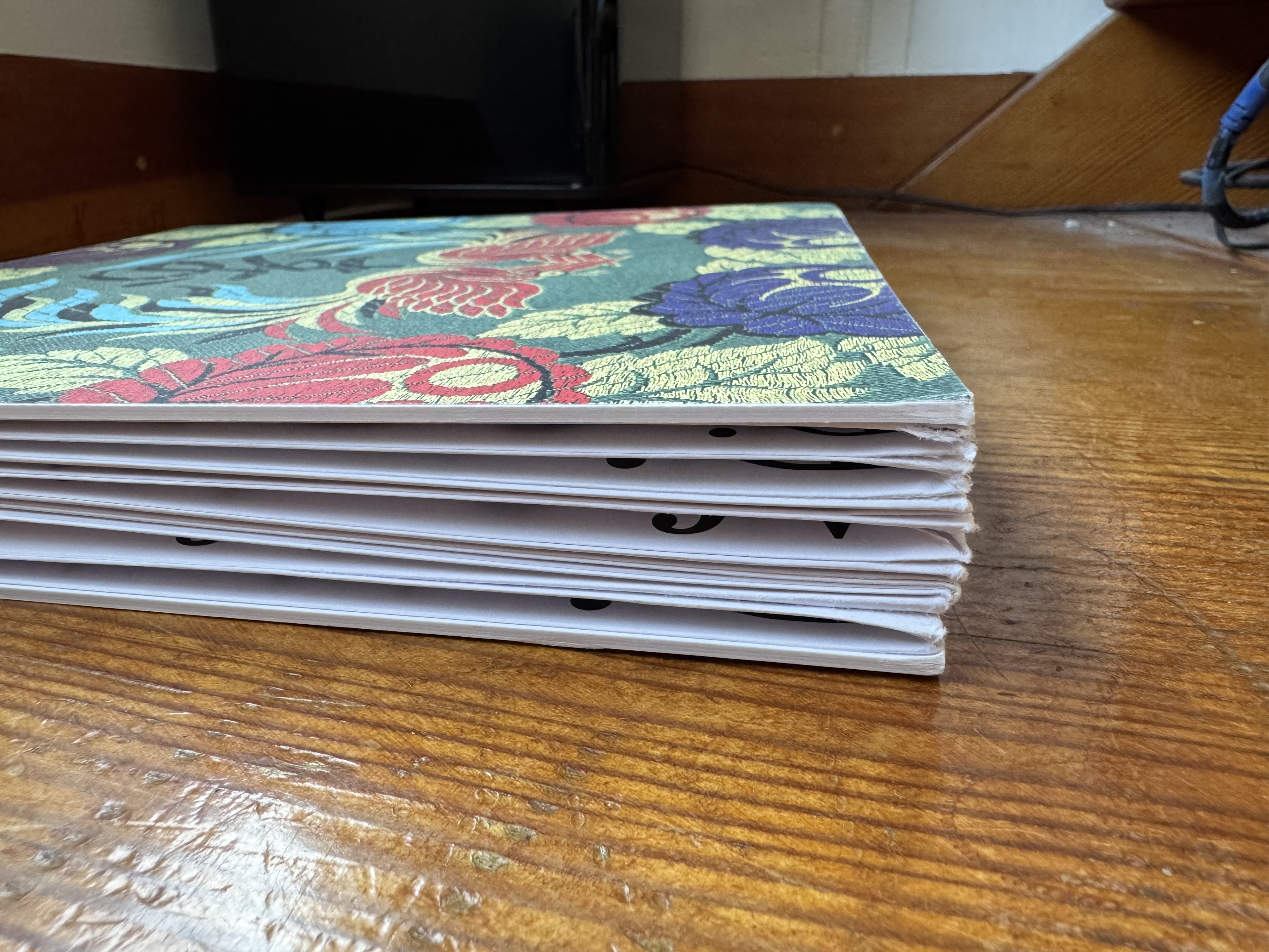

I have enjoyed these issues immensely and have finally ordered issue 4, will probably order issue 5 soon too. Great work from:
Editors: Gill Partington, Simon Morris, Adam Smyth
Designer: The Fraser Muggeridge Studio, London
https://inscriptionjournal.com/
Oh and I must not forget this nice folding Mail Art template:


You should also read:

Emigré the journal issues (33-49 bound)
I have a few loose issues of Emigré so when the bound volumes were released I had to grab them. These are from the more theoretically engaged period, epitomized by the mouthpiece series. Great to look back on and see the issues that raged and in…
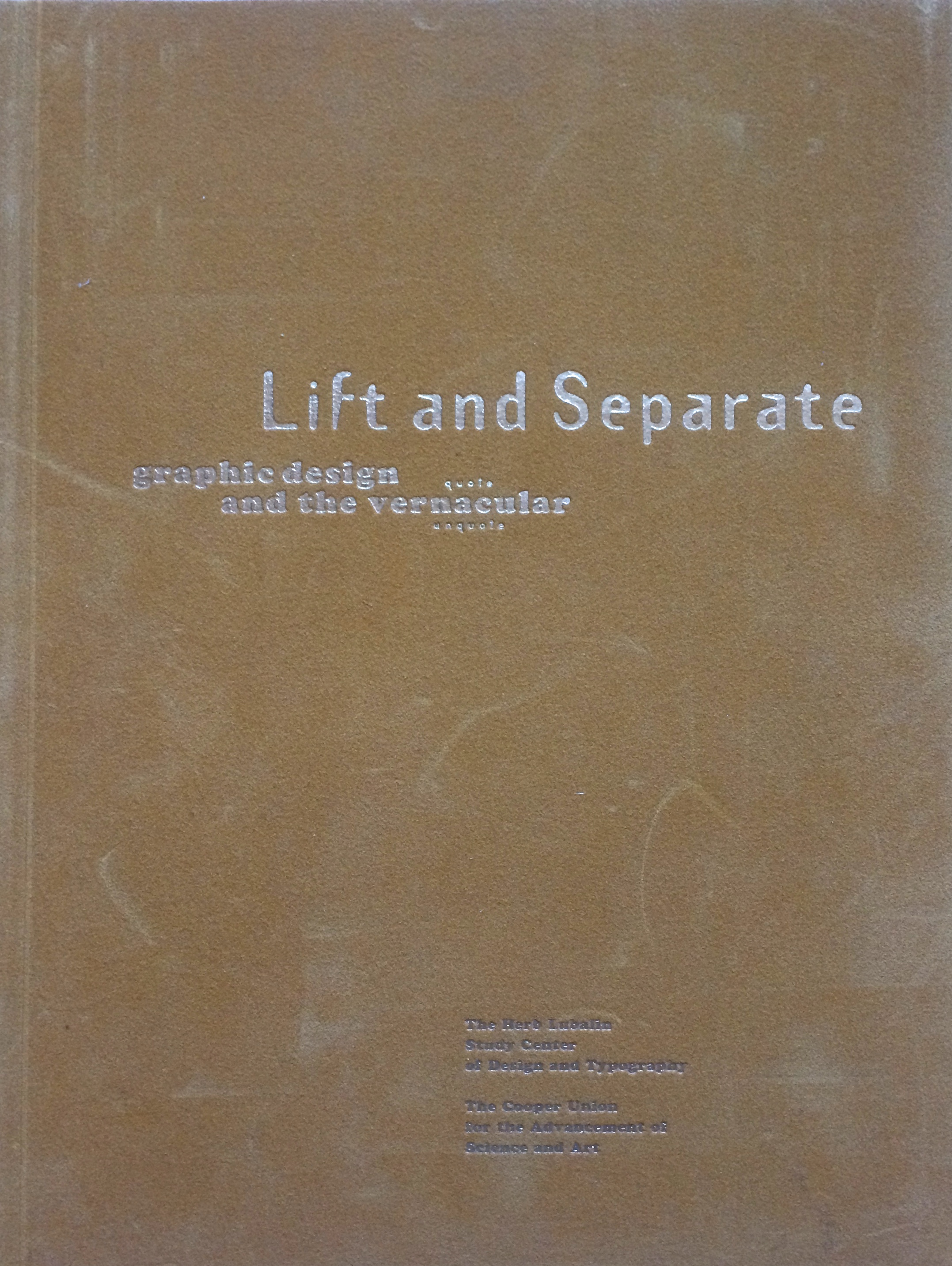
Lift and Separate - a graphic design journal
Lift and Separate is a lovely tactile journal, very much in the spirit of Emigré and Eye. It was published circa 1993 by the Herb Lubalin Study Center. What I really like, is the piece on vernacular and the journey from drawing fanciful letters in a note book to purging the ornaments…

Issue 1 of The Office for Creative Research's journal
This was an absolute must for me. Not least because I'm a print and design obsessive but also because I work in the data visualisation and analytics field. And it didn't disappoint! Beautiful. A lovely piece of design from The Office for Creative Research (o-c-r.org) . Best of all the…