design systems (6)

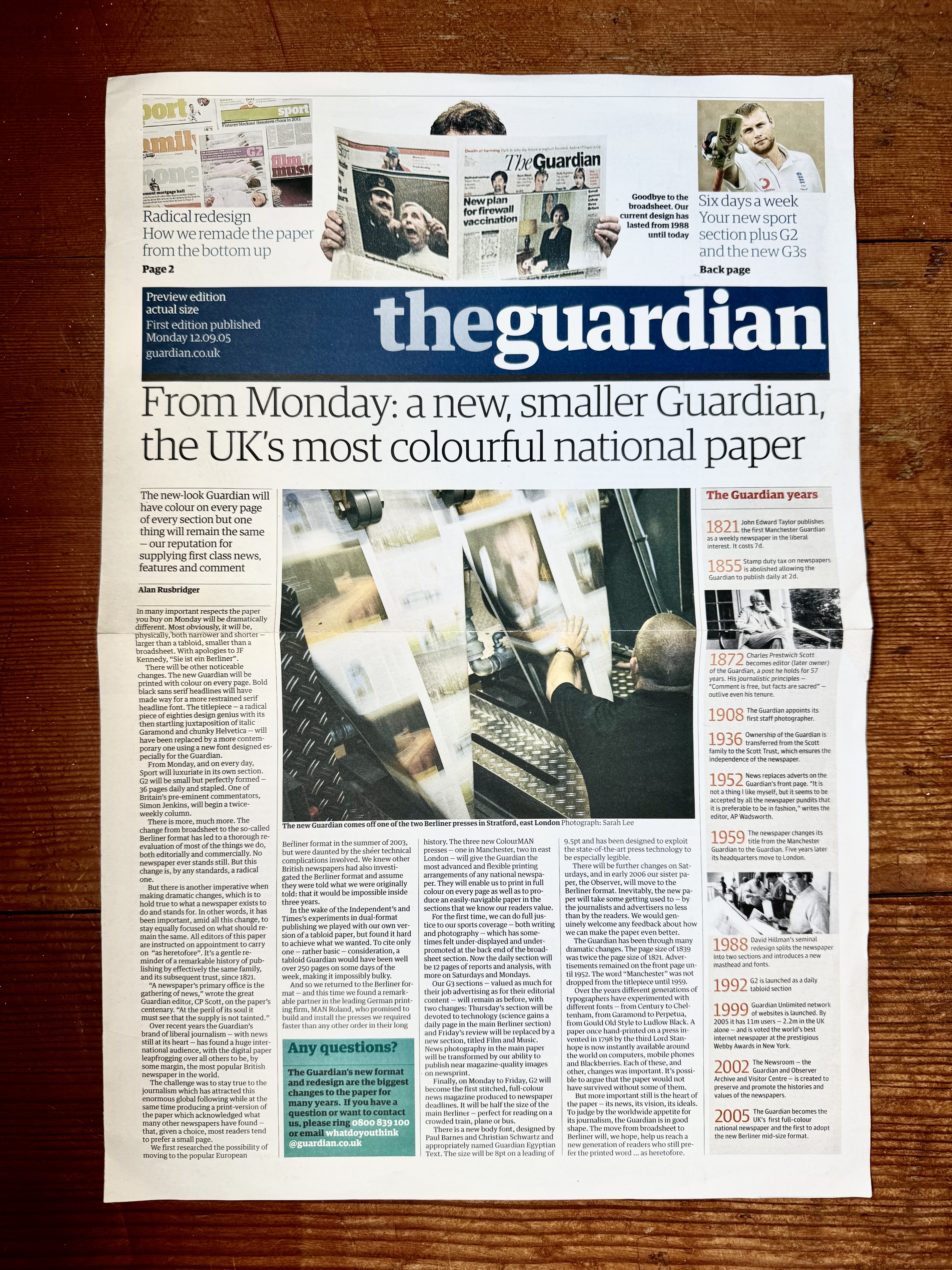
Front page of a Guardian newspaper supplement introducing their new Berliner format and design. It is in the format and design of the paper and the main story header says: From Monday: a new, smaller Guardian, the UK's most colourful national paper

20 years ago The Guardian was redesigned

Almost 20 years ago the Guardian newspaper did a major redesign. It was a big one; full visual system, grid, typeface and format overhaul - which meant full press and production overhaul too. That's a lot on the shoulders of the then creative director: Mark…

An advertising manual for Coca Cola, it is very large and there is a mans hand on it to illustrate that its approximately 20 inches by 16 inches

Some unposted gems from 2018 p1

Here are a few items that I didn’t feel I could put a full post together for back in 2018. Either it’s because they only have a few pics or they were items I’ve spied elsewhere so didn’t have much extra info for them. PART…

The cover of the report Preliminary Report No. 5 Urban Design Principles for San Francisco. It is deep pink with a large black 5 on it.

San Francisco's 1970 Study for Urban Design

View fullsize View fullsize View fullsize I love a bit of design history. Whilst in the Mission yesterday I picked up this gem from 1970 at Farnsworth Mercantile on Valencia. It's part of an urban planning study that was carried out by the city in…

An IBM brand book, it is black with small primary colored IBM logos gravitating towards the center

Letterform Archive - brand and design guidelines

As you'd expect, the Letterform Archive has a lot of identity and brand guidelines. Many of these are not very glamorous, often simply presented in ring binders, but they are graphic design gold. On a recent visit I spent some time cataloguing them. Here are…

🦣 🦣 masto.paperposts.me
🦣 🦣 🦣 🦣