20 years ago The Guardian was redesigned
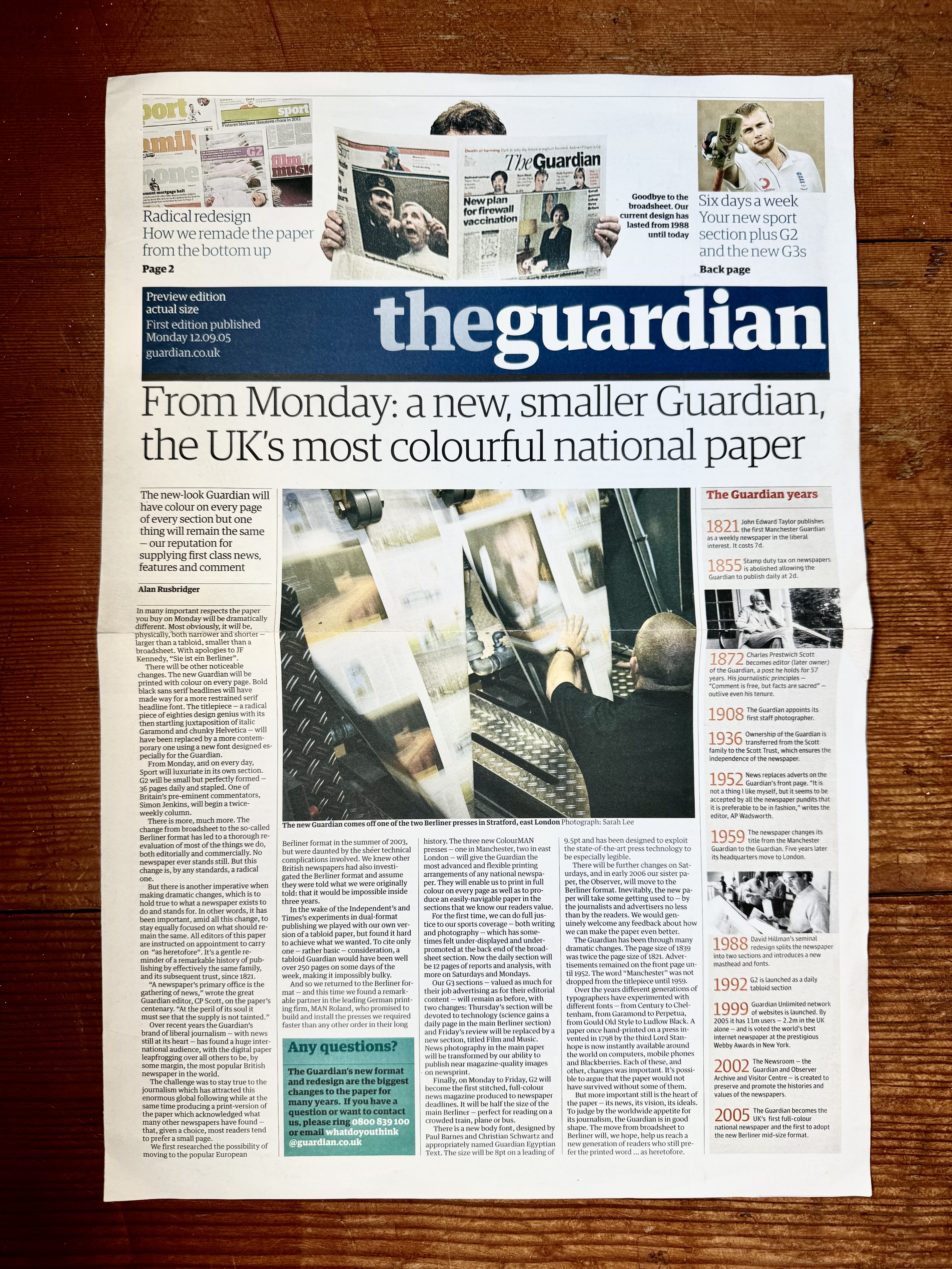
Almost 20 years ago the Guardian newspaper did a major redesign. It was a big one; full visual system, grid, typeface and format overhaul - which meant full press and production overhaul too. That's a lot on the shoulders of the then creative director: Mark Porter. And it was worth it, as it was a breath of fresh air for the 'proper' papers.
Much of it was about moving away from the traditional broadsheet to the Berliner format, but also it was about shifting from a print centric model to a more digital first outlook (supposedly). The cool thing was that they printed a separate feature pullout on the change. It's a single folded sheet in the 'new' format and styles, with some history and reasoning about the design.


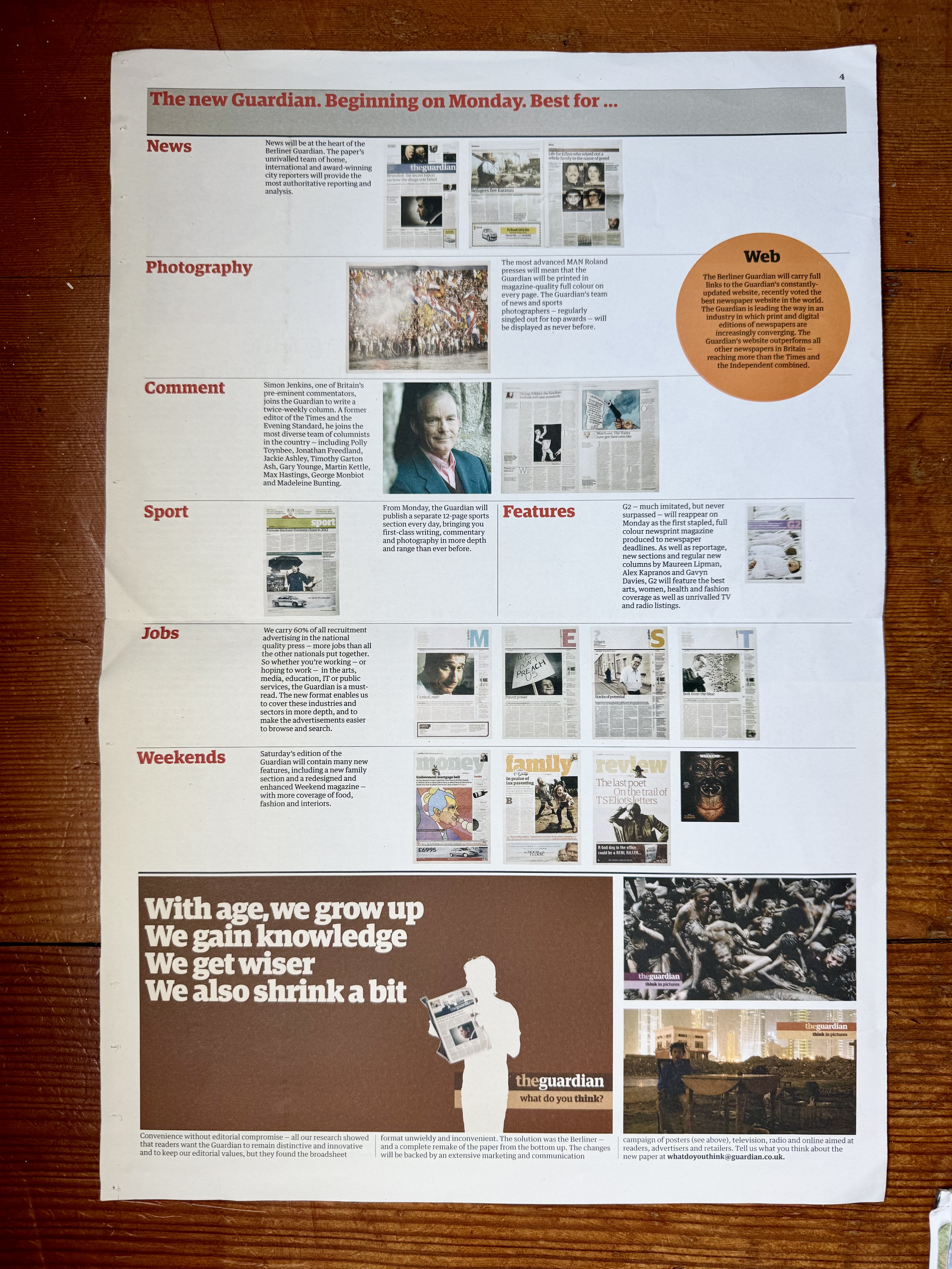
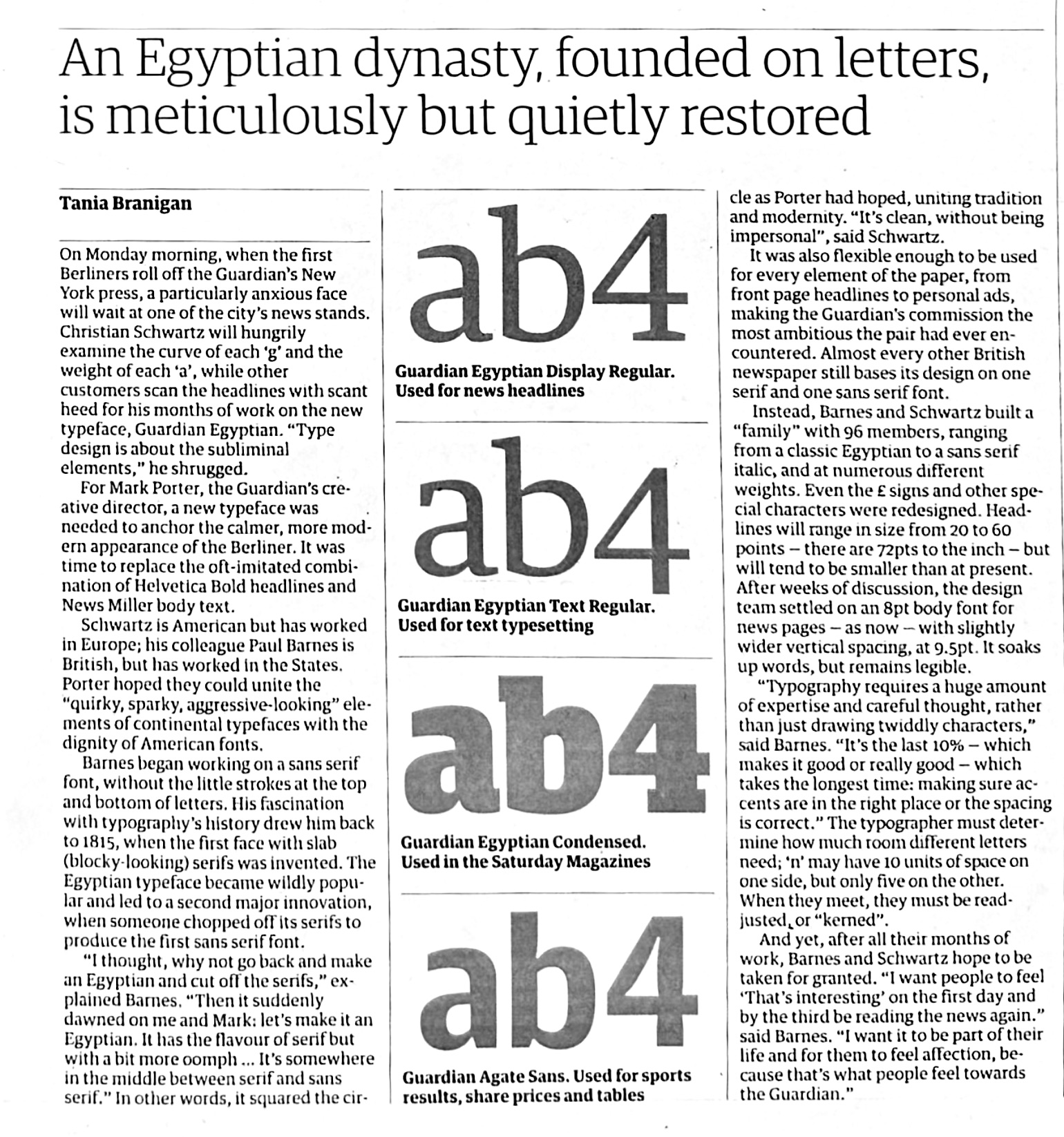
It talks about the 96 cuts for the font family Guardian Egyptian that were created – the type design lead by Christian Schwartz and Paul Barnes. Also touches on the history of the Berliner format, as well as a preview of the new styles and graphic language. It also made a big deal about it having colour on every page.


You should also read:

20 years ago this month - I-D Magazine (issue 136)
I held on to this issue of I-D magazine from January 1995 mainly because it featured people I knew back then, but also because my vanity got the better of me (you can see a poster I designed in the background of one of the photographs). I hadn't seen…