


Arrived back from a long weekend and this little beauty was waiting for me: Action Time Vision, #002 in Unit Edition's Archive Series. I'd almost forgot that I'd ordered it! I'm loving the books being put out by Unit Editions (Tony Brook, Patricia Finegan and Adrian Shaughnessy), and can't wait for the Lance Wyman Visual Diaries that just got funded via Kickstarter.
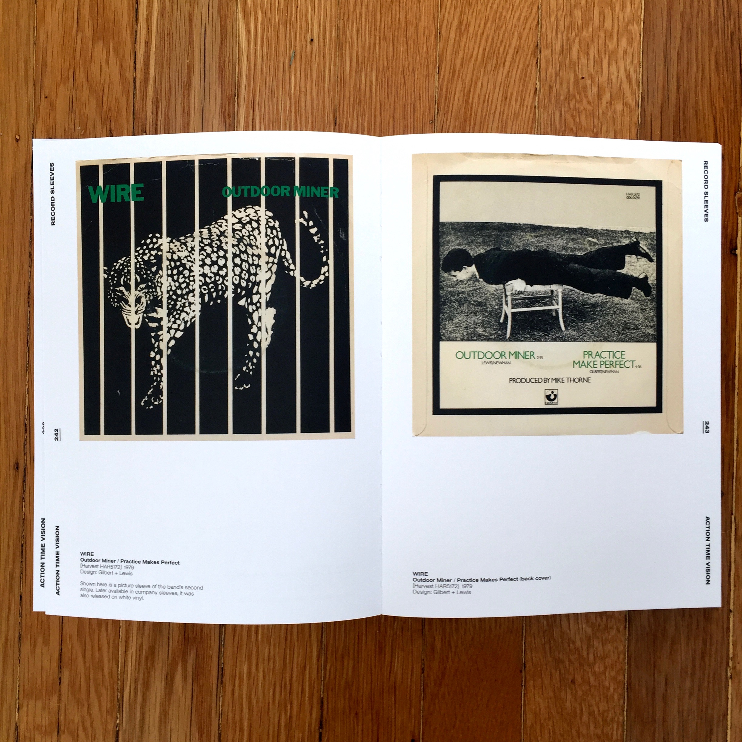
This book was a must for me. Although a little too young for Punk the design has resonated with me as much as the music over the years. It's a great collection of punk 7" single sleeves spanning from 1976 to 1984, and features such design legends as Malcolm Garrett, Peter Saville, Barney Bubbles and of course Jamie Reid. The book is created from the collections of Tony Brook and Russ Bestley. Russ is an ex Portsmouth design grad (was in the year below me) and a regular collaborator with the Ian Noble. He's also considered one of the world's leading authorities on punk and post-punk music.
It's yet another lovingly crafted book, designed by Callin Mackintosh. Mine came with four buttons (badges). Of which "99% IS SHIT" is my favourite, but "NEVER BEEN IN A RIOT" is a close second.
Grab a copy here: action-time-vision
or check out another of their publications I have here: FHK Henrion