
Reading Aaron Marcus' interview in Letraset The DIY Typography Revolution reminded me that a while back I took a few pictures of his work when on a visit to the Letterform Archive. They have a large amount of his work, which includes plenty of his Letraset based compositions. Also he recently gave them his complete reference library, which is a fabulous insight into the ideas behind his creative process.
If you join the Letterform Archive you can get access to beautifully shot (much better than my iphone pics) high res versions of this work and a tonne of other amazing pieces by him and 1000s more items.
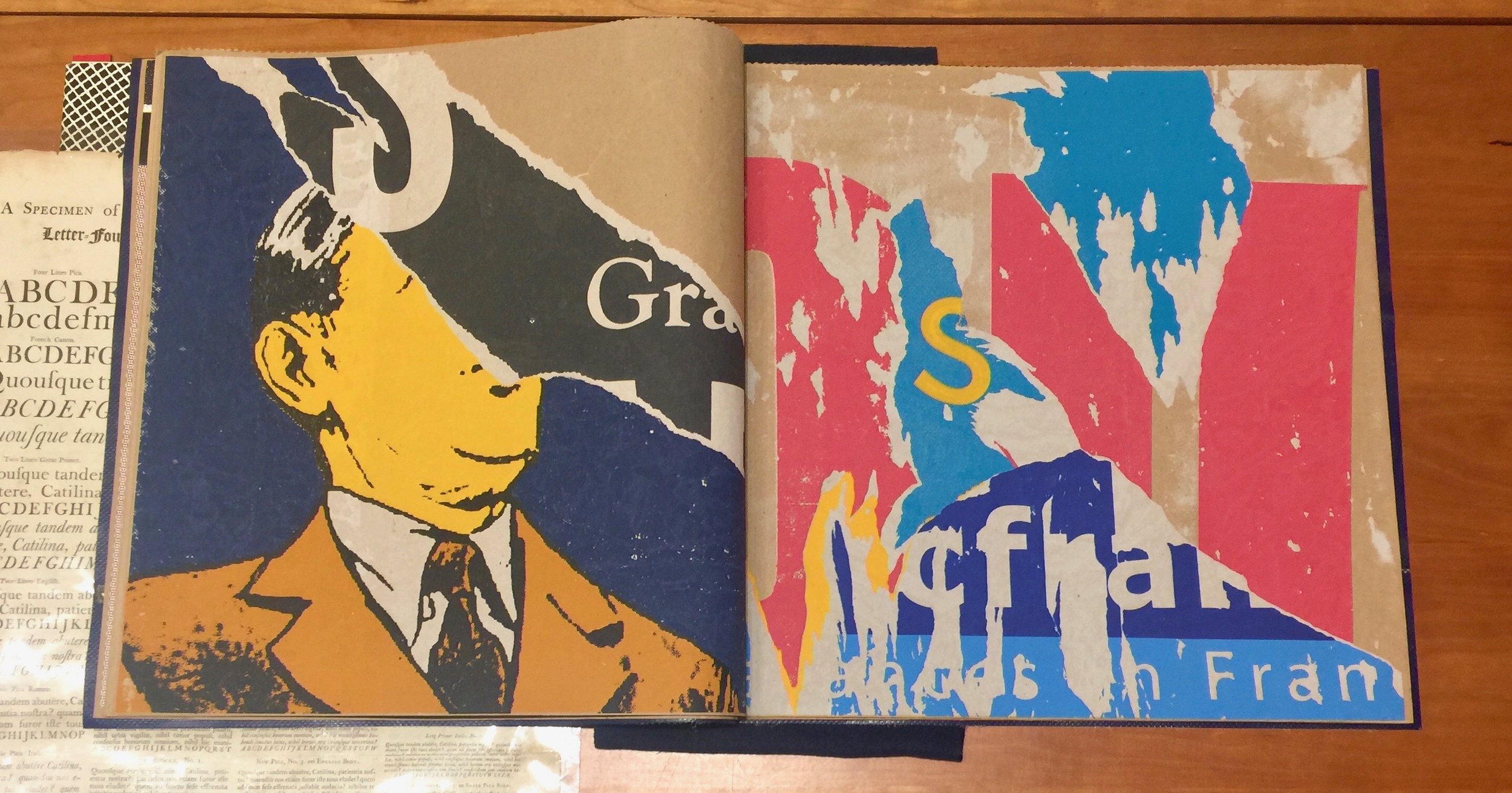
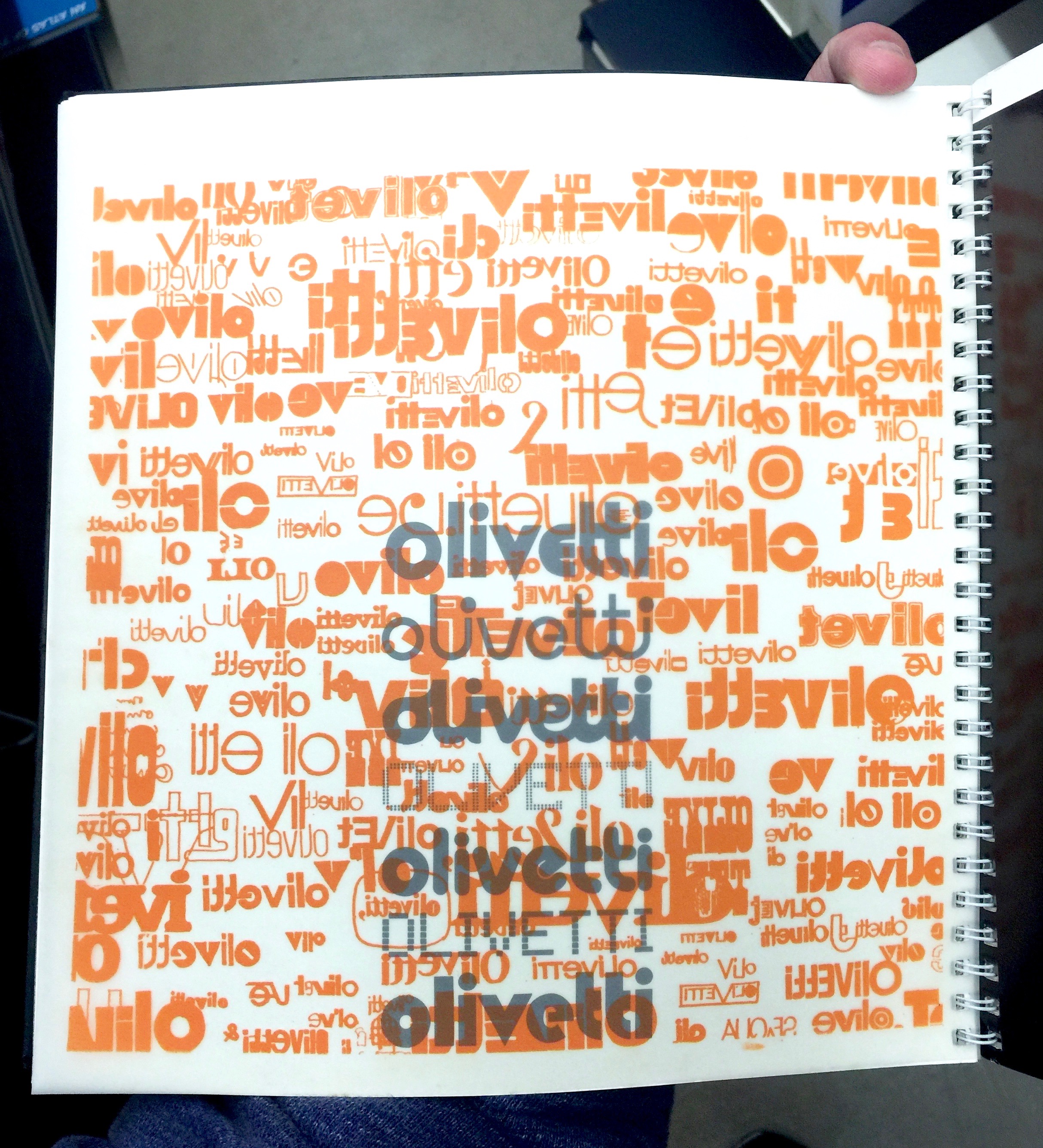
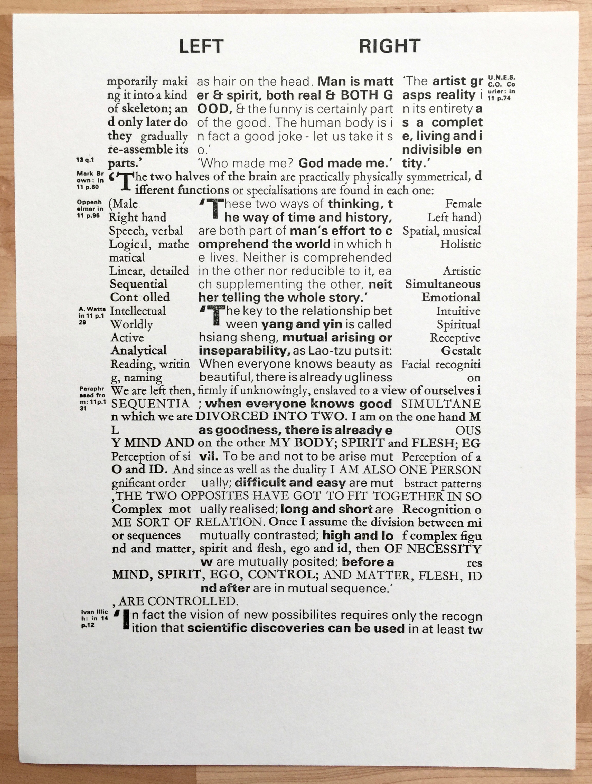
Whether you call them art, concrete poetry or typographic experiment I can't help but love these compositions. The energy and flow of them is outstanding - totally my bag.


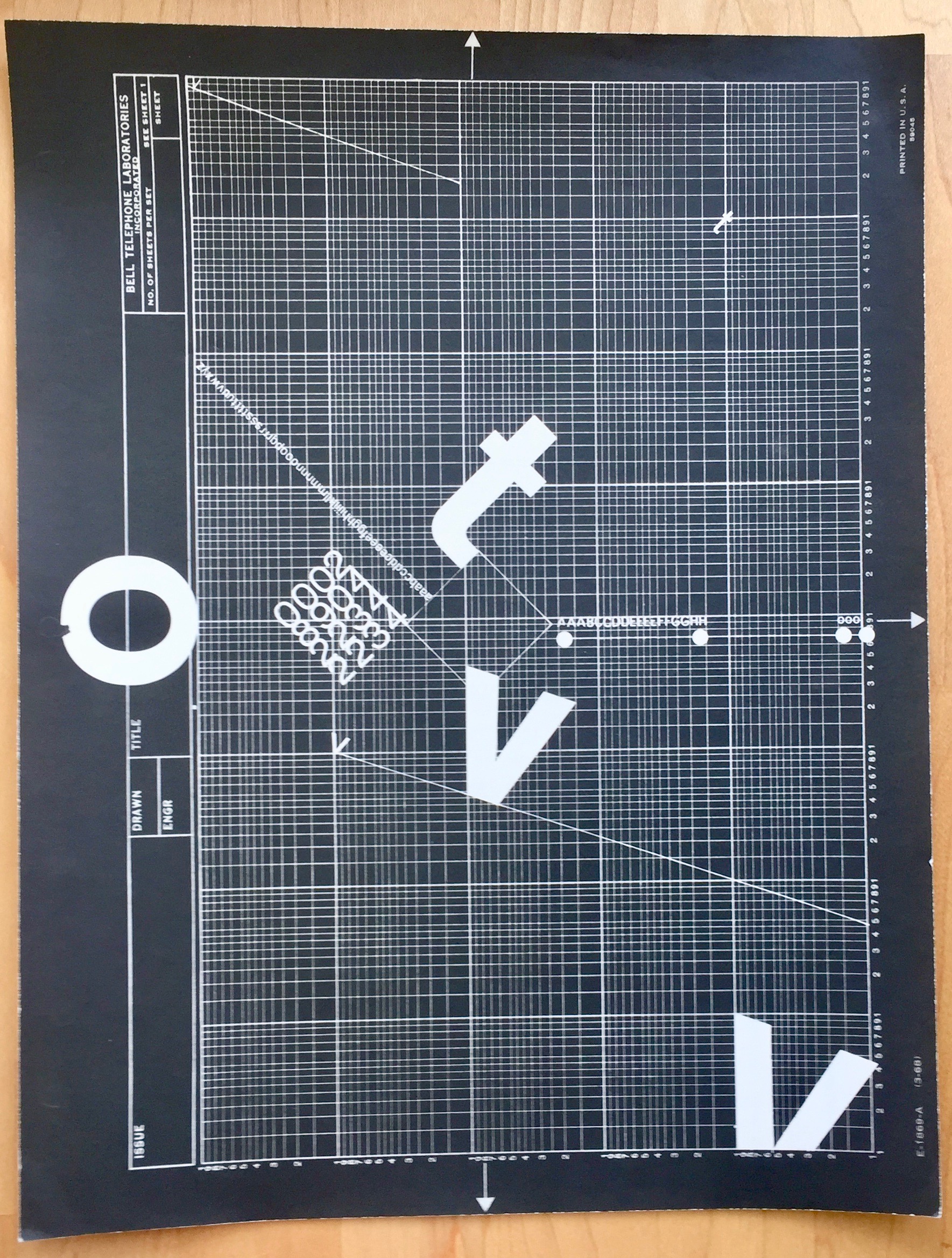

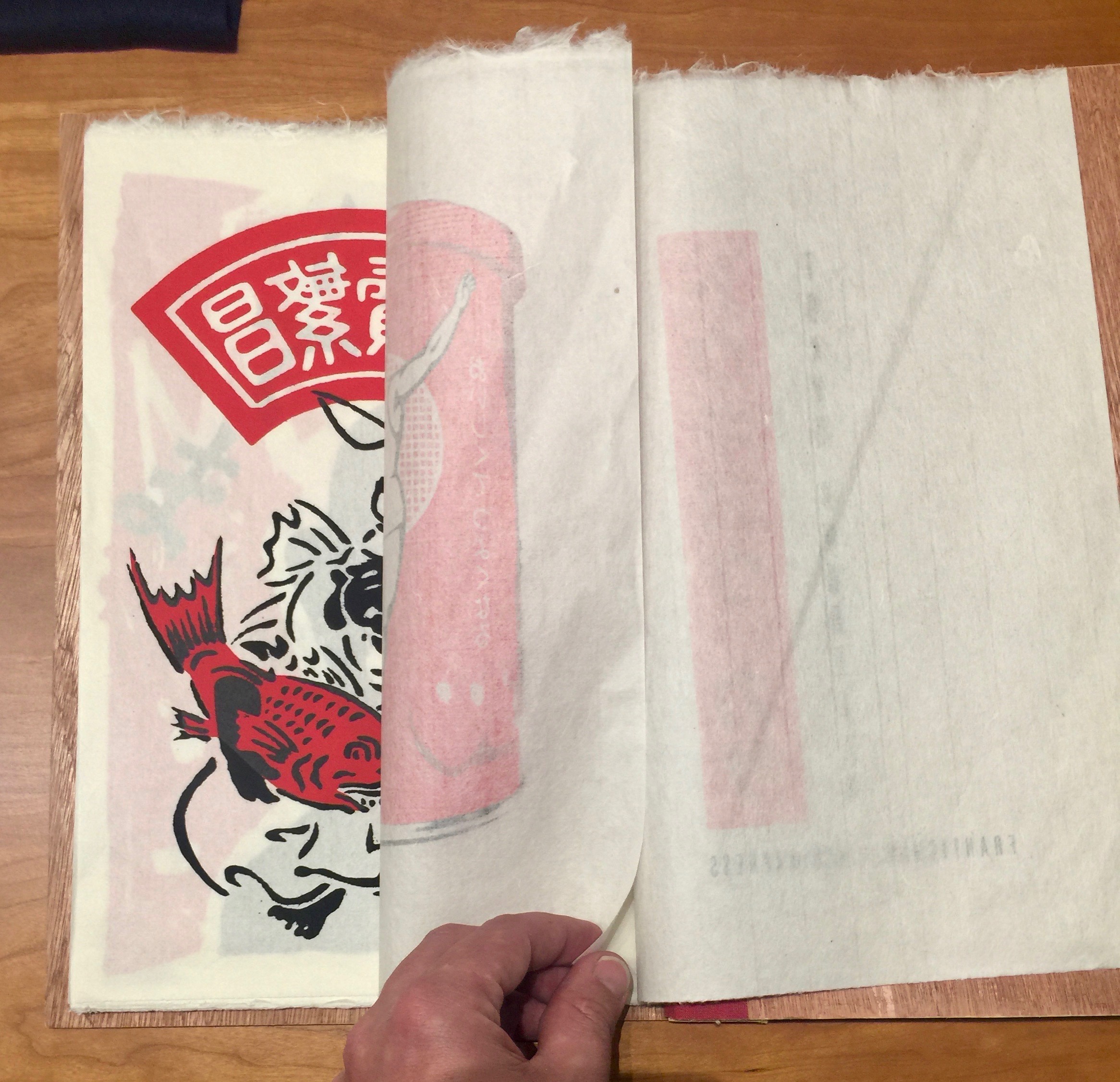
Now one of the trickiest things about these pieces is working out which way up they go. So apologies if some of the above are wrong.
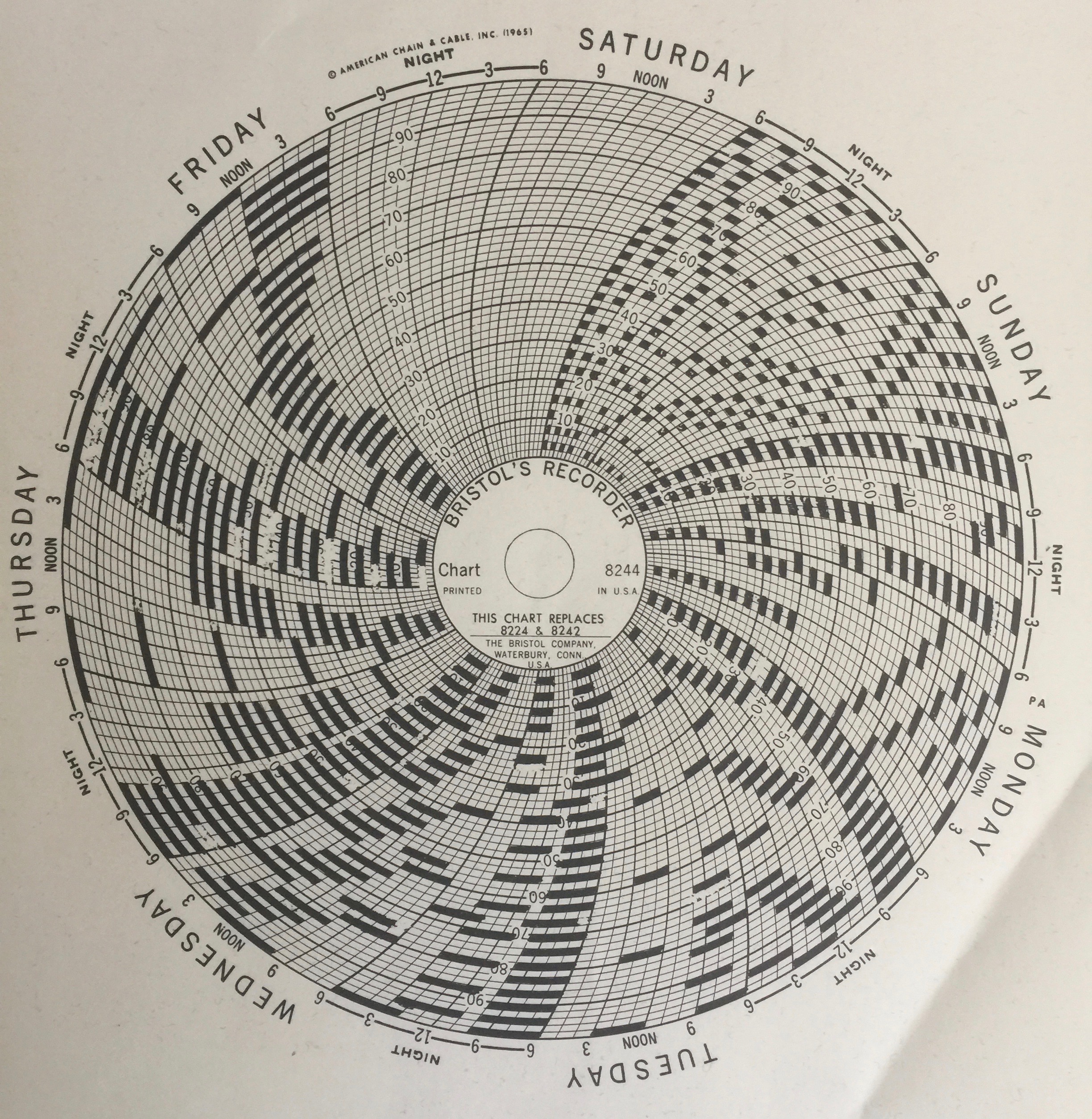
This one had me really confused (because of the annotation) so you decide:


If you're looking for a little information and even to get hold of some nicely shot high-res images of his work, then check out this piece on Letterform Archive.
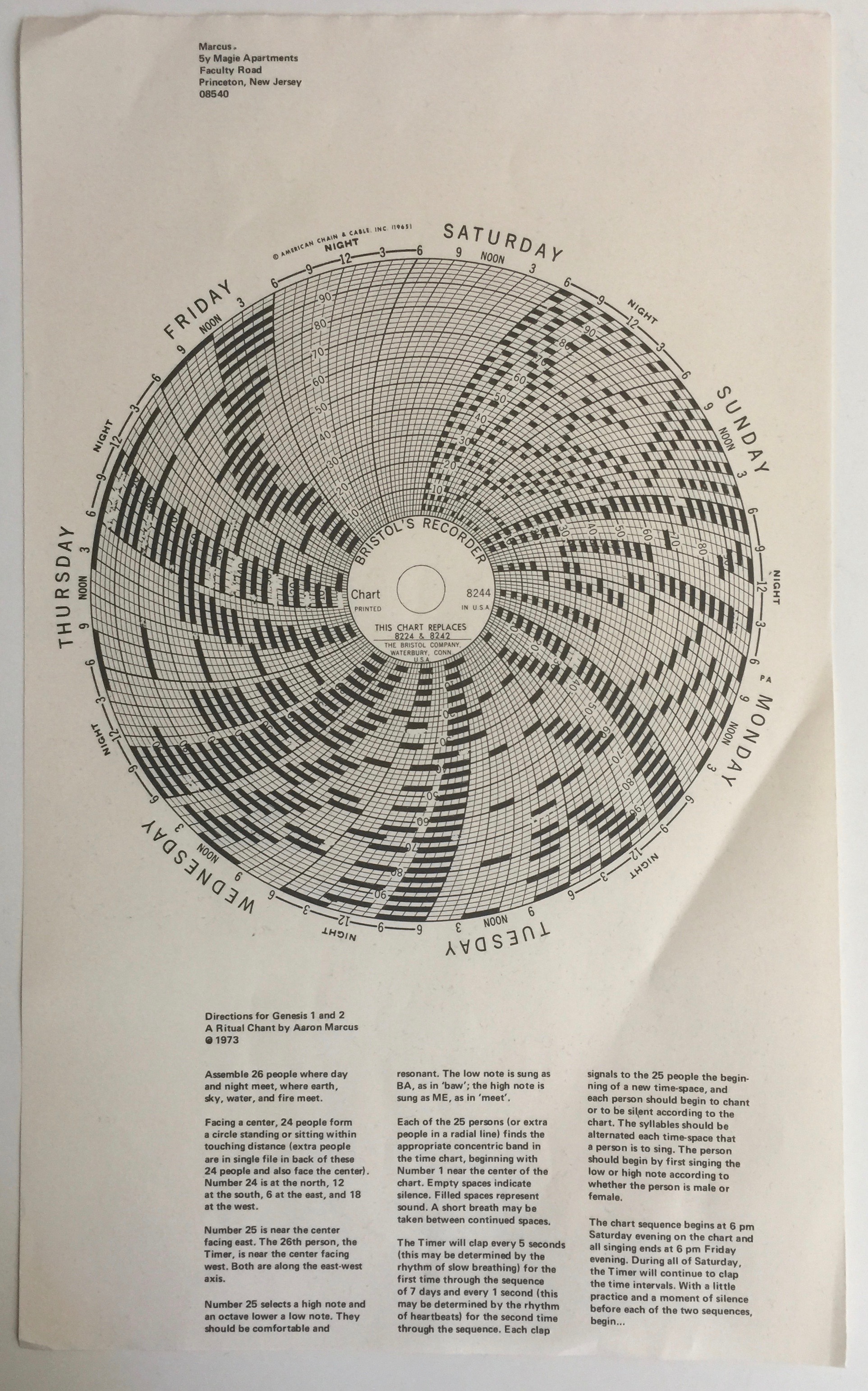
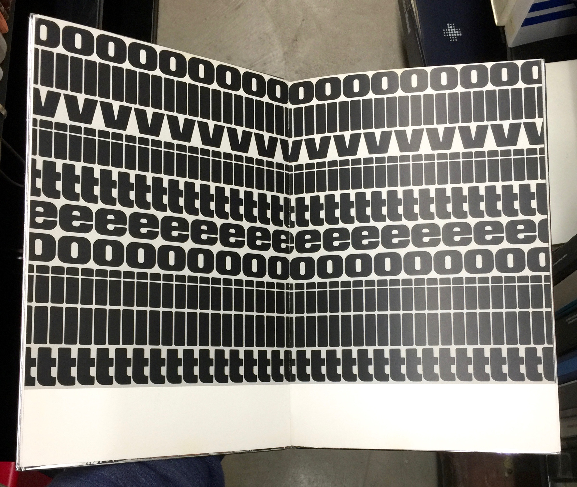
But for now here's a taste of another piece Directions for Genesis 1 and 2: