1990s (7)

A pamphlet. It has 2 retro male faces and the title of The Immediasts Seizing the Media

The Immediasts

For me this pamphlet sums up a lot of the themes and ideas driving the DIY culture movement from the early 90s. The main thrust, back then, was getting access to the methods of production and broadcast of media. And for this pamphlet broadcast was…
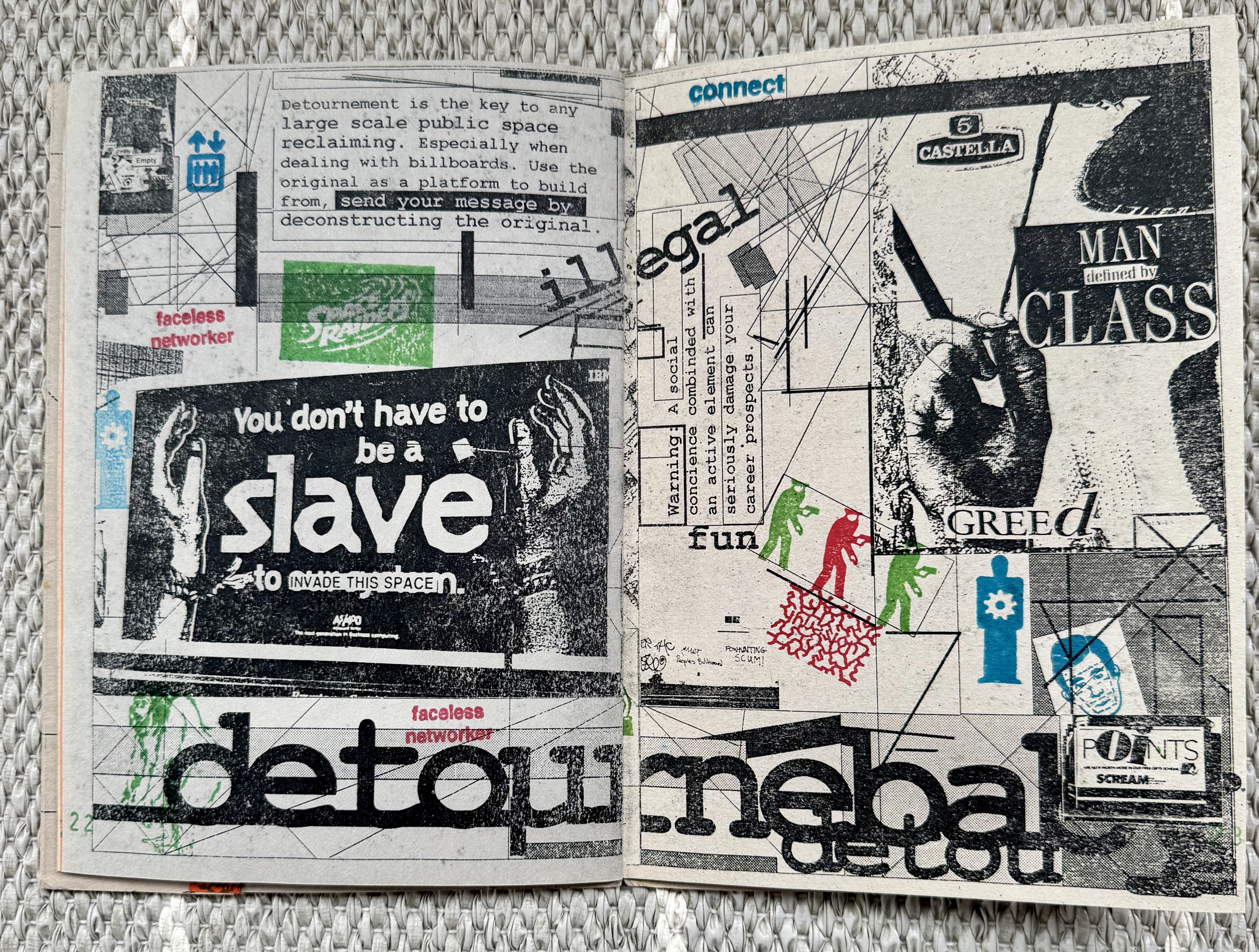
A double page spread of a photocopied, rubberstamped and stickered zine. It is a noisy layout of text, images and icon.

Invasion

Invasion was a 'seizing the media' event held in Portsmouth more than 30 years ago. In the heady days before widespread use of mobile phones, internet access and well before social media. It was inspired by the many DIY culture events of the early 90s,…

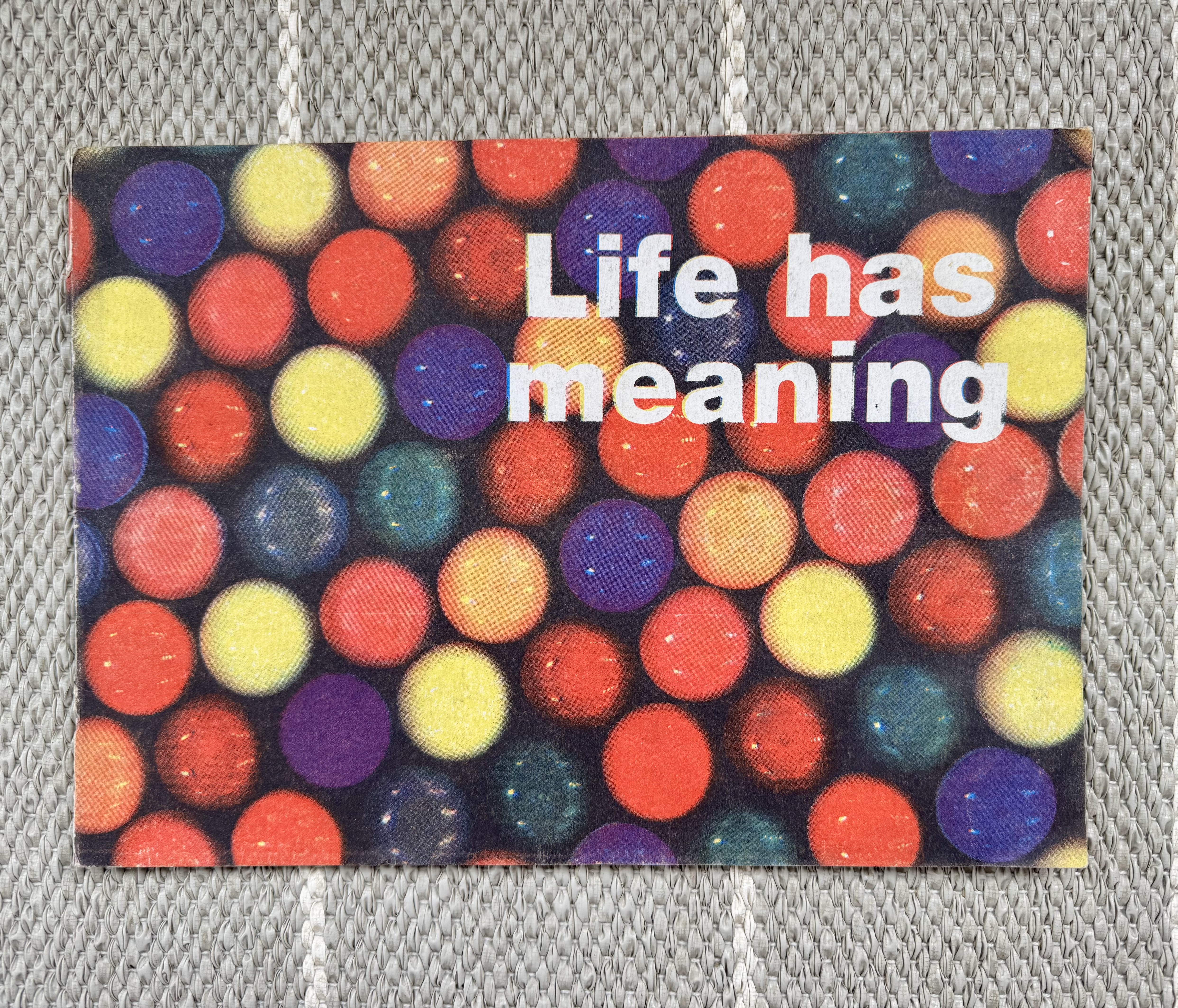
A brightly coloured A4 landscape book with a bold white title saying Life Has Meaning

Mark Pawson

The world lost Mark Pawson a little over a year ago (March 2025). I met Mark back in my student days and was fascinated and inspired by his art. His blend of "trash" culture, ephemera collection (he didn't do this cynically, it was not some…

The cover of the A-Z of The Designers Republic, which is silver and features a DR style character and ASTDR in signature neon or piped letters

The vast A-Z of The Designers Republic

I’ve had this a while and finally gotten around to posting it. Mostly because there’s so much of it! AZTDR or A-Z of The Designers Republic is a vast body of work from the Sheffield duo. Chocked full of commercial, personal, political, cultural and random…

The Letterform Archive logo, which is 9 As rotated in a circle but each A gets progressively heavier in weight, starting at 3 o'clock and moving anti-clockwise

Letterform Archive - an eclectic sample

One of the things I love most about visiting the Letterform Archive is the impromptu discovery of awesome bits of design. You can book a research session with them and get a focussed deep dive into a particular subject area, but as a volunteer you…

The large A3 sized landscape journal that is Semiotext(e) Architecture. The photographic cover features the title inside 2 syringes

Semiotext(e) Architecture

This is Semiotext(e) Architecture from 1992. It's a massive (44x28 cm) landscape orientated collection of essays, experiments and ideas focussed on design, architecture and theory. I included the shot with my feet just to show it's size when opened. Totally unmanageable and doesn't fit on any of my…

Head magazine, featuring a fish interlaced with a barcode on the cover

More from the '90s self publishing scene

Head Magazine I've posted previously about how there was an idea in the early 90s of DIY culture. This manifested in many ways from 'crusty squatters' and indi-networks through to self publishing and a revival of the punk aesthetic and the 'zine. This post is…

🦣 🦣 masto.paperposts.me 🦣