PaperPosts:
Print, paper, mail art and ephemera

The typography journal Spin in the plastic bag it came in

Spin - Adventures in Typography

Last month I was back in London, for the first in years. Amongst other things I simply couldn't resist the opportunity to swing by MagCulture - always a treat and chocked full of incredible publications and gems. Unfortunately I had to limit my purchases as hand…

A facsimile of the Depero bolted book

The Depero Bolted Book - a facsimile

Depero Bolted Book facsimile and the Reader's Guide by Designers and Books It's been way too long since I had something to post about, so when this arrived this week I was doubly happy. Some time ago I backed the kickstarter campaign to create a…

The cover of the Graphis annual Graphis Diagrams with a pseudo visualisation on red lines on the cover

Graphis Diagrams - 1974 data visualisation

I've been after a copy of Graphis Diagrams ed. Walter Herdeg (Graphis, 1974) for years. Always hoped I'd find it in a second hand book store, alas in the end I snagged it on Amazon Marketplace. It's had the edges 'repaired' or at least protected with…

a pamphlet showing a picture and the name of George Maciunas, he is short haired and wearing round glasses

Rediscovering George Maciunas

View fullsize Last week I came across a fantastic article on Hyperalergelic about mapping art movements, which in turn led me to George Maciunas' Fluxus timeline. I'd forgot how much I love his graphic design and typography. Luckily there's a pretty good facsimile version on…

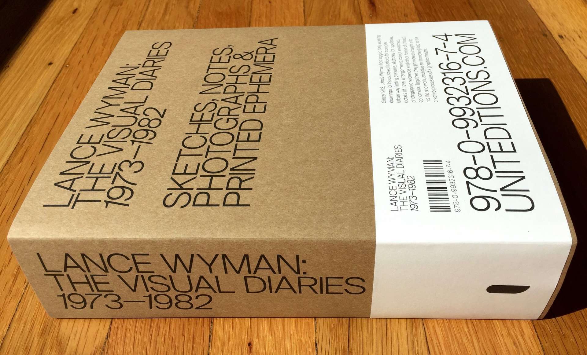
The Lance Wyman visual diaries book, it is a very large heavy looking book

Inside the design process of the great Lance Wyman

What seems like a very long time ago I sponsored the Lance Wyman Visual Diaries project on Kickstarter. Another amazing and ambitious project from Unit Editions. Yesterday the swag arrived, and boy was it worth the wait. The pack included; a boxed version of Lance…

An IBM brand book, it is black with small primary colored IBM logos gravitating towards the center

Letterform Archive - brand and design guidelines

As you'd expect, the Letterform Archive has a lot of identity and brand guidelines. Many of these are not very glamorous, often simply presented in ring binders, but they are graphic design gold. On a recent visit I spent some time cataloguing them. Here are…

The Letterform Archive logo, which is 9 As rotated in a circle but each A gets progressively heavier in weight, starting at 3 o'clock and moving anti-clockwise

Letterform Archive - an eclectic sample

One of the things I love most about visiting the Letterform Archive is the impromptu discovery of awesome bits of design. You can book a research session with them and get a focussed deep dive into a particular subject area, but as a volunteer you…

🦣 🦣 masto.paperposts.me
🦣 🦣 🦣 🦣