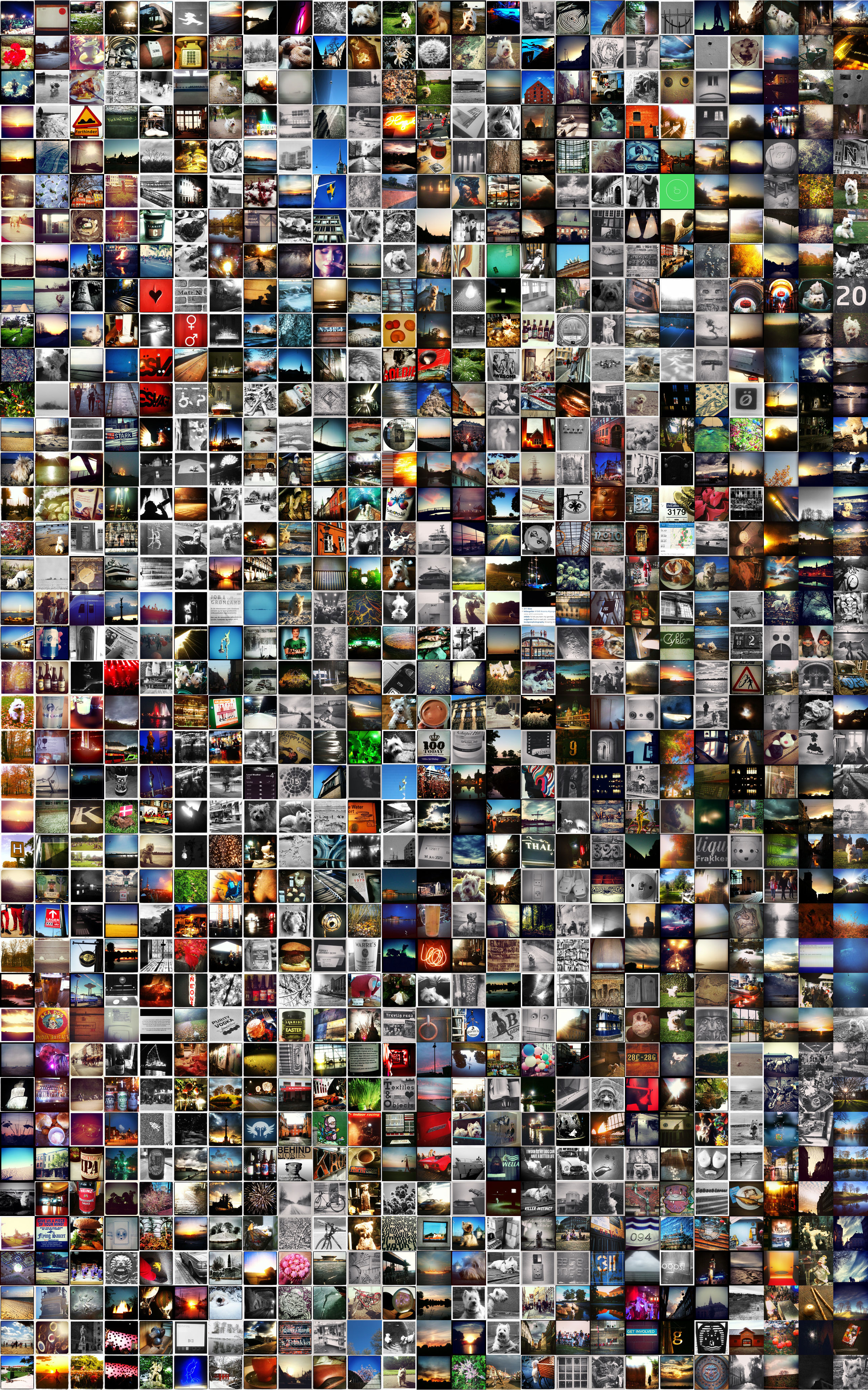
We all knew that Yahoo would be the kiss of death for Flickr. When they first took over it was the horror of moving from 'oldschool' flickr account to Yahoo account with all it's log on horrors, invasive signup and clunkiness. But the years went by and Flickr was still Flickr. Many people like me upgraded to Pro accounts and threw our images up into the cloud, where we were content to share them and manage them. Always secretly hoping someone would discover our 'brilliance'.
When the new kids appeared it was Facebook that drove the social image, the 'friends at play' and the holiday pics. No one sent out Flickr invites for holiday pics anymore, they were on Facebook - "why would I need to invite someone? " Of course a few of us resisted the assimilation (and still do) . But then Instagram got it's hooks into me and that was that. It became my social image space, where I was happy to have strangers see my images and even comment on them. I knew the rules, it wasn't my intimate moments it was snaps and fun images and it was with me all the time on a near immediately gratification loop. Flickr became the place where 'real' pictures went, or where I stubbornly adhered to ideas I'd started on there through sets and groups. The thing is, it's the social bit, the fun frivolousness, and above all instantness of Instagram that keeps you engaged. Flickr felt like the boring friend you'd known since childhood and had taken a very different path in life. You still feel obliged to spend time with them but it always feels like a chore - especially when you could be having fun with your new friends.
Yahoo obviously saw this (after all their numbers must have been plummeting) and decided to act - FULL REDESIGN. Predictable response, and not always the right one. Especially as it meant they needed to pull a fast one on all the Flickr Pro members to get the new model in place. This left the community feeling a little sour.
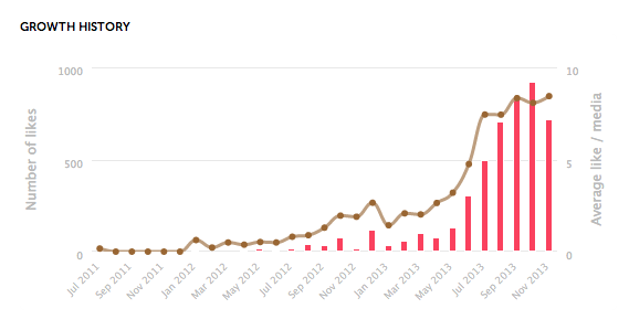
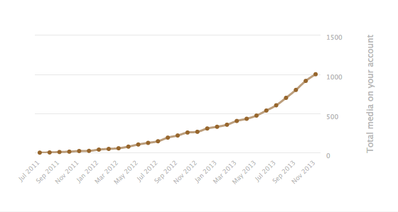
So it's been a few months since the redesign, I've abandoned the Pro account and essentially have abandoned the account in general. Last weekend I uploaded a bunch of images but it was the first time in months. Is this a result of the design change or is it simply that they are too late and stuck in an outdated model?
It seemed such a good approach:
- Make it all about the images (and video)
- give people tonnes of space
- Focus on the people and activity
- Make it all HTML 5 and look like a modern site
Good try but not enough. From a design point of view the images never seem to be at a useful size for the device I'm viewing on and the video experience just isn't as good as elsewhere. The 'activity' stuff is just too late, sorry the other players do it better. The modern site, yes looks clean but the navigation is horrible, full of dead ends, traps and remnants from the old site. It just doesn't do it for me.
So as Yahoo struggles to reinvent itself and it's services, are we seeing a strategic play to appeal to an aging web population? After all, the new brand and a logotype looks surprisingly like a masthead from an early 80's crossword magazine. Maybe they want to be the boring old friend/relative that you feel obliged to spend time with? You never know as these services get ever more ubiquitous and experiential they could add their own scent - perhaps it will be cat pee.