
The Brick Index
Living in California means I live in a wooden house, which feels like I'm the second of The Three Little Pigs. But I grew up just north of London in a brick terrace house so this book on bricks from brickworks across the UK had…

Living in California means I live in a wooden house, which feels like I'm the second of The Three Little Pigs. But I grew up just north of London in a brick terrace house so this book on bricks from brickworks across the UK had…
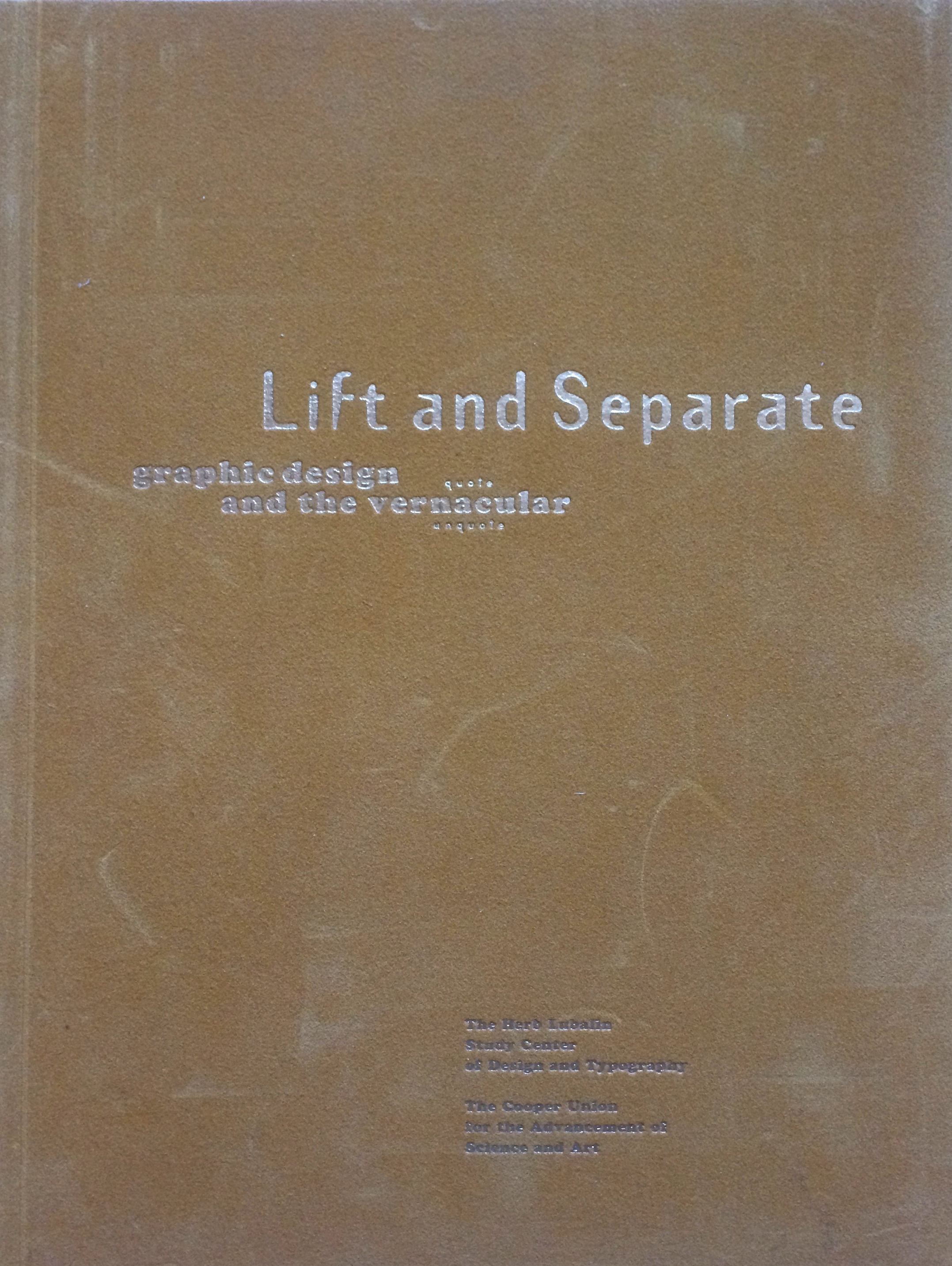
Lift and Separate is a lovely tactile journal, very much in the spirit of Emigré and Eye. It was published circa 1993 by the Herb Lubalin Study Center. What I really like, is the piece on vernacular and the journey from drawing fanciful letters in a note book to purging the ornaments…