PaperPosts:
Print, paper, mail art and ephemera

A book, with a silvery blue cover and the title, Wait You're Not a Centaur.

Nate Denver's poems and songs

Recently I visited McSweeney's in their office on Valencia in San Francisco. They share a space in the building that used to be home to the rather magical little book/art store Little Otsu. They have since moved to Portland, but it reminded me of this…

Issue 1 of the  The Office for Creative Research journal

Issue 1 of The Office for Creative Research's journal

This was an absolute must for me. Not least because I'm a print and design obsessive but also because I work in the data visualisation and analytics field. And it didn't disappoint! Beautiful. A lovely piece of design from The Office for Creative Research (o-c-r.org) . Best of all the…

a small hardback book - 101 things I learned in Architecture school

A lovely little book - 101 things...

Picked up this lovely little gem, 101 Things I Learned in Architecture School by Matthew Frederick. Each spread is a single idea, technique or concept. Great illustrations and wise words throughout. I really love the board cover and binding. Another nice touch is the numbering and the…

5 books arranged on a floor, from McSweeneys

A bumper haul of McSweeneys

This weekend I went to the McSweeney's pop up kickstarter event on Valencia Street in San Francisco. I'd already backed the campaign but thought I'd swing by anyway. So glad I did! Met some great people and came home with this small haul of books.

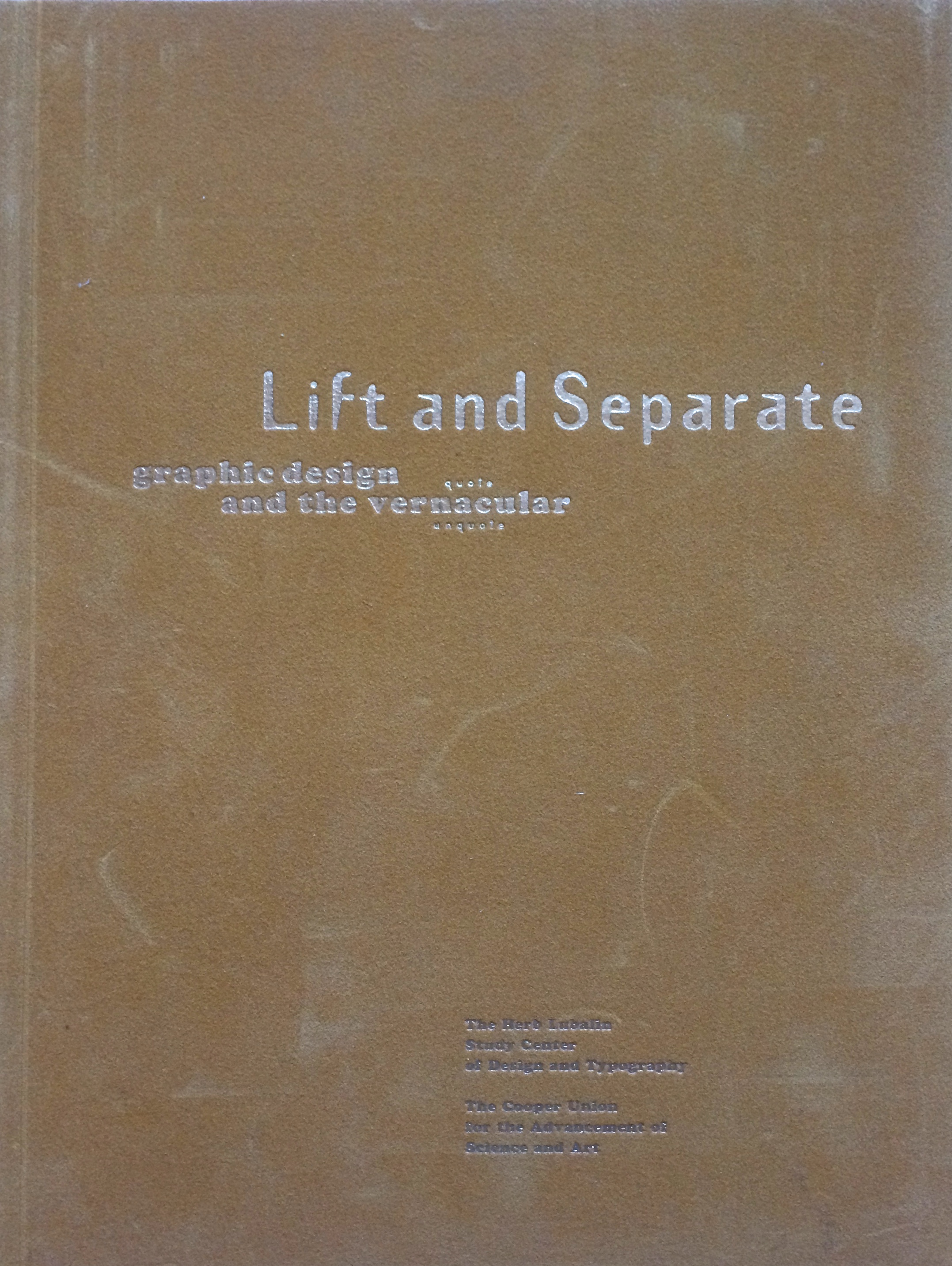
A typography and design journal called Lift and Separate

Lift and Separate - a graphic design journal

Lift and Separate is a lovely tactile journal, very much in the spirit of Emigré and Eye. It was published circa 1993 by the Herb Lubalin Study Center. What I really like, is the piece on vernacular and the journey from drawing fanciful letters in a note book to purging the ornaments…

2 heavy, orange bound tomes featuring Emigre magazine

Emigré the journal issues (33-49 bound)

I have a few loose issues of Emigré so when the bound volumes were released I had to grab them. These are from the more theoretically engaged period, epitomized by the mouthpiece series. Great to look back on and see the issues that raged and in…

Issue 26 of Emigre magazine, with blue cover with flame motif

Issue 26 of Emigré magazine

This is one of the later issues (No. 26 Spring 1993) of Emigré that was published in the large format. Fairly soon after this it went to a smaller journal like publication. Interestingly this coincided with a shift in graphic design writing. A move away from pure design expressions…

🦣 🦣 masto.paperposts.me 🦣