Cards Against Humanity - xmas 2017 campaign

As you probably already know, I really like cards and card systems. The game Cards Against Humanity is a brilliant example of an open card system and I've posted before about one of the additional sets

The other thing that they are famous (infamous?) for, are their seasonal promotions. They have always rejected the traditional marketing dirge sent out around Black Friday and 'The Holidays', by creating some funny and often contentious campaigns. A few years back they sold literal bullshit to people at $5.80 a pop (more on that here). Then there was the Cards Against Humanity digs a really big hole campaign (that one really pissed people off). The 2017 campaign was equally great: Cards Against Humanity Saves America, well someone has too. 

It’s 2017, and the government is being run by a toilet. Last month, 150,000 people paid Cards Against Humanity $15 to save America with six days of incredible surprises. Throughout December, we will reveal the surprises here.

At $15 it was a no brainer. They've always done interesting stuff and given plenty to good causes. To be honest I wasn't expecting much to come my way, just hoped to see some hijinx and the odd piece Trump lampooning, boy was I wrong.

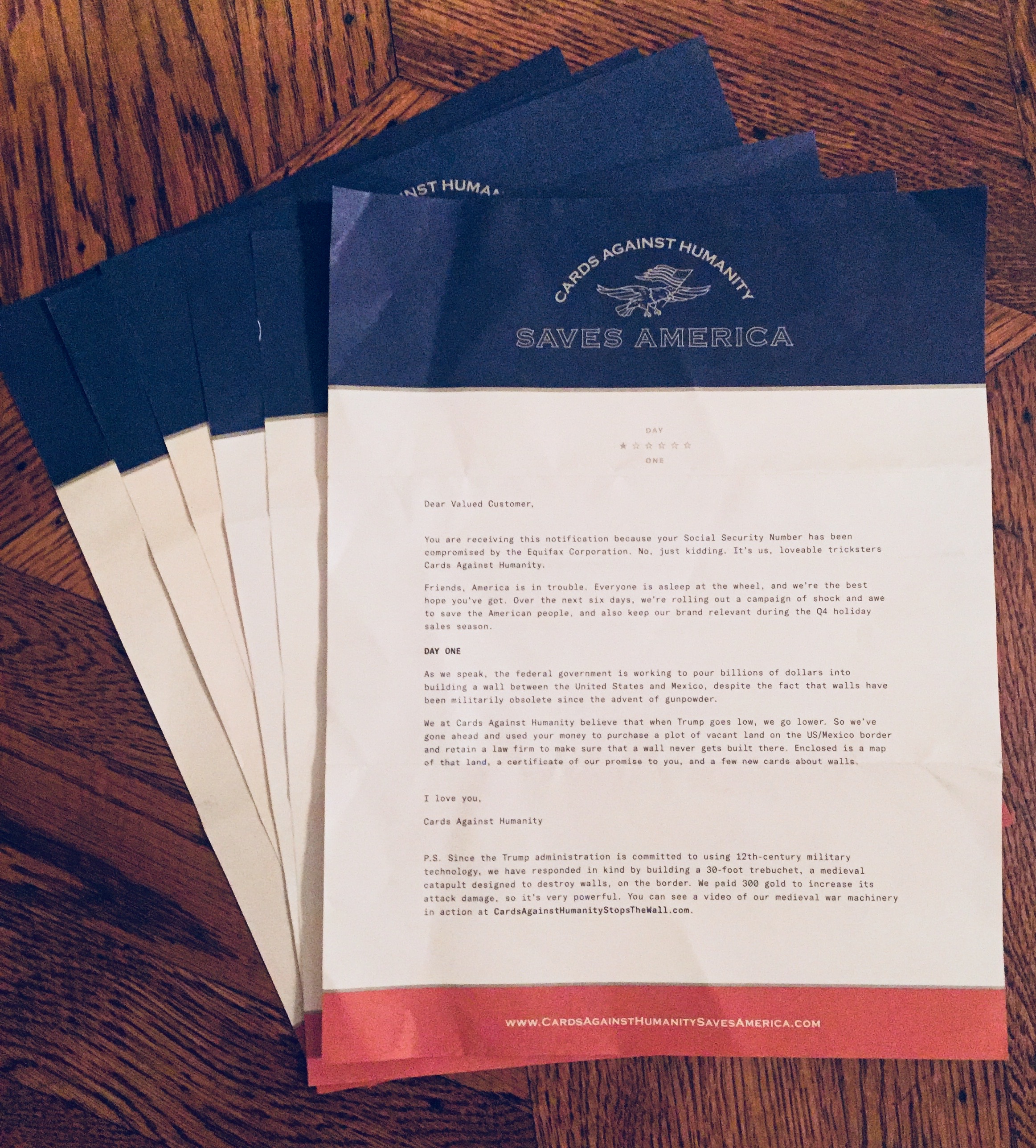
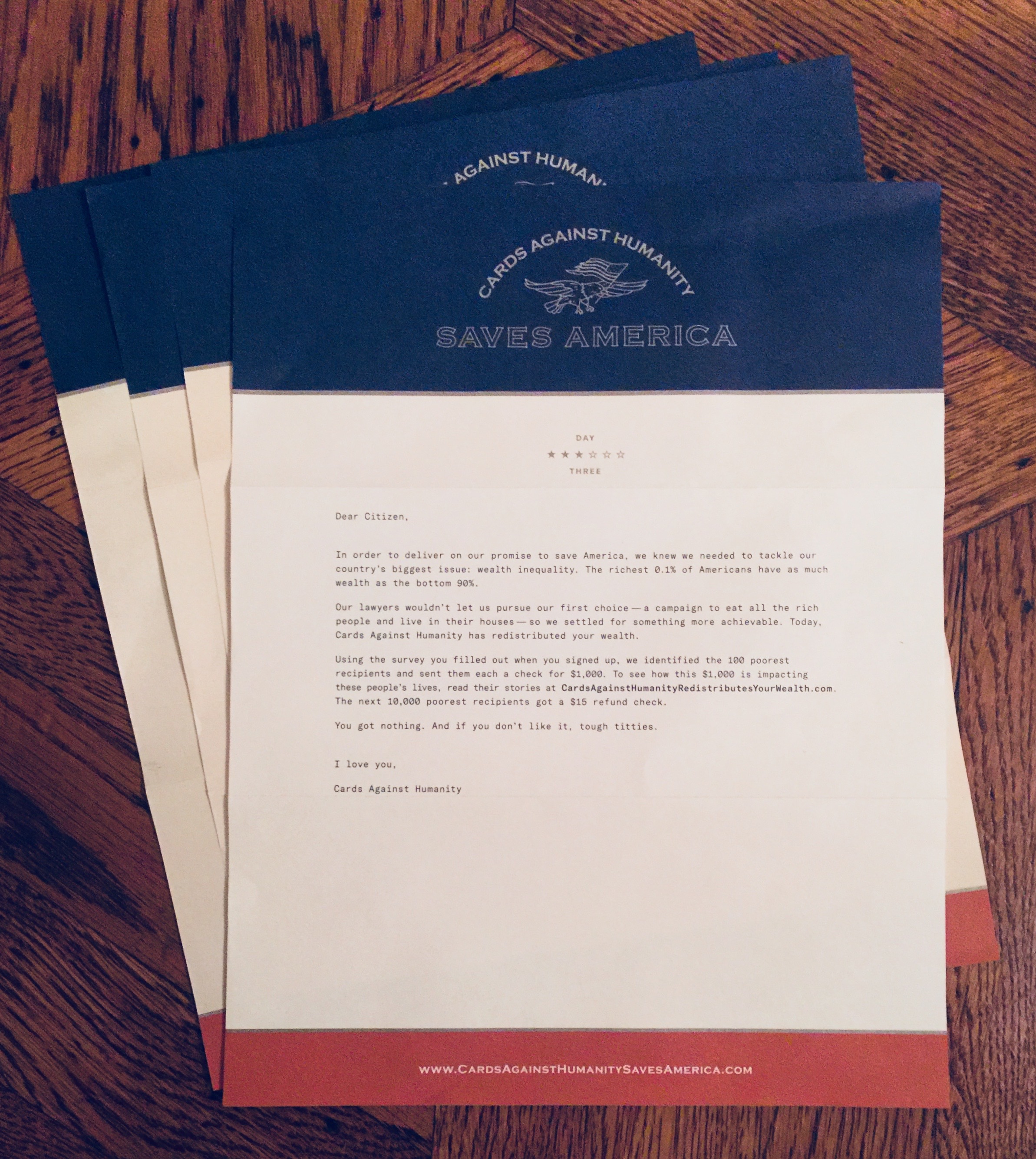
For each of the Six Days I receive a letter and some cards (always great) and then some other things supporting that day's specific campaign. The days are as follows:

  1. CARDS AGAINST HUMANITY STOPS THE WALL
  2. THE GOOD NEWS PODCAST
  3. CARDS AGAINST HUMANITY REDISTRIBUTES YOUR WEALTH
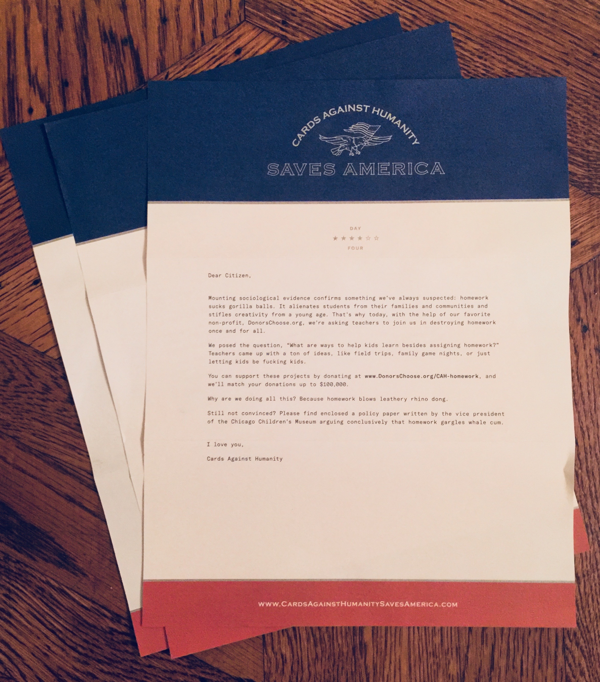
  4. CARDS AGAINST HUMANITY DESTROYS  HOMEWORK
  5. CARDS AGAINST HUMANITY’S PULSE OF THE NATION
  6. CARDS AGAINST HUMANITY SAVES BASEBALL

I'm not going to get into the ideas of campaigns here, I'll add links at the bottom. Today I'm just sharing all the ephemera. First up, the letters:

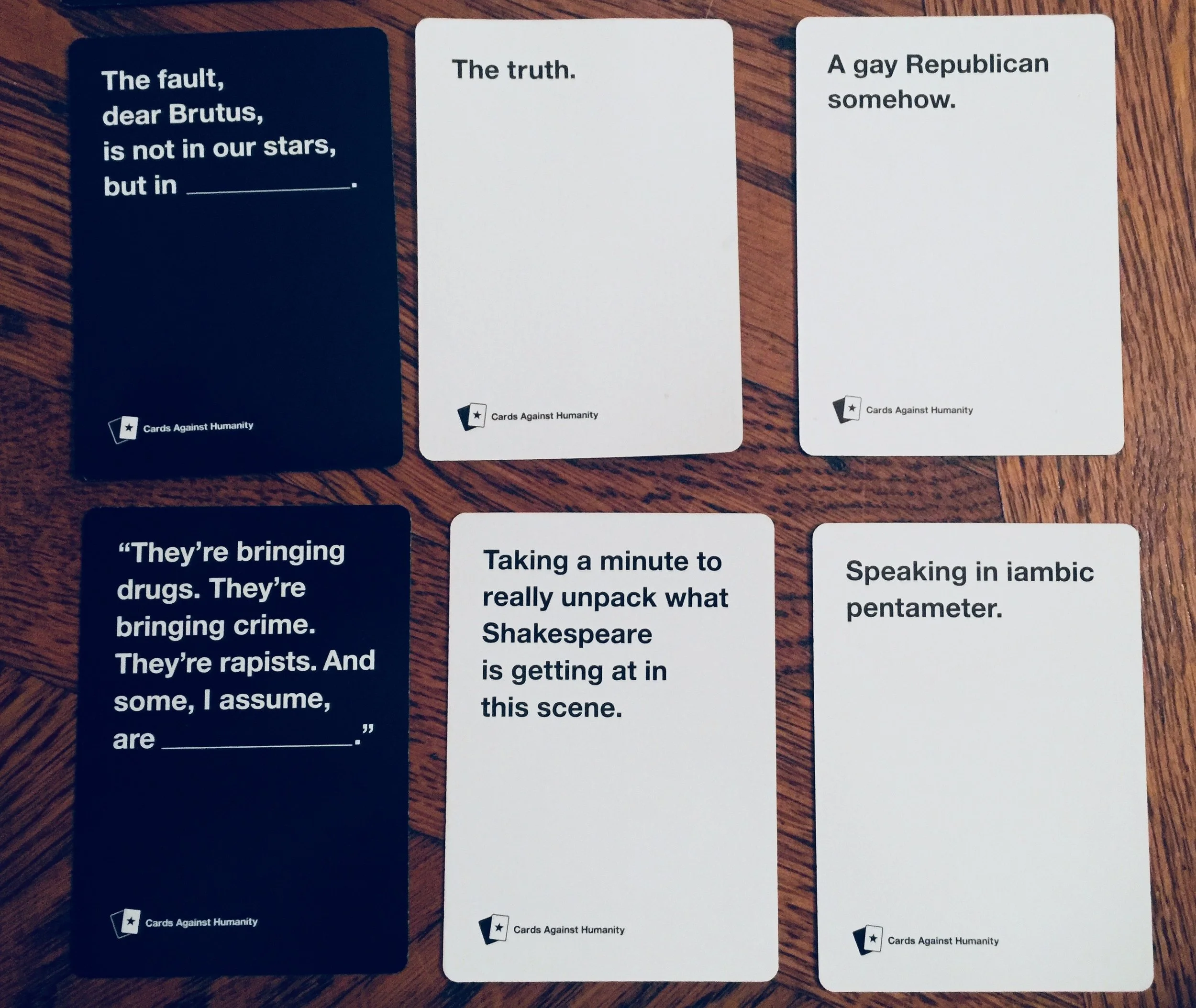
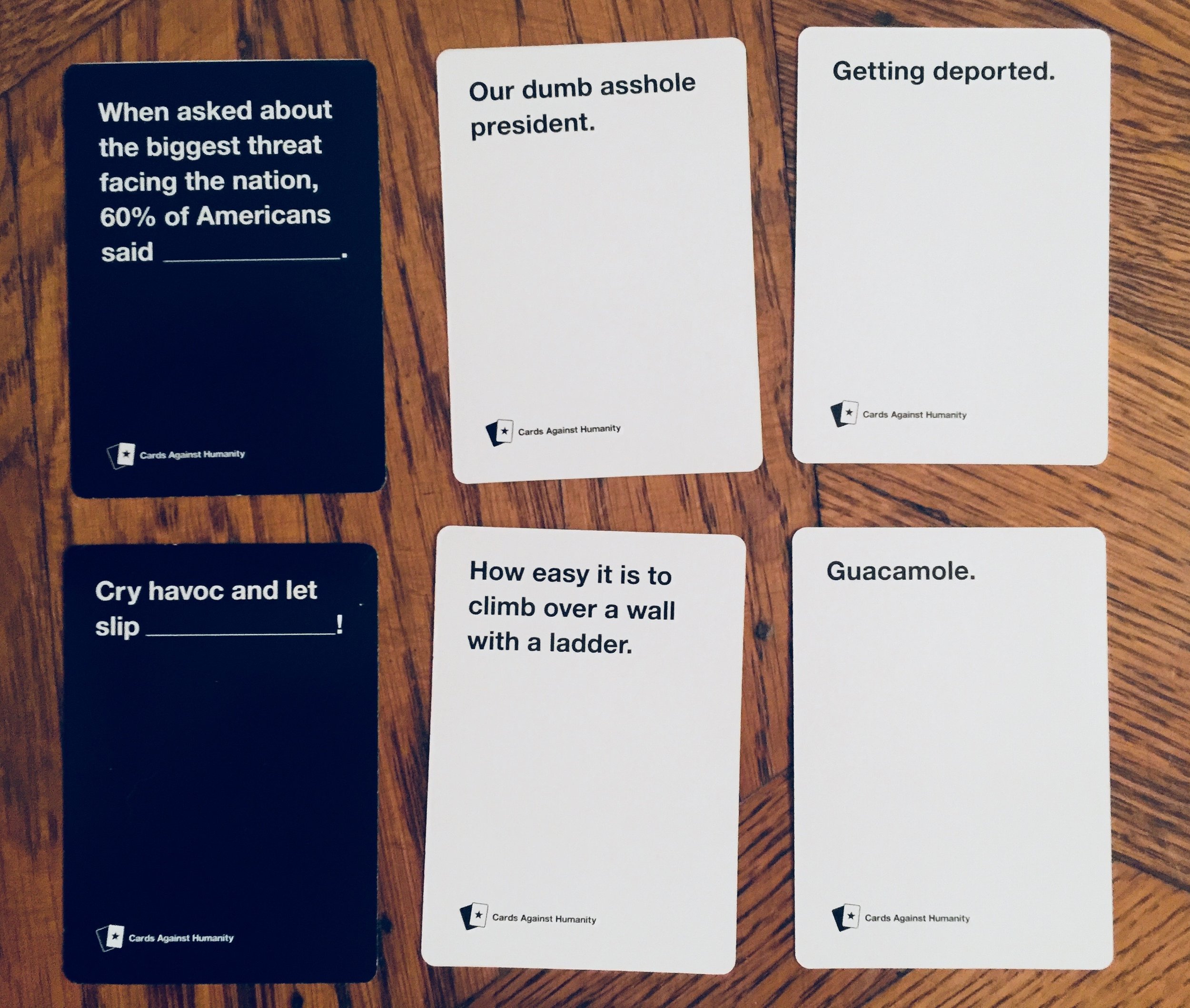
Then there are all the cards, here's a selection of my favourite combos:

And finally here's some of the other things that I received.

However, I can't for the life of me understand why they decided to save baseball.

IMG_0063.jpg

Way more than you'd expect for $15. Great work, great idea and lets hope they can continue to create challenging, frivolous and wonderful projects.

Anyway, here are a few additional links to the campaigns and issues:

Braun Design Guidelines - “The Realization of a Corporate Concept”

On my last visit to the Letterform Archive I got to have a look at some of the Braun design guidelines. These aren’t the Dieter Rams principles for good design, they are the translation of the Braun design philosophy into a set of brand guidelines. I do admire Dieter Rams and his work but I’m in no way part of the whole “Dieter Rams design cult” that seems to have sprung up over the few years in the UI/UX space, for me there's more to design than minimalism. However the guidelines have four parts and The Realization of a Corporate Concept part is chocked full of great design insight - a wonderful translation of product design into practice and on into brand.
Braun Design Guidelines


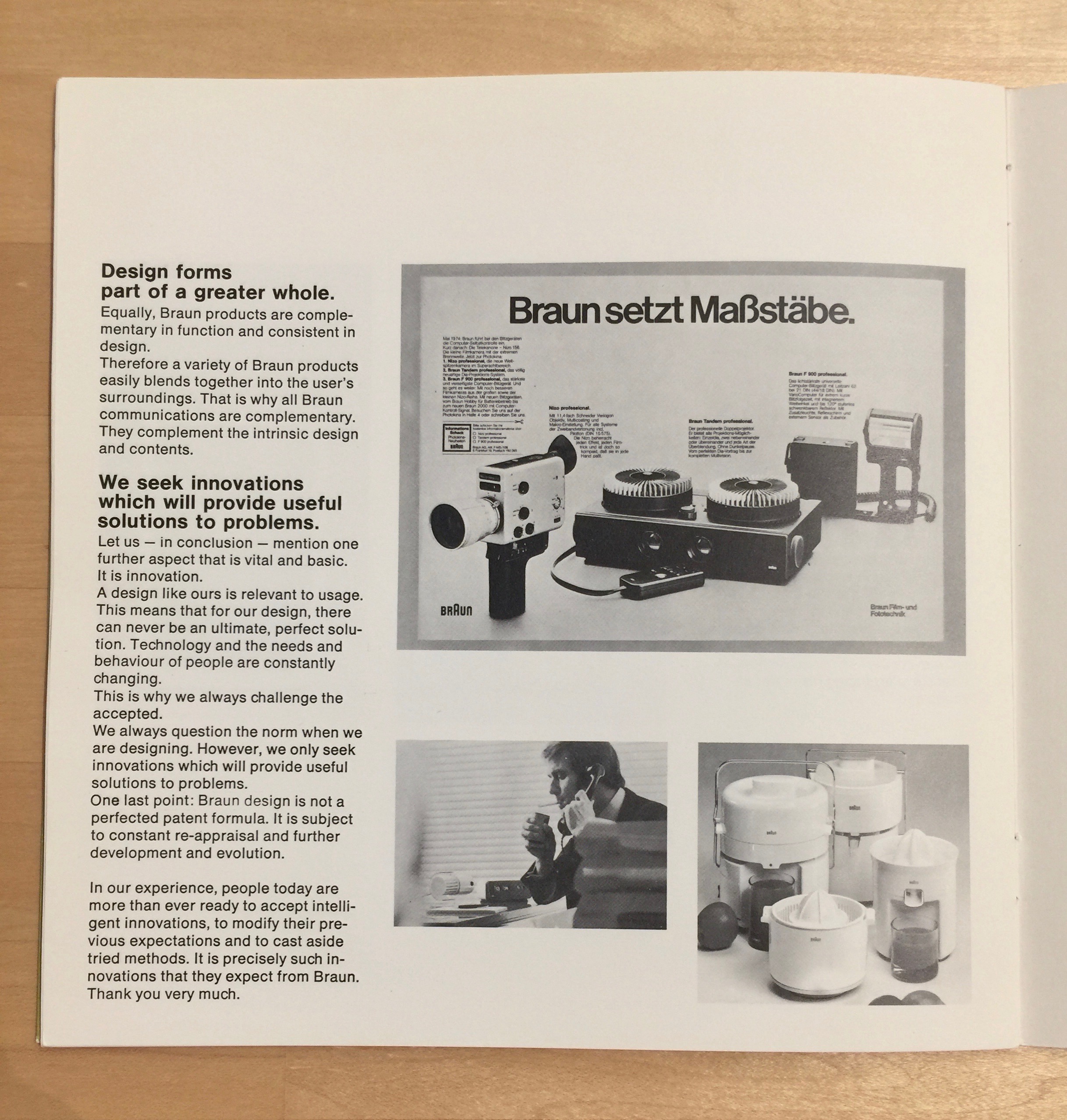
Here's a selection of pages from the guideline: 

These have some real gems on them, like:

  • Braun design is teamwork - I love this, so often we focus on the individual, but at the end of the day design is always a collaboration. It takes a lot more than 1 person to bring a product to life.

  • Design is not an applied technique of embellishment - damn right! Design is core to the essence of a thing; how it works, the intension of use, the expereince of the thing.

  • Design is not a transforming mask, nor an added after-thought - hence; "you can't put lipstick on a pig", "you can't polish a turd" ("but you can role it in glitter" as an old colleague of mine used to say).

  • The design must contribute to the use of a product and Design forms part of a greater whole - it must always be meaningful, it must support the overall purpose.

  • Consistency is an expression of our design philosophy - this hits home for me, it creates that underlying almost invisible sense of belonging and being part of the same family, so key for any organisation.

  • Communication and product must compliment each other - often there's tension between product and marcomms teams, but everything must feel part of the same overall aesthetic/ideals or there's an unsatisfying shock when someone experiences one then the other, mismatched marcomms can make a customer feel duped.

  • For us, good design means as little design as possible - not so sure about this, I'd say that the impression of 'little design' is still a lot of design work - at least in the technology field.

  • Our design is orderly - I love this as it seems to cut straight to the cultural heart of the brand.

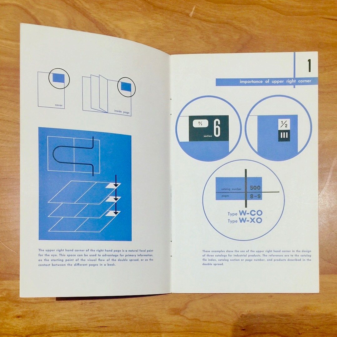
And here's part of the guidance for comms work:

IMG_0040.jpg

Whatever you feel about Braun and the elegance/tyranny (delete as necessary) of the modernist Northern European design aesthetic, these guidelines offer some great advice for product/brand teams and how they can come together.

Also take a look at Dieter Ram's now infamous Ten Principles for Good Design.