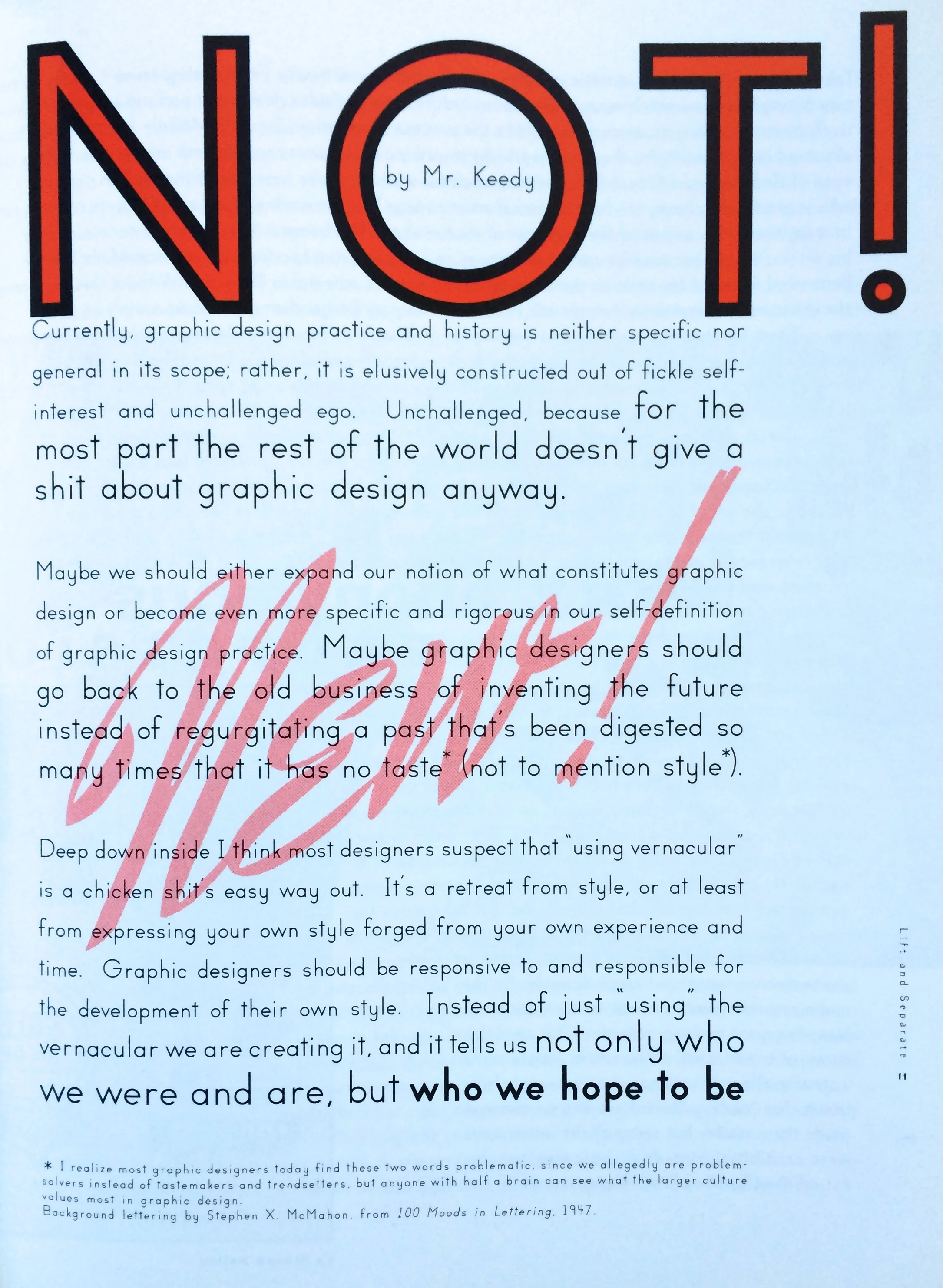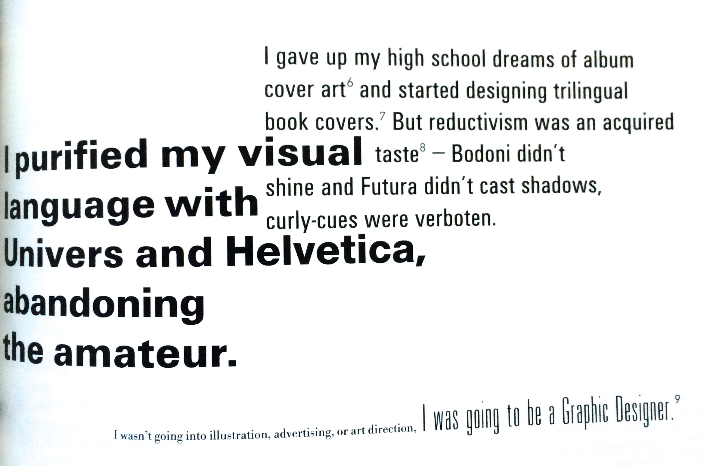
Lift and Separate is a lovely tactile journal, very much in the spirit of Emigré and Eye. It was published circa 1993 by the Herb Lubalin Study Center. What I really like, is the piece on vernacular and the journey from drawing fanciful letters in a note book to purging the ornaments and being a 'proper' designer. That shift to proper type and the favouring of Univers and Helvetica over all else. I think a lot of designers went/go through this, only to discover that the objective purity they believed those fonts provide isn't real, it's just another stylistic choice. As I've gotten older I've grown to love hand drawn, found and everyday type. The myriad of visual languages that exist outside the strict world of acceptable 'current' graphic design. There's something wonderful about the bad, broken and 'ugly' - but I do still love Univers.
×