
I was really disappointed when Twitter bought, then shut down Posterous. It was a great service and was the one blogging platform where the service and technology didn't get in the way. Posting by email was soooo easy and worked perfectly. I simply wrote an email and nothing got in my way, no badly written web client, no flakey and convoluted media uploader or file manager. It even understood the urls I used and did it's best to go and get the content and embed it. After years blogging false starts I'd found a way to create and share stuff which wasn't a chore and didn't impede me from the start. I loved the autopost features as they let me syndicate and promote my content on other more difficult to work with platforms. This meant I could still keep other blogs running without abandoning them. Admittedly if you did have to do anything more than post it got tricky and had the obligatory awful web based posting tool, but hey I never needed it.
When they announced it would be shut down I was gutted, but then Twitter had bought them. Maybe they would create an even easier, even better tool to take over - 'medium' was being talked about and sounded cool. But they didn't give us it, only the select few. So I went on the hunt for a new platform. I fired up my old Wordpress server, updated then tried to get email posting to work. Not good, not good at all. Ditched it again. Tried a few others including Blogger as I hoped I'd find a free service but in the end realised I needed to get a paid service for what I wanted to do. I know, 'why not Tumblr', and yes it is great but it just doesn't do the sort of things I want.
Eventually I found Squarespace.com. First off it looks great, not just the themes and templates but the actual service. It feels like a well crafted UI, designed by people who care about their software, take pride in it. It's very much aimed at creatives, designers and makers and it shows in the details. There's an understanding of content layout and page design built in and it's pretty easy to get to grips with.
So after these first few months what's the verdict? In general it's everything I hoped, and if I ever get around to signing up for the developer edition I'm sure it's a hell of a lot more. However it does have it's oddities and issues. Here are a few:
- Accessing already used files and media can be a pain in the butt and seems impossible from some places. Like adding an image to be used to represent a post. Even when you have images in the post it makes you upload a specific one or 'find' one by pasting in a URL. Annoying.
- If you have a low res screen (vertically) the dialogues can become pretty difficult to use. I often have to 'shrink' the browser content to get to the buttons when on my MacMini and TV set up.
- The drag on drop content editor is nice, especially with the column and row approach but doesn't play well when it comes to scrolling. So I can be cumbersome to rearrange page if it's fairly long.
- Sometimes you get into semi modal dialogue hell, again especially of small screens.
- Posting via email is not so great but there is an iPhone App that does the job. This could do with a few more features such as posting to Twitter in the same way as with the web service.
- Autoposting is not really 'auto', you have to go in and turn on the places to post to for each post.
OK. that's the moaning bit done and despite those points I'm beginning to really love using Squarespace.
- I love how elegant it is, it looks and feels great a really modern and clean tool.
- The full window post editor is really nice and is better than most of the others I've used., feels like real content, not just some horrible web form input box.
- Dragging and dropping images from the desktop works really well and as yet hasn't forced me to navigate away from the page (which happens all the time with Confluence).
- You can set the focus position for an image, so when it's used in different shaped containers it centres on a good spot.
- Mixing up your content is easy and looks good - unfortunately it seems that it's 1 blog template for all blogs (out of the box) so you get stuck with the same sidebar across all of them.
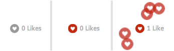
But it's the little things that win you over the most. Here's an image of the 3 states of the 'like' button. Not sure if this is a theme thing or a squarespace thing, but it's wonderful. When you rollover the heart throbs, when you click it floods animated hearts out from it. Kitsch yes but also delightful. Go ahead and try it out by 'liking' this post (and I don't mean on FB).